Three on Four International

Advertising Sales Trade Cards

112 listings in Advertising Sales Trade Cards, $10.00 to $94.42. Each one is shown in its own photos and described in full below; buy on eBay.

Prices and availability as of November 3, 2026.

ca1900 Au Bon Marche Paris Trade Card La Poule aux Oeufs d'Or Exposition 1900

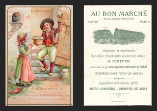
ca1900 Au Bon Marche Paris Trade Card La Poule aux Oeufs d'Or Exposition 1900 — "AU BON MARCHÉ" at the top; a fable scene: a village girl with a basket of eggs and a young man in a red waistcoat at a farm gate, a hen at their feet. Approx. 4.30 x 6.38 in.

$94.42 1900

Description

"AU BON MARCHÉ" at the top; a fable scene: a village girl with a basket of eggs and a young man in a red waistcoat at a farm gate, a hen at their feet. Caption: "La Poule aux Oeufs d'Or" (The Hen That Laid the Golden Eggs), no. 2, with French verse below.

The back is printed in green: "AU BON MARCHÉ, Maison Aristide Boucicaut, Paris," with an engraving of the store and its "Annexe" on a busy street. "Magasins de Nouveautés. Les plus importants du monde entier. A visiter comme l'une des plus remarquables curiosités de Paris. Interprètes dans toutes les langues. Exposition Universelle 1900. Hors Concours — Membre du Jury." Printer: "Imp. B. Sirven, Toulouse-Paris."

Approx. 4.30 x 6.38 in.

Read the full description

Historical Context

The great Paris department store. The back invites visitors to see the store as "one of the most remarkable curiosities of Paris," with "interpreters in every language," and names its founder, Aristide Boucicaut.

Paris 1900. At the Exposition Universelle of 1900 the store was "Hors Concours — Membre du Jury": too distinguished to compete, it sat on the jury instead.

A fable for children. The front illustrates La Fontaine's fable of the hen that laid golden eggs, from a numbered series.

Condition

Front: very good, bright color with a slick finish. Back: light foxing, crisp green printing. Please see the photos, which are part of the description.

About The Printing

This is an original chromolithograph, and it was slow, exacting work. Each color had to be drawn onto its own separate stone by hand — in monochrome, the artist judging how much stipple each area needed so the colors would combine correctly only once every stone had been printed. The sheet then went through the press once for every color it carries, often a dozen or more, and every pass had to register exactly against the last. A pass out of register showed.

Under magnification the image resolves into irregular hand-drawn stipple, each ink carrying its own dot pattern, the colors mixing in the eye rather than on the paper. There is no regular halftone screen and no four-color rosette, which is what a modern reproduction would show. Modern process printing simulates every color from four inks; chromolithography laid each color down as its own.

The front has a slick, glossy finish, and the back is printed in a single green ink.

Provenance

From my family's estate collections, built over more than 60 years by knowledgeable antiques collectors and traders. Stored in a climate-controlled environment.

Also In Our Store

More Victorian advertising trade cards are in our store.

Disclaimer

The images and any video show the actual item and are part of the official listing description, so please review them closely. Measurements and weights are approximate, and any maker or material we haven't confirmed is described as assumed. Questions? Message us; we answer quickly.
View on eBay

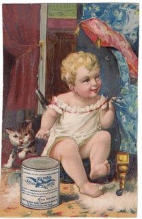
Antique Advertising Trade Card for Gail Borden's Eagle Brand Condensed Milk

Antique Victorian Advertising Trade Card for Gail Borden's Eagle Brand Condensed Milk

$74.58

Antique Advertising Trade Card for Gail Borden's Eagle Brand Condensed Milk

  • Time Period: Late 19th Century, Copyright 1887
  • Origin: New York, USA
Read the full description

Background

Gail Borden Jr. patented his process for making condensed milk in 1856, revolutionizing the dairy industry and providing a shelf-stable milk product for consumers. The Eagle Brand Condensed Milk, established by Borden, quickly became a household name, particularly valued for its convenience and safety compared to fresh milk, which was often prone to spoilage. The company's marketing often featured idyllic scenes of healthy children and families, associating their product with purity and well-being.

This particular advertisement, likely a trade card or a similar piece of ephemera, showcases the popular Victorian aesthetic with its detailed lithography and sentimental imagery. Such cards were widely distributed to promote products and were often collected by households. The depiction of a child and a kitten alongside the milk can was a common marketing strategy to evoke feelings of domesticity, care, and nourishment, appealing to mothers and families.

More Background & Description

Gail Borden Jr. patented his process for making condensed milk in 1856, revolutionizing food preservation and infant nutrition. His "Eagle Brand" became a household name, offering a shelf-stable milk product that was particularly vital in times when fresh milk was scarce or unsafe. The New York Condensed Milk Company, founded by Borden, was instrumental in popularizing this innovation across the United States.

This advertisement trade card, dates from the late 19th century, as indicated by the "COPYRIGHT 1887" mark. Such cards were common promotional items, distributed to consumers to build brand recognition and provide product information. The imagery of the eagle, a symbol of American strength and freedom, was strategically used to associate these qualities with the Eagle Brand, while the detailed instructions highlight its versatility and importance as a food source, especially for infants.

Ref: 1.0516

  • Please reivew pictures carefully as they are part of the item description and condition.
  • Dimensions: H: 5.5" x W: 3.5"
  • Composition: Heavy cardstock with color printing.
  • Please visit our store as we are constantly adding more items of all types. Thank you!

View on eBay

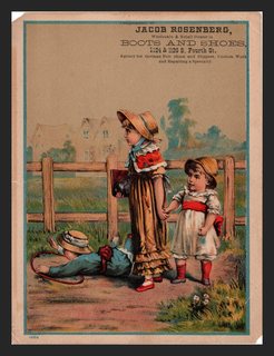
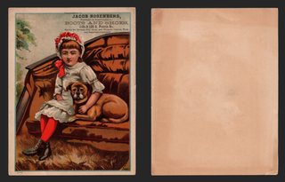
ca1885 Trade Card Jacob Rosenberg Boots Shoes Girl with Pug Dog Large XL

ca1885 Trade Card Jacob Rosenberg Boots Shoes Girl with Pug Dog Large XL — A girl in a white dress, red stockings and a red bonnet sits on an overstuffed brown sofa with her arm around a pug. Approx. 5.72 x 7.56 in.

$70.68

Description

A girl in a white dress, red stockings and a red bonnet sits on an overstuffed brown sofa with her arm around a pug. Imprint at the top: "Jacob Rosenberg, Wholesale & Retail Dealer in Boots and Shoes, 1124 & 1126 S. Fourth St.," with German felt shoes and repairing noted. Stock number "1005." The back is blank.

Approx. 5.72 x 7.56 in.

Read the full description

Historical Context

A neighborhood shoe store. Rosenberg sold wholesale and retail from a double storefront on South Fourth Street and took in custom work and repairs.

A girl and her pug. Dog collectors prize pug cards, and this is one of the largest cards in the group.

Condition

Front: excellent, bright color, light edge wear. Back: blank and toned. Please see the photos, which are part of the description.

About The Printing

This is an original chromolithograph, and it was slow, exacting work. Each color had to be drawn onto its own separate stone by hand — in monochrome, the artist judging how much stipple each area needed so the colors would combine correctly only once every stone had been printed. The sheet then went through the press once for every color it carries, often a dozen or more, and every pass had to register exactly against the last. A pass out of register showed.

Under magnification the image resolves into irregular hand-drawn stipple, each ink carrying its own dot pattern, the colors mixing in the eye rather than on the paper. There is no regular halftone screen and no four-color rosette, which is what a modern reproduction would show. Modern process printing simulates every color from four inks; chromolithography laid each color down as its own.

The Rosenberg imprint is printed in black, and the back is blank.

Provenance

From my family's estate collections, built over more than 60 years by knowledgeable antiques collectors and traders. Stored in a climate-controlled environment.

Also In Our Store

More Jacob Rosenberg cards in our store: https://www.ebay.com/str/tfauctionsintl?_nkw=rosenberg

More Victorian advertising trade cards are in our store.

Disclaimer

The images and any video show the actual item and are part of the official listing description, so please review them closely. Measurements and weights are approximate, and any maker or material we haven't confirmed is described as assumed. Questions? Message us; we answer quickly.
View on eBay

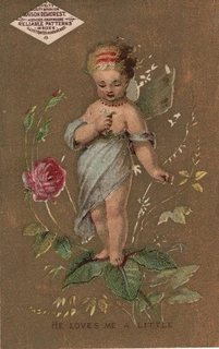
Victorian Advertising Card with a Fairy Child and Maison Demorest Patterns

Antique Victorian Advertising Trade Card Featuring a Fairy Child and Maison Demorest Patterns

$62.68

Vintage A. Block Dry Goods Store Advertising Trade Business Card from Keyport, New Jersey

  • Time Period: Circa 1880s-1890s Ivictorian Era)
  • Origin: Keyport, New Jersey, United States
  • Composition: Cardstock with color printing
  • Dimensions: H: 4.75" x W: 3"
  • Please reivew pictures carefully as they are part of the item description and condition.
Read the full description

Description

This trade card served as an advertisement for fashion patterns, using a sentimental image of a fairy child and the phrase "He Loves Me A Little" to evoke a sense of romance and domesticity. Such ephemera provides a fascinating glimpse into the popular culture, artistic styles, and marketing strategies of the Victorian period, making them sought after by collectors of antique paper goods and advertising.

Company Background

Maison Demorest was a prominent fashion and pattern company in the late 19th and early 20th centuries, founded by Ellen Louise Demorest. They were known for their "Reliable Patterns," which were widely distributed and advertised through various means, including trade cards like this one. These cards often featured charming illustrations to attract customers and promote their sewing patterns, which were essential for home dressmaking during the Victorian era. Mme. Demorest's Reliable Patterns were a popular brand of sewing patterns during the late 19th and early 20th centuries, founded by Jane Conklin. These patterns enabled home sewers to create fashionable garments, and their availability in dry goods stores made them accessible to a broad audience. The agency for these patterns signifies A. Block's role in providing not just materials but also the means for creating finished goods, reflecting a common business model of the era.

Histrorical Context

Dry goods stores were a staple of commerce in the 19th and early 20th centuries, offering a wide array of textiles, clothing, and household items. These establishments served as crucial community hubs, providing essential goods and often acting as agents for popular pattern companies, like Mme. Demorest's, which allowed individuals to create fashionable clothing at home. The variety of items listed on this card indicates a comprehensive general store catering to the needs of its local clientele.

Ref: 1.0522

  • Please visit our store as we are constantly adding more items of all types. Thank you!

View on eBay

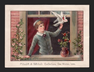
ca1885 Trade Card Fidler & Gould Confections Des Moines Iowa Boy Dove Window

ca1885 Trade Card Fidler & Gould Confections Des Moines Iowa Boy Dove Window — A boy in a sailor-collared suit leans from a brick window framed in roses to release a white dove carrying a letter. Approx. 5.94 x 4.41 in.

$50.78

Description

A boy in a sailor-collared suit leans from a brick window framed in roses to release a white dove carrying a letter. Imprint at the foot: "FIDLER & GOULD, Confections, Des Moines, Iowa." The back is blank.

Approx. 5.94 x 4.41 in.

Read the full description

Historical Context

A Des Moines sweet shop. Fidler & Gould had a stock picture card imprinted with their name, a common way for a local confectioner to advertise.

Sending a message. The boy with his dove and letter is a charming subject for collectors of birds, children and Iowa history.

Condition

Front: very good to excellent, bright color, light edge wear. Blank back with foxing spots. Please see the photos, which are part of the description.

About The Printing

This is an original chromolithograph, and it was slow, exacting work. Each color had to be drawn onto its own separate stone by hand — in monochrome, the artist judging how much stipple each area needed so the colors would combine correctly only once every stone had been printed. The sheet then went through the press once for every color it carries, often a dozen or more, and every pass had to register exactly against the last. A pass out of register showed.

Under magnification the image resolves into irregular hand-drawn stipple, each ink carrying its own dot pattern, the colors mixing in the eye rather than on the paper. There is no regular halftone screen and no four-color rosette, which is what a modern reproduction would show. Modern process printing simulates every color from four inks; chromolithography laid each color down as its own.

The confectioner's imprint is printed in black, and the back is blank.

Provenance

From my family's estate collections, built over more than 60 years by knowledgeable antiques collectors and traders. Stored in a climate-controlled environment.

Also In Our Store

More Victorian advertising trade cards are in our store.

Disclaimer

The images and any video show the actual item and are part of the official listing description, so please review them closely. Measurements and weights are approximate, and any maker or material we haven't confirmed is described as assumed. Questions? Message us; we answer quickly.
View on eBay

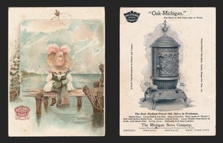
1890s Garland Stoves Trade Card Child Fishing Michigan Stove Co Oak-Michigan

1890s Garland Stoves Trade Card Child Fishing Michigan Stove Co Oak-Michigan — A small child in a big pink bonnet sits on the end of a dock, fishing line in the water, under a pale sky. Approx. 4.44 x 5.92 in.

$50.22

Description

A small child in a big pink bonnet sits on the end of a dock, fishing line in the water, under a pale sky. The Garland Stoves and Ranges trademark sits at lower left.

The back shows the "Oak-Michigan" heating stove "For Hard or Soft Coal, Coke or Wood," with the Michigan Stoves & Ranges eagle crest at upper left: "The Best Medium-Priced Oak Stove in Existence. The Michigan Stove Company, Largest Makers of Stoves and Ranges in the World. Detroit, Chicago, Buffalo, New York City."

Approx. 4.44 x 5.92 in.

Read the full description

Historical Context

A Detroit stove giant. The Michigan Stove Company sold its Garland stoves and ranges across the country, and the back calls the firm the largest maker of stoves and ranges in the world.

Heat for the parlor. The Oak-Michigan is a classic Victorian oak stove, with nickel trim and an ornate finial, built to burn coal, coke or wood.

Condition

Front: light toning, clean image. Back: clean and bright, crisp stove engraving. Please see the photos, which are part of the description.

About The Printing

This is an original chromolithograph, and it was slow, exacting work. Each color had to be drawn onto its own separate stone by hand — in monochrome, the artist judging how much stipple each area needed so the colors would combine correctly only once every stone had been printed. The sheet then went through the press once for every color it carries, often a dozen or more, and every pass had to register exactly against the last. A pass out of register showed.

Under magnification the image resolves into irregular hand-drawn stipple, each ink carrying its own dot pattern, the colors mixing in the eye rather than on the paper. There is no regular halftone screen and no four-color rosette, which is what a modern reproduction would show. Modern process printing simulates every color from four inks; chromolithography laid each color down as its own.

The back is printed in black.

Provenance

From my family's estate collections, built over more than 60 years by knowledgeable antiques collectors and traders. Stored in a climate-controlled environment.

Also In Our Store

More Victorian advertising trade cards are in our store.

Disclaimer

The images and any video show the actual item and are part of the official listing description, so please review them closely. Measurements and weights are approximate, and any maker or material we haven't confirmed is described as assumed. Questions? Message us; we answer quickly.
View on eBay

Victorian Trade Card Garfield Tea Syrup Dressed Pigs Patent Medicine Laxative

DESCRIPTION

$47.48

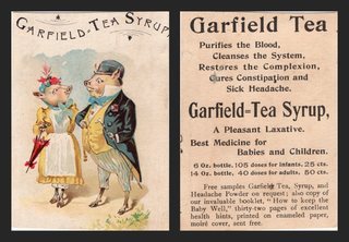
A comic card of two well-dressed pigs out for a stroll. She wears a flowered bonnet, a yellow dress with puffed sleeves, a white apron and a blue bow, and carries a red parasol; he wears a bowler hat, a tailcoat with a flower in the buttonhole, a yellow waistcoat, a blue bow tie and striped trousers, and leans on a cane. Lettered across the top: "Garfield-Tea Syrup" (the final letters run off the right edge, as cut).

The back is printed in black: "Garfield Tea. Purifies the Blood, Cleanses the System, Restores the Complexion, Cures Constipation and Sick Headache. Garfield-Tea Syrup, A Pleasant Laxative. Best Medicine for Babies and Children." It lists a 6 oz. bottle, "105 doses for infants", and a 14 oz. bottle, "40 doses for adults", and offers free samples of Garfield Tea, Syrup and Headache Powder with the booklet "How to keep the Baby Well," thirty-two pages "printed on enameled paper, moiré cover, sent free."

Approx. 2.40 x 3.35 in.

Read the full description

Historical Context

Patent medicine on parade. One remedy to purify the blood, clear the complexion, cure constipation and headache, and serve as the "Best Medicine for Babies and Children": claims like these ran freely before the federal Pure Food and Drug Act of 1906. Garfield Tea and Garfield Tea Syrup were made by the Garfield Tea Company of Brooklyn, New York, and examples of the products are held in the Smithsonian's National Museum of American History.

Pigs in their Sunday best. Dressed animals were among the most popular trade card subjects, and this courting couple, parasol and cane in hand, is a fine example for collectors of pigs and comic animals.

Condition

Very good for its age. Front: bright color; a faint vertical crease line near the right edge in the lower half; the card was cut close at the right, so the end of the heading runs off the edge; light toning; corners sharp to lightly worn. Back: light toning; a small grey smudge by "Cures"; a small dark fleck in "Garfield" in the lower text; a faint round dent in the left margin near the top; partial printing from the neighboring card along the left edge. Please see the photos, which are part of the description.

About The Printing

This is an original chromolithograph, and it was slow, exacting work. Each color had to be drawn onto its own separate stone by hand — in monochrome, the artist judging how much stipple each area needed so the colors would combine correctly only once every stone had been printed. The sheet then went through the press once for every color it carries, often a dozen or more, and every pass had to register exactly against the last. A pass out of register showed.

Under magnification the image resolves into irregular hand-drawn stipple, each ink carrying its own dot pattern, the colors mixing in the eye rather than on the paper. There is no regular halftone screen and no four-color rosette, which is what a modern reproduction would show. Modern process printing simulates every color from four inks; chromolithography laid each color down as its own.

The back is printed in black type, separate from the color work on the front.

Provenance

From my family's estate collections, built over more than 60 years by knowledgeable antiques collectors and traders. Stored in a climate-controlled environment.

Also In Our Store

More Victorian advertising trade cards for patent medicines, coffee and baking soda are in our store.

Disclaimer

Specifications and detailed item descriptions are provided as a courtesy only and are not guaranteed to be one hundred percent accurate. Please do your own research. There are generally no receipts available for any items from original purchases. Any dimensions and/or weights are approximate. The absence of a more detailed condition report does not imply there are no condition issues with the item(s). Please inspect images carefully as they are part of the official item description and best representation of the actual condition. Additional images may be available upon request depending on time and availability. Not responsible for internet mis-translations or mis-identification of maker's marks if found or assumptions of makers or materials — item descriptions will indicate if it is assumed. If you see a problem, please message us immediately and we will do our best to sort out a solution and confirm the information. With the exception of eBay rules, no returns are accepted.

View on eBay

Victorian Trade Card Advertising Leighton Bros. Boot and Shoe Store

Antique Victorian Vintage Advertising Trade Card for Leighton Bros. Boot and Shoe Store

$47.25

Company Backgroud

Leighton Bros. was a retailer of boots, shoes, and hats, operating from Bangor, Maine. This business trade card served as a form of advertisement, using a charming, imaginative scene to attract customers and promote their business. The specific imagery of children in a shoe might have been intended to evoke a sense of comfort, family, or perhaps even the idea of finding the perfect fit.

  • Time Period: Late 19th Century (Victorian Era)
  • Origin: Bangor, Maine, United States
  • Composition: Cardstock with color printing, card back is blank
  • Dimensions: H:3" x W: 4.5" (appoximately)
  • Please reivew pictures carefully as they are part of the item description and condition.
Read the full description

Historical Context

Business trade cards like these were a popular form of advertising in the late 19th and early 20th centuries, often featuring colorful illustrations and company information. They were distributed as promotional items, similar to modern flyers or business cards, and were collected by many people, especially children. These cards provide valuable insights into the commercial practices and artistic styles of the era.

Ref: 1.0530

  • Please visit our store as we are constantly adding more items of all types. Thank you!

View on eBay

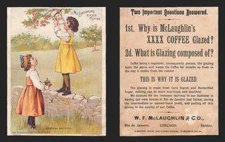
1892 McLaughlin's XXXX Coffee Trade Card Cherries Are Ripe Girls Cosack Large

1892 McLaughlin's XXXX Coffee Trade Card Cherries Are Ripe Girls Cosack Large — "Cherries Are Ripe": a girl in a yellow pinafore stands on a stone wall reaching into a cherry tree while her friend in an orange dress waits below. Approx. 5.00 x 6.52 in.

$47.02 1892

Description

"Cherries Are Ripe": a girl in a yellow pinafore stands on a stone wall reaching into a cherry tree while her friend in an orange dress waits below. Foot: "This is one of a set of eighteen cards" and the Cosack & Co. printer's line, copyright 1892.

The back, printed in black, is headed "Two Important Questions Answered. 1st. Why is McLaughlin's XXXX Coffee Glazed? 2d. What is Glazing composed of?" It explains that the glaze of corn starch and reclarified sugar "seals the pores and keeps the Coffee for months as fresh as the day it comes from the roaster," and is signed "W. F. McLaughlin & Co., Rio de Janeiro, Chicago, Santos." The foot reads "A beautiful picture card in every package. 18 designs in this set."

Approx. 5.00 x 6.52 in.

Read the full description

Historical Context

Glazed coffee. Chicago roaster W. F. McLaughlin & Co. sold its XXXX brand roasted in the whole bean and coated with a glaze, and the back of this card makes the case in the company's own words. The firm names its own houses in Rio de Janeiro and Santos, Brazil, the coffee ports.

Collect the set. McLaughlin's issued its picture cards in numbered series, packed one to a package, and families saved them in albums.

Condition

Front: excellent, bright color. Back: light toning. Please see the photos, which are part of the description.

About The Printing

This is an original chromolithograph, and it was slow, exacting work. Each color had to be drawn onto its own separate stone by hand — in monochrome, the artist judging how much stipple each area needed so the colors would combine correctly only once every stone had been printed. The sheet then went through the press once for every color it carries, often a dozen or more, and every pass had to register exactly against the last. A pass out of register showed.

Under magnification the image resolves into irregular hand-drawn stipple, each ink carrying its own dot pattern, the colors mixing in the eye rather than on the paper. There is no regular halftone screen and no four-color rosette, which is what a modern reproduction would show. Modern process printing simulates every color from four inks; chromolithography laid each color down as its own.

The back is printed in black.

Provenance

From my family's estate collections, built over more than 60 years by knowledgeable antiques collectors and traders. Stored in a climate-controlled environment.

Also In Our Store

More McLaughlin's cards in our store: https://www.ebay.com/str/tfauctionsintl?_nkw=mclaughlin

More Victorian advertising trade cards are in our store.

Disclaimer

The images and any video show the actual item and are part of the official listing description, so please review them closely. Measurements and weights are approximate, and any maker or material we haven't confirmed is described as assumed. Questions? Message us; we answer quickly.
View on eBay

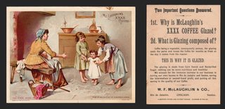
1892 McLaughlin's XXXX Coffee Trade Card The First Step Baby Walking Cosack

1892 McLaughlin's XXXX Coffee Trade Card The First Step Baby Walking Cosack — "The First Step": in a cottage kitchen a mother kneels with open arms as two older children help the baby take its first steps. Approx. 6.77 x 5.08 in.

$46.68 1892

Description

"The First Step": in a cottage kitchen a mother kneels with open arms as two older children help the baby take its first steps. Foot: "This is one of a set of eighteen cards," Cosack & Co., copyright 1892.

The back, printed in black, is headed "Two Important Questions Answered. 1st. Why is McLaughlin's XXXX Coffee Glazed? 2d. What is Glazing composed of?" It explains that the glaze of corn starch and reclarified sugar "seals the pores and keeps the Coffee for months as fresh as the day it comes from the roaster," and is signed "W. F. McLaughlin & Co., Rio de Janeiro, Chicago, Santos." The foot reads "A beautiful picture card in every package. 18 designs in this set."

Approx. 6.77 x 5.08 in.

Read the full description

Historical Context

Glazed coffee. Chicago roaster W. F. McLaughlin & Co. sold its XXXX brand roasted in the whole bean and coated with a glaze, and the back of this card makes the case in the company's own words. The firm names its own houses in Rio de Janeiro and Santos, Brazil, the coffee ports.

Collect the set. McLaughlin's issued its picture cards in numbered series, packed one to a package, and families saved them in albums.

Condition

Front: excellent, bright color. Back: light toning. Please see the photos, which are part of the description.

About The Printing

This is an original chromolithograph, and it was slow, exacting work. Each color had to be drawn onto its own separate stone by hand — in monochrome, the artist judging how much stipple each area needed so the colors would combine correctly only once every stone had been printed. The sheet then went through the press once for every color it carries, often a dozen or more, and every pass had to register exactly against the last. A pass out of register showed.

Under magnification the image resolves into irregular hand-drawn stipple, each ink carrying its own dot pattern, the colors mixing in the eye rather than on the paper. There is no regular halftone screen and no four-color rosette, which is what a modern reproduction would show. Modern process printing simulates every color from four inks; chromolithography laid each color down as its own.

The back is printed in black.

Provenance

From my family's estate collections, built over more than 60 years by knowledgeable antiques collectors and traders. Stored in a climate-controlled environment.

Also In Our Store

More McLaughlin's cards in our store: https://www.ebay.com/str/tfauctionsintl?_nkw=mclaughlin

More Victorian advertising trade cards are in our store.

Disclaimer

The images and any video show the actual item and are part of the official listing description, so please review them closely. Measurements and weights are approximate, and any maker or material we haven't confirmed is described as assumed. Questions? Message us; we answer quickly.
View on eBay

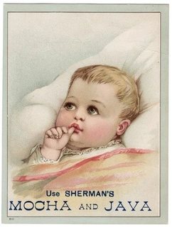
Victorian Trade Card Advertising Sherman's Mocha and Java Coffee

Antique Victorian Trade Card Advertising Sherman's Mocha and Java Coffee

$45.64

Description

Sherman's Mocha and Java likely refers to a brand of coffee or a related product, using the image of a healthy, content baby to associate their product with well-being and domestic comfort. The use of such imagery was common in advertising during this period, aiming to evoke positive emotions and create a memorable brand association. These cards are now sought after by collectors for their historical significance and artistic merit.

  • Time Period: Late 19th Century (Victorian Era)
  • Origin: United States
  • Composition: Cardstock with color printing, back of card is blank
  • Dimensions: H: 4.75" x W: 3.5" (approximately)
  • Please reivew pictures carefully as they are part of the item description and condition.
Read the full description

Historical Context

Victorian promotional trade cards were a popular form of advertising in the late 19th and early 20th centuries, often featuring colorful illustrations of children, animals, or sentimental scenes. These cards were distributed by businesses to showcase their products and services, serving as both an advertisement and a collectible item. They were frequently given away with purchases, encouraging brand loyalty and providing a tangible reminder of the company.

Ref: 1.0526

  • Please visit our store as we are constantly adding more items of all types. Thank you!

View on eBay

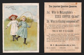
1892 McLaughlin's XXXX Coffee Trade Card Two Girls Jump Rope Hoop Cosack Large

1892 McLaughlin's XXXX Coffee Trade Card Two Girls Jump Rope Hoop Cosack Large — Two little girls in a meadow, one in white with a red hat and one in blue, skipping with a long rope. Approx. 5.15 x 7.01 in.

$44.18 1892

Description

Two little girls in a meadow, one in white with a red hat and one in blue, skipping with a long rope. "McLaughlin's XXXX Coffee" at upper left; foot: "This is one of a set of sixteen cards," Cosack & Co., 1892.

The back, printed in black, is headed "Two Important Questions Answered. 1st. Why is McLaughlin's XXXX Coffee Glazed? 2d. What is Glazing composed of?" It explains that the glaze of corn starch and reclarified sugar "seals the pores and keeps the Coffee for months as fresh as the day it comes from the roaster," and is signed "W. F. McLaughlin & Co., Rio de Janeiro, Chicago, Santos." The foot reads "A beautiful picture card in every package. 16 designs in this set."

Approx. 5.15 x 7.01 in.

Read the full description

Historical Context

Glazed coffee. Chicago roaster W. F. McLaughlin & Co. sold its XXXX brand roasted in the whole bean and coated with a glaze, and the back of this card makes the case in the company's own words. The firm names its own houses in Rio de Janeiro and Santos, Brazil, the coffee ports.

Collect the set. McLaughlin's issued its picture cards in numbered series, packed one to a package, and families saved them in albums.

Condition

Front: excellent, bright color. Back: toned, with a spot. Please see the photos, which are part of the description.

About The Printing

This is an original chromolithograph, and it was slow, exacting work. Each color had to be drawn onto its own separate stone by hand — in monochrome, the artist judging how much stipple each area needed so the colors would combine correctly only once every stone had been printed. The sheet then went through the press once for every color it carries, often a dozen or more, and every pass had to register exactly against the last. A pass out of register showed.

Under magnification the image resolves into irregular hand-drawn stipple, each ink carrying its own dot pattern, the colors mixing in the eye rather than on the paper. There is no regular halftone screen and no four-color rosette, which is what a modern reproduction would show. Modern process printing simulates every color from four inks; chromolithography laid each color down as its own.

The back is printed in black.

Provenance

From my family's estate collections, built over more than 60 years by knowledgeable antiques collectors and traders. Stored in a climate-controlled environment.

Also In Our Store

More McLaughlin's cards in our store: https://www.ebay.com/str/tfauctionsintl?_nkw=mclaughlin

More Victorian advertising trade cards are in our store.

Disclaimer

The images and any video show the actual item and are part of the official listing description, so please review them closely. Measurements and weights are approximate, and any maker or material we haven't confirmed is described as assumed. Questions? Message us; we answer quickly.
View on eBay

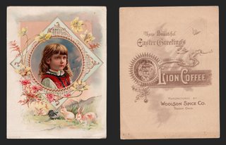
1891 Lion Coffee Easter Greetings Trade Card Girl Portrait Rabbits Flowers Large

1891 Lion Coffee Easter Greetings Trade Card Girl Portrait Rabbits Flowers Large — A girl with long hair in a red bodice framed in a lace diamond, with spring flowers and rabbits at her feet. Approx. 5.22 x 6.93 in.

$41.38 1891

Description

A girl with long hair in a red bodice framed in a lace diamond, with spring flowers and rabbits at her feet. Printer's line: "Copyrighted 1891 by Geo. S. Harris & Sons Lith., Phila."

The back is printed in soft brown: "These Beautiful Easter Greetings are found only in the one pound packages of LION COFFEE. Manufactured by Woolson Spice Co., Toledo, Ohio," around a sunburst roundel with the Lion Coffee lion and a bird in flight.

Approx. 5.22 x 6.93 in.

Read the full description

Historical Context

The coffee that came with a picture. Lion Coffee began in Toledo, Ohio, in 1864 and became part of the Woolson Spice Company in 1882. Alvin Woolson built the brand by putting picture cards in every package, and the back of this card says so.

Condition

Front: excellent, bright color. Back: light toning. Please see the photos, which are part of the description.

About The Printing

This is an original chromolithograph, and it was slow, exacting work. Each color had to be drawn onto its own separate stone by hand — in monochrome, the artist judging how much stipple each area needed so the colors would combine correctly only once every stone had been printed. The sheet then went through the press once for every color it carries, often a dozen or more, and every pass had to register exactly against the last. A pass out of register showed.

Under magnification the image resolves into irregular hand-drawn stipple, each ink carrying its own dot pattern, the colors mixing in the eye rather than on the paper. There is no regular halftone screen and no four-color rosette, which is what a modern reproduction would show. Modern process printing simulates every color from four inks; chromolithography laid each color down as its own.

The back is printed in a single brown ink.

Provenance

From my family's estate collections, built over more than 60 years by knowledgeable antiques collectors and traders. Stored in a climate-controlled environment.

Also In Our Store

More Lion Coffee cards in our store: https://www.ebay.com/str/tfauctionsintl?_nkw=lion+coffee

More Victorian advertising trade cards are in our store.

Disclaimer

The images and any video show the actual item and are part of the official listing description, so please review them closely. Measurements and weights are approximate, and any maker or material we haven't confirmed is described as assumed. Questions? Message us; we answer quickly.
View on eBay

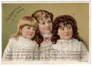
Antique Advertising Trade Card for E.W. Hoyt & Co.'s Rubifoam and German Cologne

Antique Victorian Advertising Trade Card for E.W. Hoyt & Co.'s Rubifoam and German Cologne

$41.33

  • Time Period: Late 19th Century (1888)
  • Origin: Lowell, Massachusetts, USA
  • Composition: Cardstock with color printing
  • Dimensions: H:3.25" x W: 4.5" (approximately)
  • Please reivew pictures carefully as they are part of the item description and condition.
Read the full description

Comapny Background

E.W. Hoyt & Co. was a pharmaceutical company based in Lowell, Massachusetts, known for products like Hoyt's German Cologne and Rubifoam. This advertising trade card highlights their dual marketing strategy, promoting both a personal fragrance and a dental product. The inclusion of pricing and dealer information aimed to facilitate direct sales and distribution. E.W. Hoyt & Co. was a prominent manufacturer of toiletries and perfumes. The company was well known for its "Hoyt's German Cologne," a popular fragrance, and "Rubifoam," a dental product. Their advertising often emphasized the quality and purity of their goods, aiming to establish brand loyalty and combat counterfeit products. This advertising card, likely distributed in the late 19th or early 20th century, served as a promotional tool. By perfuming the card itself, the company offered a tangible sensory experience of their cologne, making the advertisement more memorable and persuasive. Such items are now collected as examples of historical ephemera and early advertising practices.

Historical Context

Victorian business trade cards were a popular form of advertising in the late 19th century, often featuring colorful illustrations and product information. Companies used these cards to promote their goods, with many being perfumed or embossed to attract consumers. They served as early forms of collectible ephemera, with designs ranging from sentimental scenes to product endorsements.

Ref: 1.0531

  • Please visit our store as we are constantly adding more items of all types. Thank you!

View on eBay

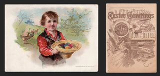
1893 Lion Coffee Easter Greetings Trade Card Boy Easter Eggs Chicks Knapp Large

1893 Lion Coffee Easter Greetings Trade Card Boy Easter Eggs Chicks Knapp Large — A smiling boy in a red jacket holds out a straw hat full of colored Easter eggs while a hen and chicks look on. Approx. 7.02 x 5.13 in.

$41.22 1893

Description

A smiling boy in a red jacket holds out a straw hat full of colored Easter eggs while a hen and chicks look on. Printer's line: "Copyrighted 1893" by The Knapp Co., N.Y.

The back is printed in brown: "These Beautiful Easter Greetings are found only in the one pound packages of LION COFFEE," with an angel, the lion, lilies and "Woolson Spice Co., Toledo, Ohio."

Approx. 7.02 x 5.13 in.

Read the full description

Historical Context

The coffee that came with a picture. Lion Coffee began in Toledo, Ohio, in 1864 and became part of the Woolson Spice Company in 1882. Alvin Woolson built the brand by putting picture cards in every package, and the back of this card says so.

Condition

Front: excellent, bright color. Back: light toning. Please see the photos, which are part of the description.

About The Printing

This is an original chromolithograph, and it was slow, exacting work. Each color had to be drawn onto its own separate stone by hand — in monochrome, the artist judging how much stipple each area needed so the colors would combine correctly only once every stone had been printed. The sheet then went through the press once for every color it carries, often a dozen or more, and every pass had to register exactly against the last. A pass out of register showed.

Under magnification the image resolves into irregular hand-drawn stipple, each ink carrying its own dot pattern, the colors mixing in the eye rather than on the paper. There is no regular halftone screen and no four-color rosette, which is what a modern reproduction would show. Modern process printing simulates every color from four inks; chromolithography laid each color down as its own.

The back is printed in a single brown ink.

Provenance

From my family's estate collections, built over more than 60 years by knowledgeable antiques collectors and traders. Stored in a climate-controlled environment.

Also In Our Store

More Lion Coffee cards in our store: https://www.ebay.com/str/tfauctionsintl?_nkw=lion+coffee

More Victorian advertising trade cards are in our store.

Disclaimer

The images and any video show the actual item and are part of the official listing description, so please review them closely. Measurements and weights are approximate, and any maker or material we haven't confirmed is described as assumed. Questions? Message us; we answer quickly.
View on eBay

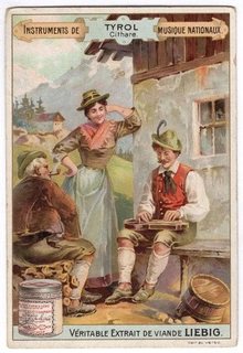
Antique Liebig Trade Card Tyrol Zither Player Austria Alps National Instruments

TITLE

$39.23

Antique Liebig Trade Card Tyrol Zither Player Austria Alps National Instruments

Read the full description

Description

An antique Liebig trade card from the French-language series "Instruments de musique nationaux" (National Musical Instruments). This card, "TYROL – Cithare", shows a young Tyrolean man in a feathered green hat, red waistcoat and lederhosen playing a zither on his knees in front of an Alpine chalet. A smiling young woman in a wide-brimmed hat and apron stands behind him, and an older man sits listening on a stack of logs. Snow-capped mountains rise in the background. A jar of Liebig meat extract stands at lower left, and the bottom banner reads "VÉRITABLE EXTRAIT DE VIANDE LIEBIG" (Genuine Liebig Meat Extract). "Voir au verso" (see reverse) is printed at lower right.

The back, printed in French, carries the Compagnie Liebig advertisement, with a vignette of a young artist painting a jar of Liebig extract at his easel and a large blue facsimile of the "J. v. Liebig" signature. In translation: "Liebig Company. Works at Fray-Bentos and branches (South America). Hors concours [beyond competition] since 1885. No foreign matter is added to genuine Liebig meat extract. It is an absolutely pure meat juice. Sold by grocers and provision merchants. Insist on the Liebig signature in blue ink on the label and the paper wrapping the jars." A second panel advertises Liebig meat peptone, "because of its extreme digestibility and high nutritional value", as the fortifying food for "the weak, the anaemic, invalids and especially those who suffer from the stomach", sold in the principal pharmacies. The bottom line reads "Importé par la Compagnie Liebig, Paris" (Imported by the Liebig Company, Paris).

Historical Context

Liebig's Extract of Meat Company was founded in London on December 4, 1865, by the German chemist Justus von Liebig and the engineer George Christian Giebert. Its factory at Fray Bentos, Uruguay, was turning out 500 tonnes of meat extract a year by 1875; the company later gave its name to Fray Bentos corned beef and launched Oxo cubes in 1911. From 1872 Liebig packed collectible card sets with its product, usually six cards to a theme (stories, history, geography), printed in many languages for markets across Europe. The blue signature on the back was the company's guarantee of the genuine product, and the card itself tells buyers to look for it.

Tyrol is the historic Alpine region of the Habsburg lands, a crown land from the 12th century until 1919, when it was divided between Austria (today's State of Tyrol) and Italy (South Tyrol and Trentino). This card was printed for French buyers, about a people and an instrument of the Austrian Alps, by a company founded in London by a German chemist with its factory in South America: an early piece of truly international advertising.

More Victorian trade cards, antique postcards and US silver dollars are in our store: https://www.ebay.com/str/tfauctionsintl

Condition

Good antique condition. Bright colors on the front with light wear to the corners and edges. Back clean and legible with light toning. Please see the photos, which are part of the description.

About The Printing

Liebig cards of this era were printed by chromolithography, with each color laid down from its own stone. The rich, layered color on the front is typical of the process.

Provenance

From my family's estate collections, built over more than 60 years by knowledgeable antiques collectors and traders. Stored in a climate-controlled environment.

Disclaimer

Specifications and detailed item descriptions are provided as a courtesy only and are not guaranteed to be one hundred percent accurate. Please do your own research. There are generally no receipts available for any items from original purchases. Any dimensions and/or weights are approximate. The absence of a more detailed condition report does not imply there are no condition issues with the item(s). Please inspect images carefully as they are part of the official item description and best representation of the actual condition. Additional images may be available upon request depending on time and availability. Not responsible for internet mis-translations or mis-identification of maker's marks if found or assumptions of makers or materials — item descriptions will indicate if it is assumed. If you see a problem, please message us immediately and we will do our best to sort out a solution and confirm the information. With the exception of eBay rules, no returns are accepted.

----- Not For Pasting -----

Item Specifics

- Brand: Liebig

- Country of Origin: set to France by Joseph, 2026-10-03. eBay has no "Unknown" option, and the field feeds international export paperwork. The card was imported and distributed by the Paris office; the actual printer is unknown.

- Language: French

- Original/Reprint: Original

Notes

- Set name and card read from the front; back translated by Claude (UNSUPPORTED; Joseph can check the French).

- Year: the live title says 1900. The back proves only "after 1885" (hors concours depuis 1885). Not dated, so the new title leaves the year out.

- Printing: chromolithography is assumed from the age and look (Joseph: "very safe bet"). No dot check was done (no original scan).

- Sanguinetti catalog number and year: not confirmed. A search turned up "S 0561 National Musical Instruments", but the match isn't confirmed.

- Condition: written from the screenshots only. Adjust if needed.

SOURCES (retrieved 2026-10-03)

- Liebig company facts and trade cards: https://en.wikipedia.org/wiki/Liebig%27s_Extract_of_Meat_Company (SOURCED)

- Tyrol: https://en.wikipedia.org/wiki/Tyrol_(region) (SOURCED)

Revision Log

r01 2026-10-03 Created from Joseph's front and back screenshots.

r02 2026-10-03 New title (79 characters), chosen by Joseph.

View on eBay

ca1885 Patent Medicine Trade Card Dr H S Woodard Bloomington Illinois Flowers

ca1885 Patent Medicine Trade Card Dr H S Woodard Bloomington Illinois Flowers — A blue-green vase of red and pink flowers with pansies at its foot. Approx. 2.98 x 4.50 in.

$38.32

Description

A blue-green vase of red and pink flowers with pansies at its foot. Imprint: "From Dr. H. S. Woodard, Cor. Main & Empire Sts., Bloomington, Ill."

The back is printed in black: "Dr. Woodard's Medicine and Flavoring Extract Manufactory, Corner of North Main and Empire Sts., Bloomington, Ill.," listing "Pure Druggist Spices, Pepper, Choice Candies, Fruits, Nuts," and a Medicine Department for "Aches, Pains, Neuralgia, Rheumatism," promoting "Woodard's Instant Relief" ("Over 11,000 bottles sold by one man in four years") and a long list of remedies.

Approx. 2.98 x 4.50 in.

Read the full description

Historical Context

Patent medicine on parade. Instant relief for aches, pains, neuralgia and rheumatism: claims like these ran freely before the federal Pure Food and Drug Act of 1906.

Medicine and flavoring extracts. Many small-town druggists made both, sold side by side with spices and candy.

Condition

Front: very good, bright color. Back: toned with staining; text legible. Please see the photos, which are part of the description.

About The Printing

This is an original chromolithograph, and it was slow, exacting work. Each color had to be drawn onto its own separate stone by hand — in monochrome, the artist judging how much stipple each area needed so the colors would combine correctly only once every stone had been printed. The sheet then went through the press once for every color it carries, often a dozen or more, and every pass had to register exactly against the last. A pass out of register showed.

Under magnification the image resolves into irregular hand-drawn stipple, each ink carrying its own dot pattern, the colors mixing in the eye rather than on the paper. There is no regular halftone screen and no four-color rosette, which is what a modern reproduction would show. Modern process printing simulates every color from four inks; chromolithography laid each color down as its own.

The back is printed in black.

Provenance

From my family's estate collections, built over more than 60 years by knowledgeable antiques collectors and traders. Stored in a climate-controlled environment.

Also In Our Store

More Victorian advertising trade cards are in our store.

Disclaimer

The images and any video show the actual item and are part of the official listing description, so please review them closely. Measurements and weights are approximate, and any maker or material we haven't confirmed is described as assumed. Questions? Message us; we answer quickly.
View on eBay

ca1885 Alden Fruit Vinegar Trade Card Fruit High But Falling Dewey Waverly KS

ca1885 Alden Fruit Vinegar Trade Card Fruit High But Falling Dewey Waverly KS — A comic scene: a barefoot boy in a straw hat loses his grip in an apple tree while a woman below holds out her apron. Approx. 3.02 x 5.05 in.

$37.82

Description

A comic scene: a barefoot boy in a straw hat loses his grip in an apple tree while a woman below holds out her apron. Caption: "Fruit High But Falling. The Alden Fruit Vinegar."

The back is printed in black: "The highest Scientific Authorities having analyzed, say 'It is a pure wholesome Vinegar, produced by natural fermentation from fruits.' For sale by W. F. DEWEY & CO., Dealers in General Merchandise, Waverly, Kas. The Alden Fruit Vinegar A Specialty."

Approx. 3.02 x 5.05 in.

Read the full description

Historical Context

A short-lived brand. The Alden Fruit Vinegar company was founded in St. Louis in 1878 and was gone by 1907 (Library Company of Philadelphia).

A Kansas railroad town. Waverly, Kansas, was platted in 1878 on the Ottawa and Burlington Railroad (Cutler, History of the State of Kansas).

Condition

Front: very good, bright color. Back: stains; text legible. Please see the photos, which are part of the description.

About The Printing

This is an original chromolithograph, and it was slow, exacting work. Each color had to be drawn onto its own separate stone by hand — in monochrome, the artist judging how much stipple each area needed so the colors would combine correctly only once every stone had been printed. The sheet then went through the press once for every color it carries, often a dozen or more, and every pass had to register exactly against the last. A pass out of register showed.

Under magnification the image resolves into irregular hand-drawn stipple, each ink carrying its own dot pattern, the colors mixing in the eye rather than on the paper. There is no regular halftone screen and no four-color rosette, which is what a modern reproduction would show. Modern process printing simulates every color from four inks; chromolithography laid each color down as its own.

The back is printed in black.

Provenance

From my family's estate collections, built over more than 60 years by knowledgeable antiques collectors and traders. Stored in a climate-controlled environment.

Also In Our Store

More Victorian advertising trade cards are in our store.

Disclaimer

The images and any video show the actual item and are part of the official listing description, so please review them closely. Measurements and weights are approximate, and any maker or material we haven't confirmed is described as assumed. Questions? Message us; we answer quickly.
View on eBay

Victorian Trade Card Bridgeport Elastic Web Congress Shoes Insurance Certificate

Bridgeport Elastic Web Co. — Congress Shoe “Insurance Certificate”

$34.58

Original Victorian advertising trade card, chromolithograph, c. 1880s. Approx. 5.00 x 3.40 in.

The front is a snowy winter landscape: a red cottage with a snow-laden roof under bare trees, a rail fence, a second house in the distance, and a frozen brook edged with dried weeds in the foreground. There is no advertising on the front; a stock number, 1026, and a small printer's device sit in the lower left corner.

The reverse is the advertisement, laid out as a certificate. A TRADE MARK roundel reads BRIDGEPORT GORING WARRANTED around a shield marked K; a sawtooth seal reads NO GORING HAS A LONGER OR STRONGER GUARANTEE THAN BRIDGEPORT. Between them: INSURANCE CERTIFICATE. The text reads: The above TRADE MARK in these Congress Shoes insures the wearer perfect service of the Gore for one-and a half years from date of sale by us, and if any fails within that time, with fair usage, the shoes may be sent to us by express, and we will insert new gores and return to owner free of charge. Insist on having this certificate with every pair of Congress Shoes. BRIDGEPORT ELASTIC WEB CO., BRIDGEPORT, CONN., U.S.A. E. STERLING, Prest.

Read the full description

Historical Context

The Congress shoe was an ankle boot with elastic panels in the sides — the gores — so it pulled on without laces. The weak point was always the elastic, which stretched and failed long before the leather wore out. This company made the elastic, and the card is a guarantee on that one part: eighteen months, or they would put in new gores free.

It is an early example of a component maker selling directly to the public over the head of the manufacturer. Ask for the shoe with our elastic in it, and keep this card as your proof.

Condition

Toning and age typical of the period. Faint pencil marks at the upper right of the reverse; light surface soiling; minor edge and corner wear. The winter scene on the front is clean and the certificate text fully legible. Please view the images carefully.

About The Printing

This is an original chromolithograph, and it was slow, exacting work. Each color had to be drawn onto its own separate stone by hand — in monochrome, the artist judging how much stipple each area needed so the colors would combine correctly only once every stone had been printed. The sheet then went through the press once for every color it carries, often a dozen or more, and every pass had to register exactly against the last. A pass out of register showed.

Under magnification the image resolves into irregular hand-drawn stipple, each ink carrying its own dot pattern, the colors mixing in the eye rather than on the paper. There is no regular halftone screen and no four-color rosette, which is what a modern reproduction would show. Modern process printing simulates every color from four inks; chromolithography laid each color down as its own.

Provenance

This item comes from the personal collections of my family estate, accumulated over more than 200 years — including items that came west by wagon train to Colorado and later to Oklahoma. Now that my parents have passed we cannot keep all of these cherished items. They were well-educated antiques collectors/traders and continued to build their collections over more than 60 years. The vast majority of the pieces are from the Victorian Era, however there are plenty of older and newer items. Everything has been stored in a climate-controlled environment over time.

Disclaimer

Specifications and detailed item descriptions are provided as a courtesy only and are not guaranteed to be one hundred percent accurate. Please do your own research. There are generally no receipts available for any items from original purchases. Any dimensions and/or weights are approximate. The absence of a more detailed condition report does not imply there are no condition issues with the item(s). Please inspect images carefully as they are part of the official item description and best representation of the actual condition. Additional images may be available upon request depending on time and availability. Not responsible for internet mis-translations or mis-identification of maker's marks if found or assumptions of makers or materials — item descriptions will indicate if it is assumed. If you see a problem, please message us immediately and we will do our best to sort out a solution and confirm the information. With the exception of eBay rules, no returns are accepted.

View on eBay

1893 World's Fair Trade Card Hygienic Kalsomine Rubber Paint Chicago Uncle Sam

Hygienic Kalsomine — Rubber Paint Company, Chicago, 1893 World's Fair

$33.88 1893

Original Victorian advertising trade card, chromolithograph, 1893. Approx. 5.60 x 3.55 in. Printed by The Milwaukee Litho. & Engr. Co.

Uncle Sam, in striped trousers and a star-spangled coat, hands packets of Hygienic Kalsomine to a crowd of fairgoers on the steps of an exposition building — a woman in a green striped dress, a man in a top hat, a visitor in a fez, a small girl, and a boy seated on the steps below. A golden dome rises behind them and a figure of Columbia in the stars and stripes stands at the head of the stair. Lettered at the foot: USE HYGIENIC KALSOMINE.

The reverse is a full trade advertisement for the Rubber Paint Company — H. M. Hooker, President; Frank Hayes, Vice President; O. J. Buck, Superintendent; A. G. Cox, General Manager — manufacturers of Mixed Paint and Kalsomine, zinc primers, bullion floor, barn, bridge and buggy paint, colors in oil, stains, brushes, barrel paint and painters' material. Headquarters for Carter Strictly Pure White Lead. Office and factory at 36-38 Boston Ave., Chicago, telephone Main 271. A line at the foot reads: Display at Worlds Fair — N. W. Portion Manufacturers & Liberal Arts Building — Section H.

Read the full description

Historical Context

That last line dates the card exactly. The Manufactures and Liberal Arts Building was the largest structure at the World's Columbian Exposition in Chicago in 1893, and this company had a stand in the north-west portion of it, Section H. The card was printed to be handed out there.

Which makes the picture a self-portrait of the moment. Uncle Sam distributing kalsomine to the nations on the steps of the White City is not subtle, but it is exactly how Chicago felt about itself that summer — and the fez in the crowd is there because the world really had turned up.

Condition

Toning and age typical of the period. Light surface soiling; minor edge and corner wear; light soiling to the reverse. The chromolithographed image remains bright with strong color and the reverse text is fully legible. Please view the images carefully.

About The Printing

This is an original chromolithograph, and it was slow, exacting work. Each color had to be drawn onto its own separate stone by hand — in monochrome, the artist judging how much stipple each area needed so the colors would combine correctly only once every stone had been printed. The sheet then went through the press once for every color it carries, often a dozen or more, and every pass had to register exactly against the last. A pass out of register showed.

Under magnification the image resolves into irregular hand-drawn stipple, each ink carrying its own dot pattern, the colors mixing in the eye rather than on the paper. There is no regular halftone screen and no four-color rosette, which is what a modern reproduction would show. Modern process printing simulates every color from four inks; chromolithography laid each color down as its own.

Provenance

This item comes from the personal collections of my family estate, accumulated over more than 200 years — including items that came west by wagon train to Colorado and later to Oklahoma. Now that my parents have passed we cannot keep all of these cherished items. They were well-educated antiques collectors/traders and continued to build their collections over more than 60 years. The vast majority of the pieces are from the Victorian Era, however there are plenty of older and newer items. Everything has been stored in a climate-controlled environment over time.

Disclaimer

Specifications and detailed item descriptions are provided as a courtesy only and are not guaranteed to be one hundred percent accurate. Please do your own research. There are generally no receipts available for any items from original purchases. Any dimensions and/or weights are approximate. The absence of a more detailed condition report does not imply there are no condition issues with the item(s). Please inspect images carefully as they are part of the official item description and best representation of the actual condition. Additional images may be available upon request depending on time and availability. Not responsible for internet mis-translations or mis-identification of maker's marks if found or assumptions of makers or materials — item descriptions will indicate if it is assumed. If you see a problem, please message us immediately and we will do our best to sort out a solution and confirm the information. With the exception of eBay rules, no returns are accepted.

View on eBay

1891 Lion Coffee Easter Greetings Trade Card Girl in Doorway Lilies Harris Lith

1891 Lion Coffee Easter Greetings Trade Card Girl in Doorway Lilies Harris Lith — A little girl in a pink dress with an armful of flowers stands in an arched doorway, with tall white lilies in the foreground. Approx. 5.19 x 6.91 in.

$32.72 1891

Description

A little girl in a pink dress with an armful of flowers stands in an arched doorway, with tall white lilies in the foreground. Printer's line: "Copyrighted 1891 by Geo. S. Harris & Sons Lith., Phila."

The back is printed in soft brown: "These Beautiful Easter Greetings are found only in the one pound packages of LION COFFEE. Manufactured by Woolson Spice Co., Toledo, Ohio," around a sunburst roundel with the Lion Coffee lion and a bird in flight.

Approx. 5.19 x 6.91 in.

Read the full description

Historical Context

The coffee that came with a picture. Lion Coffee began in Toledo, Ohio, in 1864 and became part of the Woolson Spice Company in 1882. Alvin Woolson built the brand by putting picture cards in every package, and the back of this card says so.

Condition

Front: very good, clean color. Back: light toning. Please see the photos, which are part of the description.

About The Printing

This is an original chromolithograph, and it was slow, exacting work. Each color had to be drawn onto its own separate stone by hand — in monochrome, the artist judging how much stipple each area needed so the colors would combine correctly only once every stone had been printed. The sheet then went through the press once for every color it carries, often a dozen or more, and every pass had to register exactly against the last. A pass out of register showed.

Under magnification the image resolves into irregular hand-drawn stipple, each ink carrying its own dot pattern, the colors mixing in the eye rather than on the paper. There is no regular halftone screen and no four-color rosette, which is what a modern reproduction would show. Modern process printing simulates every color from four inks; chromolithography laid each color down as its own.

The back is printed in a single brown ink.

Provenance

From my family's estate collections, built over more than 60 years by knowledgeable antiques collectors and traders. Stored in a climate-controlled environment.

Also In Our Store

More Lion Coffee cards in our store: https://www.ebay.com/str/tfauctionsintl?_nkw=lion+coffee

More Victorian advertising trade cards are in our store.

Disclaimer

The images and any video show the actual item and are part of the official listing description, so please review them closely. Measurements and weights are approximate, and any maker or material we haven't confirmed is described as assumed. Questions? Message us; we answer quickly.
View on eBay

ca1885 Victorian Trade Card Rising Sun Yeast Pink Daisies Given Away Grocer

ca1885 Victorian Trade Card Rising Sun Yeast Pink Daisies Given Away Grocer — A tall spray of pink-tipped daisies and wildflowers rising from a bed of grass. Approx. 4.00 x 5.43 in.

$31.42

Description

A tall spray of pink-tipped daisies and wildflowers rising from a bed of grass. No printing on the front.

The back is printed in black: "This beautiful card GIVEN AWAY with every package of 'RISING SUN YEAST.' Ask your grocer for it."

Approx. 4.00 x 5.43 in.

Read the full description

Historical Context

A free picture with every package. The back says it plainly: the card was the premium, given away to bring the customer back.

Flowers for the album. Botanical cards like this were favorites for scrapbooks and still appeal to flower collectors.

Condition

Front: light toning, bright flowers. Back: toned. Please see the photos, which are part of the description.

About The Printing

This is an original chromolithograph, and it was slow, exacting work. Each color had to be drawn onto its own separate stone by hand — in monochrome, the artist judging how much stipple each area needed so the colors would combine correctly only once every stone had been printed. The sheet then went through the press once for every color it carries, often a dozen or more, and every pass had to register exactly against the last. A pass out of register showed.

Under magnification the image resolves into irregular hand-drawn stipple, each ink carrying its own dot pattern, the colors mixing in the eye rather than on the paper. There is no regular halftone screen and no four-color rosette, which is what a modern reproduction would show. Modern process printing simulates every color from four inks; chromolithography laid each color down as its own.

The back is printed in black.

Provenance

From my family's estate collections, built over more than 60 years by knowledgeable antiques collectors and traders. Stored in a climate-controlled environment.

Also In Our Store

More Victorian advertising trade cards are in our store.

Disclaimer

The images and any video show the actual item and are part of the official listing description, so please review them closely. Measurements and weights are approximate, and any maker or material we haven't confirmed is described as assumed. Questions? Message us; we answer quickly.
View on eBay

Victorian Advertising Trade Card of a Girl with Flowers and Letter [Lion Coffee]

Victorian Advertising Trade Card of a Girl with Flowers and a Letter

$31.22

Vintage Lion Coffee Advertising Trade Card Promoting the Coffee's Purity

Read the full description

Description

This advertising trade card, with its depiction of a young girl holding a letter and a basket of flowers, likely served as a greeting card or a promotional item for a company that dealt with correspondence or floral arrangements. The style of the girl's dress, with its puffed sleeves and ruffled hem, along with her hairstyle, places it firmly within the late Victorian or Edwardian period. Such cards are sought after by collectors for their artistic merit, historical significance, and nostalgic appeal.

More Historical Context about Lion Coffee

Lion Coffee was a popular brand in the late 19th and early 20th centuries, known for its distinctive advertising campaigns that often included collectible trade cards. These cards were a common marketing strategy to encourage repeat purchases and build brand loyalty among consumers. The brand's advertising often highlighted the quality and purity of their coffee, differentiating it from competitors. This particular advertisement promotes the idea that Lion Coffee is not glazed, implying a superior, pure flavor compared to other brands that might use a "cheap coating." The mention of a "Picture Card" being included in each package further emphasizes the collectible nature of the brand's promotional materials during the Victorian era. These cards are now sought after by collectors of ephemera and advertising history.

  • Time Period: Circa 1890-1910
  • Origin: United States
  • Composition: Cardstock with color printing
  • Dimensions: H: 4" x W: 2.5" (approximate)
  • Please reivew pictures carefully as they are part of the item description and condition.

Historical Context

Trade cards were a popular form of advertising and collectible ephemera during the late 19th and early 20th centuries. Often featuring colorful illustrations, they were distributed by manufacturers and retailers to promote their products or simply as a form of goodwill. These cards depicted a wide range of subjects, from sentimental scenes and children to patriotic motifs and product advertisements, making them a valuable window into the social and cultural history of the era. Many were beautifully printed using chromolithography, a technique that allowed for vibrant and detailed color reproduction.

Ref: 1.0523

  • Please visit our store as we are constantly adding more items of all types. Thank you!

View on eBay

ca1885 Victorian Sunday School Card Put on the Whole Armour of God Girl Daisies

ca1885 Victorian Sunday School Card Put on the Whole Armour of God Girl Daisies — A little girl in a blue bonnet in a diamond frame, surrounded by daisies, inside a floral border. Approx. 5.40 x 3.61 in.

$30.98

Description

A little girl in a blue bonnet in a diamond frame, surrounded by daisies, inside a floral border. Verse: "Put on the whole armour of God." (Ephesians 6:11).

The back is embossed with flowers and carries a faint purple rubber stamp: "Sunday School Cards, John Burns Book Co., St. L. Mo." (best reading).

Approx. 5.40 x 3.61 in.

Read the full description

Historical Context

A reward for Sunday school. Cards like this were given to children for learning a verse or for attendance, and many were saved in Bibles and albums.

A St. Louis religious publisher. The stamp names the John Burns Book Co. of St. Louis as the seller.

Condition

Front: very good, embossed, bright color. Back: embossed, light toning, faint stamp. Please see the photos, which are part of the description.

About The Printing

This is an original chromolithograph, and it was slow, exacting work. Each color had to be drawn onto its own separate stone by hand — in monochrome, the artist judging how much stipple each area needed so the colors would combine correctly only once every stone had been printed. The sheet then went through the press once for every color it carries, often a dozen or more, and every pass had to register exactly against the last. A pass out of register showed.

Under magnification the image resolves into irregular hand-drawn stipple, each ink carrying its own dot pattern, the colors mixing in the eye rather than on the paper. There is no regular halftone screen and no four-color rosette, which is what a modern reproduction would show. Modern process printing simulates every color from four inks; chromolithography laid each color down as its own.

The card is embossed, and the back carries a rubber stamp.

Provenance

From my family's estate collections, built over more than 60 years by knowledgeable antiques collectors and traders. Stored in a climate-controlled environment.

Also In Our Store

More Victorian advertising trade cards are in our store.

Disclaimer

The images and any video show the actual item and are part of the official listing description, so please review them closely. Measurements and weights are approximate, and any maker or material we haven't confirmed is described as assumed. Questions? Message us; we answer quickly.
View on eBay

1890s Lion Coffee Woolson Spice Christmas Greeting Trade Card Sea Captain Holly

1890s Lion Coffee Woolson Spice Christmas Greeting Trade Card Sea Captain Holly — An old sea captain in oilskins and sou'wester at a ship's wheel in driving snow, framed beside a coastal scene, with holly and berries. Approx. 6.85 x 5.43 in.

$30.82

Description

An old sea captain in oilskins and sou'wester at a ship's wheel in driving snow, framed beside a coastal scene, with holly and berries. Lettered "Woolson Spice Co's Christmas Greeting."

The back, printed in black: "To secure a Picture Card like this you have only to buy a package of LION COFFEE! It is composed of a successful combination of Mocha, Java and Rio," around a "MOCHA JAVA RIO" roundel, with "It is roasted with the greatest care but is not ground. LION is the King of Coffees! Manufactured by the Woolson Spice Co., Toledo, Ohio."

Approx. 6.85 x 5.43 in.

Read the full description

Historical Context

The coffee that came with a picture. Lion Coffee began in Toledo, Ohio, in 1864 and became part of the Woolson Spice Company in 1882. Alvin Woolson built the brand by putting picture cards in every package, and the back of this card says so.

A Christmas card in the coffee. Woolson issued large seasonal greeting cards for Christmas, Easter and midsummer.

Condition

Front: very good, bright color; slightly out of square as trimmed. Back: light toning. Please see the photos, which are part of the description.

About The Printing

This is an original chromolithograph, and it was slow, exacting work. Each color had to be drawn onto its own separate stone by hand — in monochrome, the artist judging how much stipple each area needed so the colors would combine correctly only once every stone had been printed. The sheet then went through the press once for every color it carries, often a dozen or more, and every pass had to register exactly against the last. A pass out of register showed.

Under magnification the image resolves into irregular hand-drawn stipple, each ink carrying its own dot pattern, the colors mixing in the eye rather than on the paper. There is no regular halftone screen and no four-color rosette, which is what a modern reproduction would show. Modern process printing simulates every color from four inks; chromolithography laid each color down as its own.

The back is printed in black.

Provenance

From my family's estate collections, built over more than 60 years by knowledgeable antiques collectors and traders. Stored in a climate-controlled environment.

Also In Our Store

More Lion Coffee cards in our store: https://www.ebay.com/str/tfauctionsintl?_nkw=lion+coffee

More Victorian advertising trade cards are in our store.

Disclaimer

The images and any video show the actual item and are part of the official listing description, so please review them closely. Measurements and weights are approximate, and any maker or material we haven't confirmed is described as assumed. Questions? Message us; we answer quickly.
View on eBay

Victorian Illustrated Advertising Calling Card with a Written Invitation

Antique Victorian Illustrated Advertising Calling Card/Trade Card with a Written Invitation

$29.58

Vintage Advertising Trade Card for E. M. Mabley & Co. Clothing Store

Read the full description

Description

This beautiful card, with its depiction of a woman writing and the accompanying message, exemplifies the romantic sentimentality often found in Victorian ephemera. The detailed illustration, likely produced through chromolithography, showcases the artistic techniques and popular motifs of the era. Such items are now collected by enthusiasts of antique paper, social history, and Victorian art and are often framed for display.

  • Time Period: Circa 1890-1910 (Victorian Era)
  • Origin: Akron, Ohio, United States
  • Composition: Cardstock with color printing
  • Dimensions: H: 4.25" x W: 2.25" (approximately)
  • Please reivew pictures carefully as they are part of the item description and condition.

Company History

E. M. Mabley & Co., operating as "The Mammoth Clothing House," was a retail establishment that specialized in men's and boys' apparel, including clothing, hats, caps, and furnishings. Such large clothing houses were common in urban centers during this period, catering to a growing demand for ready- made garments and offering a wide selection of goods. The address in Akron, Ohio, places this specific business within a significant industrial and commercial hub of the time.

-Historical Context

Victorian-era calling cards and illustrated stationery were popular forms of communication and social expression during the late 19th century. These cards often featured romantic or sentimental imagery, reflecting the prevailing aesthetic and social customs of the time. They served as a means of conveying invitations, greetings, or personal messages, adding a touch of elegance to everyday correspondence. Trade cards were a popular form of advertising in the late 19th and early 20th centuries, serving as precursors to modern business cards and flyers. They were often printed on cardstock and distributed by businesses to promote their goods and services, frequently featuring decorative elements and detailed information about the establishment. These cards provide valuable insights into the commercial practices and consumer culture of the era.

Ref: 1.0524

  • Please visit our store as we are constantly adding more items of all types. Thank you!

View on eBay

"Big Bonanza Stove Polish" Advertising Trade Card by Geo. A. Hyers

"Big Bonanza Stove Polish" Advertising Trade Card by Geo. A. Hyers

$29.55

Description

Geo. A. Hyers was a manufacturer of stove polish, a common household product during the era when coal and wood-burning stoves were prevalent. The "Big Bonanza" brand name suggests an effort to convey value and effectiveness. The inclusion of a promotional offer, such as a cooking stove with each package (though likely a small toy or a discount voucher), was a common tactic to incentivize purchases and create memorable advertising.

  • Time Period: Circa 1890s-1910s
  • Origin: Chicago, Illinois
  • Composition: Heavy card stock
Read the full description

Background

Advertising trade cards like this one were popular in the late 19th and early 20th centuries as a form of marketing. They often featured colorful illustrations and catchy slogans to promote various products, from household goods to patent medicines. These cards served as a way for businesses to reach consumers directly, often distributed by merchants or included with product purchases.

Note: No image on back.

Ref: 1.0515

  • Please reivew pictures carefully as they are part of the item description and condition.
  • Dimensions: H: 5.5" x W: 3.5"
  • Composition: Heavy embossed cardstock with color printing and handwriting.
  • Please visit our store as we are constantly adding more items of all types. Thank you!

View on eBay

1891 Lion Coffee Easter Greetings Trade Card Children Lilies Harris Lith Large

1891 Lion Coffee Easter Greetings Trade Card Children Lilies Harris Lith Large — Three children in a meadow of white lilies: a girl in blue with a red bow in her hair and two boys in red and white, one holding a basket. Approx. 6.90 x 5.24 in.

$29.42 1891

Description

Three children in a meadow of white lilies: a girl in blue with a red bow in her hair and two boys in red and white, one holding a basket. Printer's line at the foot: "Copyrighted 1891 by Geo. S. Harris & Sons Lith., Phila."

The back is printed in soft brown: "These Beautiful Easter Greetings are found only in the one pound packages of LION COFFEE. Manufactured by Woolson Spice Co., Toledo, Ohio," around a sunburst roundel with the Lion Coffee lion and a bird in flight.

Approx. 6.90 x 5.24 in.

Read the full description

Historical Context

The coffee that came with a picture. Lion Coffee began in Toledo, Ohio, in 1864 and became part of the Woolson Spice Company in 1882. Alvin Woolson built the brand by putting picture cards in every package, and the back of this card says so.

Easter in the coffee can. The large Easter Greetings cards were packed only in the one-pound packages, a reward for the bigger purchase.

Condition

Front: very good, clean color, light edge wear. Back: overall toning with blotchy stains at the center and lower right. Please see the photos, which are part of the description.

About The Printing

This is an original chromolithograph, and it was slow, exacting work. Each color had to be drawn onto its own separate stone by hand — in monochrome, the artist judging how much stipple each area needed so the colors would combine correctly only once every stone had been printed. The sheet then went through the press once for every color it carries, often a dozen or more, and every pass had to register exactly against the last. A pass out of register showed.

Under magnification the image resolves into irregular hand-drawn stipple, each ink carrying its own dot pattern, the colors mixing in the eye rather than on the paper. There is no regular halftone screen and no four-color rosette, which is what a modern reproduction would show. Modern process printing simulates every color from four inks; chromolithography laid each color down as its own.

The back is printed in a single brown ink.

Provenance

From my family's estate collections, built over more than 60 years by knowledgeable antiques collectors and traders. Stored in a climate-controlled environment.

Also In Our Store

More Lion Coffee cards in our store: https://www.ebay.com/str/tfauctionsintl?_nkw=lion+coffee

More Victorian advertising trade cards are in our store.

Disclaimer

The images and any video show the actual item and are part of the official listing description, so please review them closely. Measurements and weights are approximate, and any maker or material we haven't confirmed is described as assumed. Questions? Message us; we answer quickly.
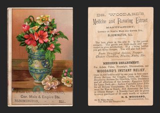
View on eBay

Victorian Trade Card Helme's Railroad Mills Snuff Apple Blossom Tobacco

Helme's Railroad Mills Snuff — Apple Blossom

$28.69

Original Victorian advertising trade card, chromolithograph, c. 1880s. Approx. 4.25 x 3.20 in.

A spray of pink-and-white apple blossom with buds and leaves arches across a pale green panel set inside a soft pink border. Lettered at the foot: Use Helme's Railroad Mills Snuff.

The reverse is blank.

Read the full description

Historical Context

Snuff advertised with apple blossom is a very Victorian combination. Tobacco cards of the period were often at their most delicate, because the advertiser wanted the card kept in a parlor album where a picture of the product itself would never have been welcome.

Helme's Railroad Mills was one of the best-known American snuff brands of its day, and the name alone was the whole message. A card like this needed only to remind.

Condition

Toning and age typical of the period. The blank reverse is toned, with a few faint pencil marks and a small brown fleck at the upper left; minor edge and corner wear. The front is clean and bright. Please view the images carefully.

About The Printing

This is an original chromolithograph, and it was slow, exacting work. Each color had to be drawn onto its own separate stone by hand — in monochrome, the artist judging how much stipple each area needed so the colors would combine correctly only once every stone had been printed. The sheet then went through the press once for every color it carries, often a dozen or more, and every pass had to register exactly against the last. A pass out of register showed.

Under magnification the image resolves into irregular hand-drawn stipple, each ink carrying its own dot pattern, the colors mixing in the eye rather than on the paper. There is no regular halftone screen and no four-color rosette, which is what a modern reproduction would show. Modern process printing simulates every color from four inks; chromolithography laid each color down as its own.

Provenance

This item comes from the personal collections of my family estate, accumulated over more than 200 years — including items that came west by wagon train to Colorado and later to Oklahoma. Now that my parents have passed we cannot keep all of these cherished items. They were well-educated antiques collectors/traders and continued to build their collections over more than 60 years. The vast majority of the pieces are from the Victorian Era, however there are plenty of older and newer items. Everything has been stored in a climate-controlled environment over time.

Disclaimer

Specifications and detailed item descriptions are provided as a courtesy only and are not guaranteed to be one hundred percent accurate. Please do your own research. There are generally no receipts available for any items from original purchases. Any dimensions and/or weights are approximate. The absence of a more detailed condition report does not imply there are no condition issues with the item(s). Please inspect images carefully as they are part of the official item description and best representation of the actual condition. Additional images may be available upon request depending on time and availability. Not responsible for internet mis-translations or mis-identification of maker's marks if found or assumptions of makers or materials — item descriptions will indicate if it is assumed. If you see a problem, please message us immediately and we will do our best to sort out a solution and confirm the information. With the exception of eBay rules, no returns are accepted.

View on eBay

1890s Lion Coffee Woolson Spice Midsummer Greeting Trade Card Two Girls Knapp

1890s Lion Coffee Woolson Spice Midsummer Greeting Trade Card Two Girls Knapp — Two girls in large sun bonnets point toward a landscape of mountains and a farmhouse framed in a golden scroll. Approx. 6.91 x 5.00 in.

$28.28

Description

Two girls in large sun bonnets point toward a landscape of mountains and a farmhouse framed in a golden scroll. Lettered "The Woolson Spice Co's Midsummer Greeting," with "Knapp & Co. N.Y." at lower right.

The back, printed in brown, is a busy typographic advertisement around a lion's head: "To secure a Picture Card like this you have only to buy a package of LION COFFEE. It is composed of a successful combination of Mocha, Java and Rio ... Sold only in one pound packages. Beautiful Picture Card in every package ... LION is the King of Coffees! Manufactured by Woolson Spice Co., Toledo, Ohio."

Approx. 6.91 x 5.00 in.

Read the full description

Historical Context

The coffee that came with a picture. Lion Coffee began in Toledo, Ohio, in 1864 and became part of the Woolson Spice Company in 1882. Alvin Woolson built the brand by putting picture cards in every package, and the back of this card says so.

Printed by Knapp. Knapp & Co. of New York was one of the great color printers of the period.

Condition

Front: very good, bright color. The top left corner has a small chip with tan board showing and a short crack running in from it. Back: toned. Please see the photos, which are part of the description.

About The Printing

This is an original chromolithograph, and it was slow, exacting work. Each color had to be drawn onto its own separate stone by hand — in monochrome, the artist judging how much stipple each area needed so the colors would combine correctly only once every stone had been printed. The sheet then went through the press once for every color it carries, often a dozen or more, and every pass had to register exactly against the last. A pass out of register showed.

Under magnification the image resolves into irregular hand-drawn stipple, each ink carrying its own dot pattern, the colors mixing in the eye rather than on the paper. There is no regular halftone screen and no four-color rosette, which is what a modern reproduction would show. Modern process printing simulates every color from four inks; chromolithography laid each color down as its own.

The back is printed in a single brown ink.

Provenance

From my family's estate collections, built over more than 60 years by knowledgeable antiques collectors and traders. Stored in a climate-controlled environment.

Also In Our Store

More Lion Coffee cards in our store: https://www.ebay.com/str/tfauctionsintl?_nkw=lion+coffee

More Victorian advertising trade cards are in our store.

Disclaimer

The images and any video show the actual item and are part of the official listing description, so please review them closely. Measurements and weights are approximate, and any maker or material we haven't confirmed is described as assumed. Questions? Message us; we answer quickly.
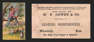
View on eBay

1890s Lion Coffee Midsummer Greeting Trade Card Children on Swing Roses Gold

1890s Lion Coffee Midsummer Greeting Trade Card Children on Swing Roses Gold — A boy and girl ride a wooden swing inside a large gilt circle, with red roses, blue flowers and a farm vignette, on a metallic gold band. Approx. 6.46 x 4.97 in.

$28.18

Description

A boy and girl ride a wooden swing inside a large gilt circle, with red roses, blue flowers and a farm vignette, on a metallic gold band. Lettered "Woolson Spice Co's Midsummer Greeting." Bufford printer's imprint.

The back, printed in black: "To secure a Picture Card like this you have only to buy a package of LION COFFEE. It is composed of a successful combination of Mocha, Java and Rio," around a roundel with a lion's head, flowering branches and "Sold only in one pound packages," and "LION is the King of Coffees! Manufactured by the Woolson Spice Co., Toledo, Ohio."

Approx. 6.46 x 4.97 in.

Read the full description

Historical Context

The coffee that came with a picture. Lion Coffee began in Toledo, Ohio, in 1864 and became part of the Woolson Spice Company in 1882. Alvin Woolson built the brand by putting picture cards in every package, and the back of this card says so.

Condition

Front: good color and gold; card slightly out of square with softly rounded corners. Back: light toning. Please see the photos, which are part of the description.

About The Printing

This is an original chromolithograph, and it was slow, exacting work. Each color had to be drawn onto its own separate stone by hand — in monochrome, the artist judging how much stipple each area needed so the colors would combine correctly only once every stone had been printed. The sheet then went through the press once for every color it carries, often a dozen or more, and every pass had to register exactly against the last. A pass out of register showed.

Under magnification the image resolves into irregular hand-drawn stipple, each ink carrying its own dot pattern, the colors mixing in the eye rather than on the paper. There is no regular halftone screen and no four-color rosette, which is what a modern reproduction would show. Modern process printing simulates every color from four inks; chromolithography laid each color down as its own.

The gold band is printed in metallic ink, and the back is printed in black.

Provenance

From my family's estate collections, built over more than 60 years by knowledgeable antiques collectors and traders. Stored in a climate-controlled environment.

Also In Our Store

More Lion Coffee cards in our store: https://www.ebay.com/str/tfauctionsintl?_nkw=lion+coffee

More Victorian advertising trade cards are in our store.

Disclaimer

The images and any video show the actual item and are part of the official listing description, so please review them closely. Measurements and weights are approximate, and any maker or material we haven't confirmed is described as assumed. Questions? Message us; we answer quickly.
View on eBay

Victorian Trade Card Red Cross Cough Drops 5 Cents Girl Daisies Embossed Gilt

Red Cross Cough Drops — Five Cents per Box

$28.11

Original Victorian advertising trade card, chromolithograph on an embossed and gilded ground, c. 1880s-90s. Approx. 4.35 x 2.95 in.

A small girl in a fringed cape and a deep pink bonnet walks a garden path, a basket on one arm, looking back over her shoulder. The scene sits in an inset panel surrounded by white and yellow daisies that spill across the card. Above it a circular device carries the trademark: a red cross, RED CROSS COUGH DROPS, and 5 CTS PER BOX.

The reverse is blank.

Read the full description

Historical Context

A nickel a box, and the card cost the maker a good deal more to produce than the profit on the first sale. That arithmetic only works if the card stays in the house, and this one was built to — embossed, gilded, and prettier than most things a family owned.

The daisies and the child have nothing to do with a sore throat. They were not supposed to. The card's job was to be kept, and a picture worth keeping put the name in front of you every time you opened the album.

Condition

Toning and age typical of the period. The embossing and gilding remain crisp with light rubbing to the high points; minor edge and corner wear; light surface soiling. Colors remain strong. Blank reverse with toning. Please view the images carefully.

About The Printing

This is an original chromolithograph, and it was slow, exacting work. Each color had to be drawn onto its own separate stone by hand — in monochrome, the artist judging how much stipple each area needed so the colors would combine correctly only once every stone had been printed. The sheet then went through the press once for every color it carries, often a dozen or more, and every pass had to register exactly against the last. A pass out of register showed.

Under magnification the image resolves into irregular hand-drawn stipple, each ink carrying its own dot pattern, the colors mixing in the eye rather than on the paper. There is no regular halftone screen and no four-color rosette, which is what a modern reproduction would show. Modern process printing simulates every color from four inks; chromolithography laid each color down as its own.

Provenance

This item comes from the personal collections of my family estate, accumulated over more than 200 years — including items that came west by wagon train to Colorado and later to Oklahoma. Now that my parents have passed we cannot keep all of these cherished items. They were well-educated antiques collectors/traders and continued to build their collections over more than 60 years. The vast majority of the pieces are from the Victorian Era, however there are plenty of older and newer items. Everything has been stored in a climate-controlled environment over time.

Disclaimer

Specifications and detailed item descriptions are provided as a courtesy only and are not guaranteed to be one hundred percent accurate. Please do your own research. There are generally no receipts available for any items from original purchases. Any dimensions and/or weights are approximate. The absence of a more detailed condition report does not imply there are no condition issues with the item(s). Please inspect images carefully as they are part of the official item description and best representation of the actual condition. Additional images may be available upon request depending on time and availability. Not responsible for internet mis-translations or mis-identification of maker's marks if found or assumptions of makers or materials — item descriptions will indicate if it is assumed. If you see a problem, please message us immediately and we will do our best to sort out a solution and confirm the information. With the exception of eBay rules, no returns are accepted.

View on eBay

Victorian Trade Card J H Harkins Millinery Fancy Goods Allentown PA Rose Cushion

Victorian Trade Card J H Harkins Millinery Fancy Goods Allentown PA Rose Cushion — Original Victorian advertising trade card, chromolithograph, c. 1880s-90s. Approx. 3.10 x 2.05 in.

$27.42

Description

J. H. Harkins, Millinery and Fancy Goods, Allentown, Pennsylvania

A pink rose with a bud and green leaves rests on a tufted turquoise satin cushion, trimmed with gold cord and tassels, against a bronze-gold ground. The merchant's card lies on the cushion beneath the rose: J. H. HARKINS, Millinery AND FANCY GOODS, 33 Hamilton St., Allentown, Pa.

The reverse is blank.

Read the full description

Historical Context

A milliner sold hats and the trimmings that went on them — ribbons, flowers, feathers, lace — and fancy goods covered the rest of what a well-dressed woman might want from a small shop. The satin cushion and the rose are the shop's own stock, shown at their most luxurious.

This is a single-shop card from one street address. A national brand might print millions; a card like this was printed for one milliner on Hamilton Street and handed out to her customers.

Condition

Toning and age typical of the period. The right edge is rough, with paper loss and small tears; a large brown stain on the blank reverse; minor corner wear. The rose and cushion on the front remain bright and the imprint fully legible. Please view the images carefully.

About The Printing

This is an original chromolithograph, and it was slow, exacting work. Each color had to be drawn onto its own separate stone by hand — in monochrome, the artist judging how much stipple each area needed so the colors would combine correctly only once every stone had been printed. The sheet then went through the press once for every color it carries, often a dozen or more, and every pass had to register exactly against the last. A pass out of register showed.

Under magnification the image resolves into irregular hand-drawn stipple, each ink carrying its own dot pattern, the colors mixing in the eye rather than on the paper. There is no regular halftone screen and no four-color rosette, which is what a modern reproduction would show. Modern process printing simulates every color from four inks; chromolithography laid each color down as its own.

Provenance

From my family's estate collections, built over more than 60 years by knowledgeable antiques collectors and traders. Stored in a climate-controlled environment.

Also In Our Store

More Victorian advertising trade cards are in our store.

Disclaimer

The images and any video show the actual item and are part of the official listing description, so please review them closely. Measurements and weights are approximate, and any maker or material we haven't confirmed is described as assumed. Questions? Message us; we answer quickly.
View on eBay

Victorian Trade Card New York One Price Clothing House Rochester NY Ice Skating

New York One Price Clothing House, Rochester, New York

$27.33

Original Victorian advertising trade card, chromolithograph, c. 1880s. Approx. 4.15 x 2.45 in.

Two girls in red winter coats and bonnets skate together on a frozen pond, bare trees and a distant skater behind them. Tall stylized chrysanthemums rise on the left from a red urn at the foot of the card.

The printed text reads: GO TO THE New York One Price Clothing House, Where they are Selling their FALL & WINTER CLOTHING REGARDLESS OF COST! M. H. Carroll, 10 West Main St., Rochester, N.Y.

The reverse is blank.

Read the full description

Historical Context

“One Price” was the selling point, and to a modern reader it looks like no selling point at all. In the 1880s it was the whole pitch. Haggling was still normal in dry goods, which meant the price you paid depended on how hard you argued and how the clerk read you. A one-price house was promising you would not be taken advantage of for being polite.

The picture makes the same argument without saying it. Two children, plainly dressed up warm, out on the ice. Buy the coats here and this is what your winter looks like.

Condition

Toning and age typical of the period. Light surface soiling; minor edge and corner wear; small nicks to the edges. Colors remain strong. Blank reverse with light toning. Please view the images carefully.

About The Printing

This is an original chromolithograph. Each color was drawn onto its own separate stone by hand and printed as its own pass through the press, every pass registering exactly against the last. This card uses the flat-color mode of the process — broad areas of solid, opaque ink with crisp boundaries rather than blended tone. It is the same technique that produced the great poster designs of the period.

Under magnification the colors resolve as solid fields with clean edges and no dot structure at all. There is no halftone screen and no four-color rosette, which is what a modern reproduction would show. Modern process printing simulates every color from four inks; here each color is its own ink, laid down whole.

Provenance

This item comes from the personal collections of my family estate, accumulated over more than 200 years — including items that came west by wagon train to Colorado and later to Oklahoma. Now that my parents have passed we cannot keep all of these cherished items. They were well-educated antiques collectors/traders and continued to build their collections over more than 60 years. The vast majority of the pieces are from the Victorian Era, however there are plenty of older and newer items. Everything has been stored in a climate-controlled environment over time.

Disclaimer

Specifications and detailed item descriptions are provided as a courtesy only and are not guaranteed to be one hundred percent accurate. Please do your own research. There are generally no receipts available for any items from original purchases. Any dimensions and/or weights are approximate. The absence of a more detailed condition report does not imply there are no condition issues with the item(s). Please inspect images carefully as they are part of the official item description and best representation of the actual condition. Additional images may be available upon request depending on time and availability. Not responsible for internet mis-translations or mis-identification of maker's marks if found or assumptions of makers or materials — item descriptions will indicate if it is assumed. If you see a problem, please message us immediately and we will do our best to sort out a solution and confirm the information. With the exception of eBay rules, no returns are accepted.

View on eBay

ca1885 Die-Cut Fan Trade Card W L Linder Clothing Burlington Iowa Roses

ca1885 Die-Cut Fan Trade Card W L Linder Clothing Burlington Iowa Roses — A die-cut card in the shape of a folding fan, with a yellow and a pink rose and green leaves over the pale ribs, a butterfly at top, and a scalloped edge all the way around. Approx. 4.37 x 5.70 in.

$27.08

Description

A die-cut card in the shape of a folding fan, with a yellow and a pink rose and green leaves over the pale ribs, a butterfly at top, and a scalloped edge all the way around.

The back is printed in black: "W. L. LINDER, Undersells Everybody in Men's, Boys' and Children's CLOTHING, 214 Jefferson Street, Burlington, Iowa."

Approx. 4.37 x 5.70 in.

Read the full description

Historical Context

A Burlington clothier. W. L. Linder sold men's, boys' and children's clothing on Jefferson Street in Burlington, Iowa, and promised to undersell everybody.

Die-cut novelties. Shaped cards cost more to make than plain rectangles and were saved as keepsakes.

Condition

Die-cut, irregular outline, cut closely around the fan. Front: a crease across the left side of the fan and small surface losses. Back: light toning. Please see the photos, which are part of the description.

About The Printing

This is an original chromolithograph, and it was slow, exacting work. Each color had to be drawn onto its own separate stone by hand — in monochrome, the artist judging how much stipple each area needed so the colors would combine correctly only once every stone had been printed. The sheet then went through the press once for every color it carries, often a dozen or more, and every pass had to register exactly against the last. A pass out of register showed.

Under magnification the image resolves into irregular hand-drawn stipple, each ink carrying its own dot pattern, the colors mixing in the eye rather than on the paper. There is no regular halftone screen and no four-color rosette, which is what a modern reproduction would show. Modern process printing simulates every color from four inks; chromolithography laid each color down as its own.

The card is die-cut with a scalloped edge, and the back is printed in black.

Provenance

From my family's estate collections, built over more than 60 years by knowledgeable antiques collectors and traders. Stored in a climate-controlled environment.

Also In Our Store

More Victorian advertising trade cards are in our store.

Disclaimer

The images and any video show the actual item and are part of the official listing description, so please review them closely. Measurements and weights are approximate, and any maker or material we haven't confirmed is described as assumed. Questions? Message us; we answer quickly.
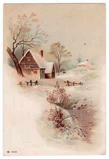
View on eBay

Victorian Advertising Trade Card for Murray & Wiley Dry Goods & Carpets

Antique Victorian Advertising Trade Card for Murray & Wiley Dry Goods & Carpets

$26.24

Description

This Vintage Victorian advertising card (not an antique) advertises 'Murray & Wiley, Dry Goods & Carpets' located in Malden, Massachusetts. The imagery of a young girl with flowers and birds was a common motif, evoking themes of domesticity, nature, and innocence, which were appealing to the target audience of the time. Such cards provide a glimpse into the commercial practices and aesthetic sensibilities of the Victorian era.

  • Time Period: Late 19th Century (Victorian Era)
  • Origin: Malden, Massachusetts, United States
  • Composition: Cardstock with color printing
  • Dimensions: H: 2.5" x W: 4.75" (approximately)
  • Please reivew pictures carefully as they are part of the item description and condition.
Read the full description

Historical Context

Victorian trade cards were a popular form of advertising in the late 19th and early 20th centuries, often featuring colorful illustrations of nature, children, or idealized scenes to attract attention. These cards served as a way for businesses to promote their products and services, often distributed with purchases or mailed directly to customers. They are now collected and often framed for their artistic merit and as historical artifacts of consumer culture.

Ref: 1.0525

  • Please visit our store as we are constantly adding more items of all types. Thank you!

View on eBay

Victorian Trade Card Comic Farm Scene Julius Rees Clothing Stillwater Minnesota

“Now Give It To 'Em Hard!” — No. 3 of a Comic Series

$25.77

Original Victorian advertising trade card, single-color lithograph on tinted stock, c. 1880s. Approx. 4.30 x 3.10 in.

A farm scene in brown ink. Pigs have broken through a rail fence and are loose in the field; a man runs up the hill after them. In the foreground a woman grips a switch behind a fence post while a barefoot boy crouches at the gap with a stick raised, both waiting to ambush the next pig through. Titled at the top: N° 3. “Now give it to 'em hard!”

The reverse advertises THE NEW YORK One Price CLOTHING HOUSE — Carries the Largest and Finest Line of Goods, New Goods Daily Arriving — Julius Rees, Proprietor, Stillwater, Minn. A note at the foot explains that the card is a small copy of one of a series of very humorous pictures on display at the store, and invites the reader to call and see them.

Read the full description

Historical Context

The card is not really selling clothes. It is selling a reason to walk into the shop: the full series is on the wall, and you will have to come in to see the rest. A numbered card that admits it is only a sample of something better elsewhere is an unusually honest piece of advertising, and a clever one.

The scene itself needed no explaining to anyone who kept pigs, which in Stillwater in the 1880s was most people.

Condition

Toning and age typical of the period. A crease to the upper left corner; light surface soiling; minor edge and corner wear. The printed image remains clear and the reverse text fully legible. Please view the images carefully.

About The Printing

This card was printed from a single stone in one ink, on tinted stock — an economical choice, since the colored card supplies a second tone at no extra press pass. The design was drawn by hand in reverse on the stone, the shading built from the density of the drawn marks rather than from color.

Under magnification the tone resolves into drawn line and hatching, not a mechanical screen. There is no halftone screen and no four-color rosette, which is what a modern reproduction would show.

Provenance

This item comes from the personal collections of my family estate, accumulated over more than 200 years — including items that came west by wagon train to Colorado and later to Oklahoma. Now that my parents have passed we cannot keep all of these cherished items. They were well-educated antiques collectors/traders and continued to build their collections over more than 60 years. The vast majority of the pieces are from the Victorian Era, however there are plenty of older and newer items. Everything has been stored in a climate-controlled environment over time.

Disclaimer

Specifications and detailed item descriptions are provided as a courtesy only and are not guaranteed to be one hundred percent accurate. Please do your own research. There are generally no receipts available for any items from original purchases. Any dimensions and/or weights are approximate. The absence of a more detailed condition report does not imply there are no condition issues with the item(s). Please inspect images carefully as they are part of the official item description and best representation of the actual condition. Additional images may be available upon request depending on time and availability. Not responsible for internet mis-translations or mis-identification of maker's marks if found or assumptions of makers or materials — item descriptions will indicate if it is assumed. If you see a problem, please message us immediately and we will do our best to sort out a solution and confirm the information. With the exception of eBay rules, no returns are accepted.

View on eBay

ca1885 Victorian Trade Card Royal Yeast Crescent Moon Snowy Church Red Rose

ca1885 Victorian Trade Card Royal Yeast Crescent Moon Snowy Church Red Rose — A gilt crescent moon frames a snowy village church at night, with a full red rose and buds at right. Approx. 4.09 x 5.89 in.

$25.68

Description

A gilt crescent moon frames a snowy village church at night, with a full red rose and buds at right. No printing on the front.

The back is embossed with a rose and printed in blue: "I got this picture card with a 5 cent package of ROYAL YEAST. The Best Yeast I ever used. The Package Contained 8 Cakes."

Approx. 4.09 x 5.89 in.

Read the full description

Historical Context

A card that speaks for the customer. Instead of the maker praising itself, the back is written in the buyer's voice: "The Best Yeast I ever used."

Yeast cakes for home baking. Dry yeast cakes, sold several to a package, were a pantry staple when most bread was baked at home.

Condition

Front: very good, bright gilt and color, light edge wear. Back: surface scuffs and small areas of paper loss from old album removal, light staining at right, embossing intact. Please see the photos, which are part of the description.

About The Printing

This is an original chromolithograph, and it was slow, exacting work. Each color had to be drawn onto its own separate stone by hand — in monochrome, the artist judging how much stipple each area needed so the colors would combine correctly only once every stone had been printed. The sheet then went through the press once for every color it carries, often a dozen or more, and every pass had to register exactly against the last. A pass out of register showed.

Under magnification the image resolves into irregular hand-drawn stipple, each ink carrying its own dot pattern, the colors mixing in the eye rather than on the paper. There is no regular halftone screen and no four-color rosette, which is what a modern reproduction would show. Modern process printing simulates every color from four inks; chromolithography laid each color down as its own.

The back is embossed and printed in a single blue ink.

Provenance

From my family's estate collections, built over more than 60 years by knowledgeable antiques collectors and traders. Stored in a climate-controlled environment.

Also In Our Store

More Victorian advertising trade cards are in our store.

Disclaimer

The images and any video show the actual item and are part of the official listing description, so please review them closely. Measurements and weights are approximate, and any maker or material we haven't confirmed is described as assumed. Questions? Message us; we answer quickly.
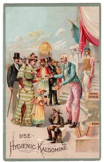
View on eBay

1879 Victorian Trade Card France Child Palm Branch Wheaton Printer New Bedford

“France” — W. F. Wheaton, Steam Printer, New Bedford, Massachusetts

$24.87 1879

Original Victorian advertising trade card, chromolithograph on a metallic gold ground, copyright 1879. Approx. 4.45 x 2.95 in.

A small child stands as the figure of France, holding a palm branch high in one hand and resting the other on a bundle of rods bound with red and green and fitted with an axe blade. She wears a jeweled headdress, gold bracelets and armlets, a gold bodice with a blue and red rosette at the breast, and a skirt in the blue, white and red of the French flag. She is captioned FRANCE in the lower right corner.

The upper right carries the printer's own imprint: W. F. Wheaton, Steam Printer, 52 William Street, New Bedford, Mass. A line at the foot reads: Copyright, 1879, by John A. Haddock, Phila.

The reverse is blank apart from the marks of an old album mounting.

Read the full description

Historical Context

This is a printer advertising himself. Stock cards like this one were designed and printed in quantity by publishers such as Haddock in Philadelphia, then sold on with the space left open for a local business to add its name. A job printer was the one customer who could put his own imprint on the card and hand it out as a sample of what he could do for yours.

The design belongs to a genre the period loved: children dressed as the nations, each carrying the symbols of the country. The bundle of rods with an axe is the fasces, the old Roman emblem of authority that the French Republic had taken up as its own.

Condition

Toning and age typical of the period. Four round patches of album-mount residue at the corners of the reverse, with faint show-through; light surface soiling; minor edge and corner wear. The metallic ground and the chromolithographed figure on the front remain bright. Please view the images carefully.

About The Printing

This is an original chromolithograph, and it was slow, exacting work. Each color had to be drawn onto its own separate stone by hand — in monochrome, the artist judging how much stipple each area needed so the colors would combine correctly only once every stone had been printed. The sheet then went through the press once for every color it carries, often a dozen or more, and every pass had to register exactly against the last. A pass out of register showed.

Under magnification the image resolves into irregular hand-drawn stipple, each ink carrying its own dot pattern, the colors mixing in the eye rather than on the paper. There is no regular halftone screen and no four-color rosette, which is what a modern reproduction would show. Modern process printing simulates every color from four inks; chromolithography laid each color down as its own.

Provenance

This item comes from the personal collections of my family estate, accumulated over more than 200 years — including items that came west by wagon train to Colorado and later to Oklahoma. Now that my parents have passed we cannot keep all of these cherished items. They were well-educated antiques collectors/traders and continued to build their collections over more than 60 years. The vast majority of the pieces are from the Victorian Era, however there are plenty of older and newer items. Everything has been stored in a climate-controlled environment over time.

Disclaimer

Specifications and detailed item descriptions are provided as a courtesy only and are not guaranteed to be one hundred percent accurate. Please do your own research. There are generally no receipts available for any items from original purchases. Any dimensions and/or weights are approximate. The absence of a more detailed condition report does not imply there are no condition issues with the item(s). Please inspect images carefully as they are part of the official item description and best representation of the actual condition. Additional images may be available upon request depending on time and availability. Not responsible for internet mis-translations or mis-identification of maker's marks if found or assumptions of makers or materials — item descriptions will indicate if it is assumed. If you see a problem, please message us immediately and we will do our best to sort out a solution and confirm the information. With the exception of eBay rules, no returns are accepted.

View on eBay

1890s Mennen's Borated Talcum Trade Card Love the Babies Newark NJ Winter Scene

1890s Mennen's Borated Talcum Trade Card Love the Babies Newark NJ Winter Scene — A winter cottage among blossoming trees with a small girl in red on the path. Approx. 3.05 x 4.68 in.

$23.78

Description

A winter cottage among blossoming trees with a small girl in red on the path. The front is faded, with faint lettering at the top and some show-through from the back.

The back is printed in black: "LOVE THE BABIES! Mothers who love their Babies use Mennen's Borated Talcum Infant Powder ... Retails at 25 Cents," with "Mennen's Sure Corn Killer" and "G. Mennen, 577 Broad Street, Newark, N.J."

Approx. 3.05 x 4.68 in.

Read the full description

Historical Context

A Newark original. The back is signed by G. Mennen of 577 Broad Street, Newark, the start of a name still on the toiletries shelf.

Powder for the nursery. "Love the Babies!" speaks straight to mothers, the buyers trade cards were made for.

Condition

Front: faded, top lettering faint, show-through from the back. Back: clean, crisp text. Please see the photos, which are part of the description.

About The Printing

This is an original chromolithograph, and it was slow, exacting work. Each color had to be drawn onto its own separate stone by hand — in monochrome, the artist judging how much stipple each area needed so the colors would combine correctly only once every stone had been printed. The sheet then went through the press once for every color it carries, often a dozen or more, and every pass had to register exactly against the last. A pass out of register showed.

Under magnification the image resolves into irregular hand-drawn stipple, each ink carrying its own dot pattern, the colors mixing in the eye rather than on the paper. There is no regular halftone screen and no four-color rosette, which is what a modern reproduction would show. Modern process printing simulates every color from four inks; chromolithography laid each color down as its own.

The back is printed in black.

Provenance

From my family's estate collections, built over more than 60 years by knowledgeable antiques collectors and traders. Stored in a climate-controlled environment.

Also In Our Store

More Victorian advertising trade cards are in our store.

Disclaimer

The images and any video show the actual item and are part of the official listing description, so please review them closely. Measurements and weights are approximate, and any maker or material we haven't confirmed is described as assumed. Questions? Message us; we answer quickly.
View on eBay

1880s Trade Card Brown's Sarsaparilla Arnica Salve Pepsin Tonic Dog Rifle

1880s Trade Card Brown's Sarsaparilla Arnica Salve Pepsin Tonic Dog Rifle — A small, big-eyed dog with tall ears sits up on its haunches, clutching a rifle almost twice its height, against a soft blue cloud of color. Approx. 3.00 x 4.40 in.

$23.28

Description

A small, big-eyed dog with tall ears sits up on its haunches, clutching a rifle almost twice its height, against a soft blue cloud of color. The front carries no advertiser imprint; the open space at the top was left for one.

The back is a full page of patent medicine advertising in black for four Brown's remedies. Brown's Arnica Salve "Cures Burns, Cuts, Bruises, Old Sores, Piles, Chapped Hands, Inflamed Sore Eyes", "No Cure. No Pay", "Only 25 cents a box." Brown's Blackberry and Ginger is "A positive remedy for Diarrhoea, Dysentery, Summer Complaint" and "the best remedy known to regulate the bowels of children while teething. Mothers, this Remedy is Entirely Safe." Brown's Pepsin Tonic is "for the Cure of Dyspepsia, Indigestion, Headache and Liver Complaint. Only 50 cents a bottle." Running up the side: "Brown's Sarsaparilla, the World's Best Blood Purifier. TRY IT!" No maker's address or city is printed.

Approx. 3.00 x 4.40 in.

Read the full description

Historical Context

Patent medicine on parade. Four cures on one card: a salve for everything from burns to piles, a blackberry cordial for teething babies, a pepsin tonic for the liver, and a sarsaparilla sold as the world's best blood purifier. Bold promises like "No Cure. No Pay" were the stock in trade of the nineteenth-century medicine business.

One picture, many advertisers. Printers sold stock cards like this with the picture finished and space left blank, and each merchant added his own advertising. Here the front stayed clean and Brown's filled the entire back.

A dog on guard. The little dog standing sentry with a rifle is a charming subject for dog collectors as well as for collectors of patent medicine and pharmacy advertising.

Condition

Very good for its age. Front: clean color; a grey smudge in the lower margin below the dog; a small dark dot at the upper right; a light soft crease and edge wear at the lower right; corners lightly rounded; light toning. Back: clean and bright for its age, with light toning and slight edge wear; no writing. Please see the photos, which are part of the description.

About The Printing

This is an original chromolithograph, and it was slow, exacting work. Each color had to be drawn onto its own separate stone by hand — in monochrome, the artist judging how much stipple each area needed so the colors would combine correctly only once every stone had been printed. The sheet then went through the press once for every color it carries, often a dozen or more, and every pass had to register exactly against the last. A pass out of register showed.

Under magnification the image resolves into irregular hand-drawn stipple, each ink carrying its own dot pattern, the colors mixing in the eye rather than on the paper. There is no regular halftone screen and no four-color rosette, which is what a modern reproduction would show. Modern process printing simulates every color from four inks; chromolithography laid each color down as its own.

The back is printed in black type, separate from the color work on the front.

Provenance

From my family's estate collections, built over more than 60 years by knowledgeable antiques collectors and traders. Stored in a climate-controlled environment.

Also In Our Store

More Victorian advertising trade cards for patent medicines, coffee and baking soda are in our store.

Disclaimer

The images and any video show the actual item and are part of the official listing description, so please review them closely. Measurements and weights are approximate, and any maker or material we haven't confirmed is described as assumed. Questions? Message us; we answer quickly.
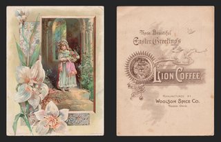
View on eBay

1880s Trade Card Kenton Baking Powder Owl Rose Winter Cottage Cincinnati

1880s Trade Card Kenton Baking Powder Owl Rose Winter Cottage Cincinnati — A Victorian trade card for Kenton Baking Powder. Approx. 6.00 x 4.35 in.

$22.92

Description

A Victorian trade card for Kenton Baking Powder. The front is a split scene: at left a large pink rose with buds against summer trees, at right a snow-covered cottage, a bare tree, a broken fence and hens scratching in the snow. The front carries no advertiser imprint.

The back is printed in black. The Kenton trademark, an owl on a branch under stars and a smiling moon, sits in a roundel lettered "KENTON BAKING POWDER" and "TRADE MARK," above a price table: "LOOK AT THESE PRICES! 1 lb. Can 20 Cts. ½ lb. Can 10 Cts. ¼ lb. Can 5 Cts." Then: "We guarantee satisfaction at these low Prices or your money refunded. ASK YOUR GROCER FOR IT. POTTER PARLIN & CO., Cincinnati, O." A closing note claims Kenton "is equal to the most costly in quality. Buy KENTON POWDER, and you will not only save money, but have light, sweet and wholesome bread."

Horizontal, approx. 6.00 x 4.35 in.

Read the full description

Historical Context

A Cincinnati brand. Kenton Baking Powder was made by Potter, Parlin & Co. of Cincinnati, and the owl with the smiling moon was its trademark.

Selling on price. Baking powder was one of the most heavily advertised grocery products of the trade card era. Kenton's pitch is plain value: a full pound for twenty cents, with a money-back guarantee.

Summer and winter. Stock designs like this were printed in quantity and sold to merchants, who added their own advertising, here on the back. A summer rose set against a farmyard in snow is a typical decorative pairing of the period.

The trade card craze. In the 1880s grocers handed out colorful cards like this by the thousand, and families saved them in scrapbooks.

Condition

Very good. Colors bright and clean. A short surface crease in the sky at the upper right of the front, near the top edge. A tiny dark speck in the top margin. Corners lightly rounded, with light wear most noticeable at the upper left. The back is evenly toned, with a few short creases at one long edge (left side as shown). No writing. Please see the photos, which are part of the description.

About The Printing

This is an original chromolithograph, and it was slow, exacting work. Each color had to be drawn onto its own separate stone by hand — in monochrome, the artist judging how much stipple each area needed so the colors would combine correctly only once every stone had been printed. The sheet then went through the press once for every color it carries, often a dozen or more, and every pass had to register exactly against the last. A pass out of register showed.

Under magnification the image resolves into irregular hand-drawn stipple, each ink carrying its own dot pattern, the colors mixing in the eye rather than on the paper. There is no regular halftone screen and no four-color rosette, which is what a modern reproduction would show. Modern process printing simulates every color from four inks; chromolithography laid each color down as its own.

The advertising on the back is printed in a single black ink.

Provenance

From my family's estate collections, built over more than 60 years by knowledgeable antiques collectors and traders. Stored in a climate-controlled environment.

Also In Our Store

More Victorian advertising trade cards for grocery products, thread and other household goods are in our store.

Disclaimer

The images and any video show the actual item and are part of the official listing description, so please review them closely. Measurements and weights are approximate, and any maker or material we haven't confirmed is described as assumed. Questions? Message us; we answer quickly.
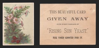
View on eBay

1880s Trade Card Wheelock's China Store Peoria Illinois Mill Bridge Roses

1880s Trade Card Wheelock's China Store Peoria Illinois Mill Bridge Roses — A Victorian stock trade card imprinted for a Peoria china store. Approx. 4.55 x 3.00 in.

$22.46

Description

A Victorian stock trade card imprinted for a Peoria china store. A gilt-framed vignette shows a country scene: a stone arched bridge with a man fishing from it, a horse-drawn hay wagon, and a red-roofed mill with its water wheel beside a river. Pink roses and orange blossoms spill in from the left and white daisies from the upper right, on a sky-blue ground. Printed at lower right: "Don't Fail to Visit Wheelock's China Store, 313 Main St., Peoria, Ill. Special Attention given to the out of town Trade." Design number "1314" at lower left. The reverse is blank.

Approx. 4.55 x 3.00 in.

Read the full description

Historical Context

A Peoria storefront. Peoria sits on the Illinois River, a trading town for the farms around it, and "Special Attention given to the out of town Trade" shows this store courting customers from the surrounding countryside. A china store sold the dinnerware, glass and lamps that furnished a Victorian home.

Stock cards, made to order. Lithographers printed picture cards like this by the thousand, with a design number in the margin, and left space for a local merchant's name to be added in black. The "1314" at lower left is that number.

The trade card craze. In the 1880s cheap color printing put picture cards on every store counter, and families pasted them into scrapbooks by the hundred.

Condition

Very good front. Bright colors. Corners lightly worn; a small nick at the top edge near the center. A small grey smudge in the blue area at right of center. The blank reverse is toned and mottled, with spots of old album residue and paper scuffing at the right side and lower left and a small ink mark at center left. Please see the photos, which are part of the description.

About The Printing

This is an original chromolithograph, and it was slow, exacting work. Each color had to be drawn onto its own separate stone by hand — in monochrome, the artist judging how much stipple each area needed so the colors would combine correctly only once every stone had been printed. The sheet then went through the press once for every color it carries, often a dozen or more, and every pass had to register exactly against the last. A pass out of register showed.

Under magnification the image resolves into irregular hand-drawn stipple, each ink carrying its own dot pattern, the colors mixing in the eye rather than on the paper. There is no regular halftone screen and no four-color rosette, which is what a modern reproduction would show. Modern process printing simulates every color from four inks; chromolithography laid each color down as its own.

The store imprint was added in black over the printed picture, and the reverse is blank.

Provenance

From my family's estate collections, built over more than 60 years by knowledgeable antiques collectors and traders. Stored in a climate-controlled environment.

Also In Our Store

More Victorian advertising trade cards for Illinois merchants and china, glass and household goods are in our store.

Disclaimer

The images and any video show the actual item and are part of the official listing description, so please review them closely. Measurements and weights are approximate, and any maker or material we haven't confirmed is described as assumed. Questions? Message us; we answer quickly.
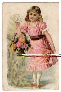
View on eBay

ca1900 Newman Bros Piano Organ Trade Card Mother Child Violets Chicago

ca1900 Newman Bros Piano Organ Trade Card Mother Child Violets Chicago — An embossed advertising card for a Chicago piano and organ maker. Approx. 3.55 x 5.40 in.

$22.38

Description

An embossed advertising card for a Chicago piano and organ maker. In a gold- and magenta-ruled oval, a dark-haired young mother in a pink gown embraces her small blonde child in a white shift. Sprays of embossed purple violets frame the oval on a deep green ground with a fine linen texture. Printed below: "Compliments of Newman Bros. Co, Chicago. Factory, W. Chicago Ave. and Dix St."

The reverse, printed in blue, pictures an upright "Style Ten Piano" with a "Newman Bros. Co." mat at its feet: "Newman Bros. Co. Manufacturers of Highest Grade Pianos and Organs. … Satisfies the Most Critical … Write for Catalogue and Prices. Factory and Warerooms, Corner W. Chicago Ave. and Dix St., Chicago, Ill."

Approx. 3.55 x 5.40 in.

Read the full description

Historical Context

A Chicago piano maker. Newman Bros. began in Chicago in 1880 building parlor and chapel organs and added high-grade pianos in 1895. The firm built a six-story factory in 1900 and closed in the Great Depression.

The parlor piano. Around 1900 an upright piano was the pride of the middle-class parlor, and makers courted buyers by mail. "Write for Catalogue and Prices" was an invitation to order from the factory.

Mother and child. The tender oval portrait and embossed violets show how far advertising cards had moved toward the sentimental keepsake by the turn of the century.

Condition

Good, with honest wear. Corners softly rounded. A short crease at the top edge near the center and a light crease at the upper right corner of the front. The reverse shows several light creases, most at the upper left and lower right, and light even toning. Embossing intact and colors bright. Please see the photos, which are part of the description.

About The Printing

This is an original chromolithograph, and it was slow, exacting work. Each color had to be drawn onto its own separate stone by hand — in monochrome, the artist judging how much stipple each area needed so the colors would combine correctly only once every stone had been printed. The sheet then went through the press once for every color it carries, often a dozen or more, and every pass had to register exactly against the last. A pass out of register showed.

Under magnification the image resolves into irregular hand-drawn stipple, each ink carrying its own dot pattern, the colors mixing in the eye rather than on the paper. There is no regular halftone screen and no four-color rosette, which is what a modern reproduction would show. Modern process printing simulates every color from four inks; chromolithography laid each color down as its own.

The violets are embossed, and the reverse is printed in a single blue ink.

Provenance

From my family's estate collections, built over more than 60 years by knowledgeable antiques collectors and traders. Stored in a climate-controlled environment.

Also In Our Store

More antique advertising trade cards for musical instruments and Chicago firms are in our store.

Disclaimer

The images and any video show the actual item and are part of the official listing description, so please review them closely. Measurements and weights are approximate, and any maker or material we haven't confirmed is described as assumed. Questions? Message us; we answer quickly.
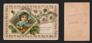
View on eBay

ca1885 Tiger Mower Advertising Card Onion Skin Signs of Fortune Misfortune Rare

ca1885 Tiger Mower Advertising Card Onion Skin Signs of Fortune Misfortune Rare — "THE TIGER MOWER" with a line drawing of the horse-drawn mowing machine and its cutter bar. Approx. 3.08 x 4.67 in.

$22.08

Description

"THE TIGER MOWER" with a line drawing of the horse-drawn mowing machine and its cutter bar. "The Most Durable and Lightest Running Mower Made. 4-ft. 3-in., 4-ft. 6-in., 5-ft. and 6-ft. Cut."

The back is printed with "The Signs of Fortune and Misfortune, As Implicitly Believed by Some, Contemptuously Disbelieved by Many, but Just a Little Heeded by All," a list of old superstitions: "Dream of eggs, sign of money," "If you sing before breakfast you'll cry before supper," "Finding a horse-shoe or a four-leaved clover brings good luck," and many more.

Approx. 3.08 x 4.67 in.

Read the full description

Historical Context

A survivor. This card is printed on paper as thin as onion skin, and it is remarkable that it has lasted well over a century. Farm-implement advertising on paper this fragile seldom survives.

Haying by horse power. The mower's cutter bar sizes, from 4 ft. 3 in. to 6 ft., were the selling points for farmers choosing a machine.

Superstitions for the farmhouse. The back gave the farm family something to keep: a page of folk sayings about luck, love and the weather.

Condition

Fragile and sold as is. Thin onion-skin paper with staining, edge tears and small chips on both sides, and soft creases. Text and illustration remain legible. It will ship in a rigid holder between stiff boards. Please see the photos, which are part of the description.

About The Printing

This card is printed in a single black ink by letterpress from a line cut, on very thin, translucent paper. Under magnification the illustration resolves into engraved lines and hatching, not a dot screen.

Provenance

From my family's estate collections, built over more than 60 years by knowledgeable antiques collectors and traders. Stored in a climate-controlled environment.

Also In Our Store

More Victorian advertising trade cards are in our store.

Disclaimer

The images and any video show the actual item and are part of the official listing description, so please review them closely. Measurements and weights are approximate, and any maker or material we haven't confirmed is described as assumed. Questions? Message us; we answer quickly.
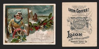
View on eBay

Victorian Trade Card Dozier Weyl Cracker Co St Louis Parrot Crescent Moon Night

Dozier-Weyl Cracker Co., St. Louis — “Royal Snow Flake”

$21.69

Original Victorian advertising trade card, chromolithograph, c. 1880s-90s. Approx. 5.30 x 3.40 in.

A striking night design. Against a deep blue-black sky scattered with stars and a shooting star, a long-tailed green parrot perches on a stand, holding a small card in its beak. A crescent moon hangs below. The lettering reads: IT'S A COLD DREARY NIGHT WHEN I CAN'T EAT THE ROYAL SNOW FLAKE, SOLD ONLY BY DOZIER-WEYL CRACKER CO., ST. LOUIS.

The reverse is blank.

Read the full description

Historical Context

Almost every trade card of this period is bright. Children, flowers, sunshine, pastel skies — the whole genre is relentlessly cheerful, because color was the novelty and printers used all of it they could.

This one goes the other way and prints a night sky. Against a wall of daylight cards it is the one that stops you, which is presumably the entire idea. The talking parrot is doing the selling, but the darkness is doing the work.

Condition

Toning and age typical of the period, mainly to the margins. Light surface soiling; minor edge and corner wear. The dark ground remains deep and even and the design is clean and bright. Blank reverse with toning. Please view the images carefully.

About The Printing

This is an original chromolithograph. Each color was drawn onto its own separate stone by hand and printed as its own pass through the press, every pass registering exactly against the last. This card uses the flat-color mode of the process — broad areas of solid, opaque ink with crisp boundaries rather than blended tone. It is the same technique that produced the great poster designs of the period.

Under magnification the colors resolve as solid fields with clean edges and no dot structure at all. There is no halftone screen and no four-color rosette, which is what a modern reproduction would show. Modern process printing simulates every color from four inks; here each color is its own ink, laid down whole.

Provenance

This item comes from the personal collections of my family estate, accumulated over more than 200 years — including items that came west by wagon train to Colorado and later to Oklahoma. Now that my parents have passed we cannot keep all of these cherished items. They were well-educated antiques collectors/traders and continued to build their collections over more than 60 years. The vast majority of the pieces are from the Victorian Era, however there are plenty of older and newer items. Everything has been stored in a climate-controlled environment over time.

Disclaimer

Specifications and detailed item descriptions are provided as a courtesy only and are not guaranteed to be one hundred percent accurate. Please do your own research. There are generally no receipts available for any items from original purchases. Any dimensions and/or weights are approximate. The absence of a more detailed condition report does not imply there are no condition issues with the item(s). Please inspect images carefully as they are part of the official item description and best representation of the actual condition. Additional images may be available upon request depending on time and availability. Not responsible for internet mis-translations or mis-identification of maker's marks if found or assumptions of makers or materials — item descriptions will indicate if it is assumed. If you see a problem, please message us immediately and we will do our best to sort out a solution and confirm the information. With the exception of eBay rules, no returns are accepted.

View on eBay

Victorian Trade Card Bush & Gerts Piano Chicago Kittens Playing Horn Fife Music

Bush & Gerts Piano Co., Chicago — Kittens with Cornet and Fife

$21.64

Original Victorian advertising trade card, chromolithograph, c. 1880s-90s. Approx. 4.25 x 2.95 in.

Two tabby kittens stand upright in the snow before a wooden picket gate, one playing a brass cornet, the other a fife. The scene is framed inside a gold outline shaped like the strung harp of a grand piano, its strings and tuning pins drawn in, with a pink ribbon bow and a green spray at the left, on a pale blue ground. The corners are rounded. A faint violet rubber stamp at the upper left of the front — likely a local dealer's name — has faded and cannot be read.

The reverse reads: HERE IT IS. A PIANO that wears well, A PIANO that is beautiful, A PIANO that delights, A PIANO that is sweet in tone, A PIANO with perfect repeating action, A PIANO with marvelous volume, A PIANO that leads them all. THE BUSH & GERTS fills the bill. 20000 Made and Sold. The Only Perfect Transposing Keyboard Made, Found only in the Bush & Gerts Piano. A perfect Mandolin Attachment recently introduced. BUSH & GERTS PIANO Co., CHICAGO, ILL.

Read the full description

Historical Context

A piano was the most expensive thing most families would ever buy apart from the house, and the card sells it like one. Seven lines, each starting A PIANO, then the only number that mattered to a nervous buyer: twenty thousand already made and sold.

The transposing keyboard and the mandolin attachment are the period's gadgets. A transposing keyboard let the player shift the key without learning the music again; a mandolin attachment changed the tone. Both were ways of saying this piano could do more than the one down the street.

Condition

Toning and age typical of the period. Mottled blistering and spotting across the blue ground in the upper part of the front; a faded, illegible violet stamp at the upper left; minor edge and corner wear; toning to the reverse. The kittens and the gold frame remain bright and the reverse text fully legible. Please view the images carefully.

About The Printing

This is an original chromolithograph, and it was slow, exacting work. Each color had to be drawn onto its own separate stone by hand — in monochrome, the artist judging how much stipple each area needed so the colors would combine correctly only once every stone had been printed. The sheet then went through the press once for every color it carries, often a dozen or more, and every pass had to register exactly against the last. A pass out of register showed.

Under magnification the image resolves into irregular hand-drawn stipple, each ink carrying its own dot pattern, the colors mixing in the eye rather than on the paper. There is no regular halftone screen and no four-color rosette, which is what a modern reproduction would show. Modern process printing simulates every color from four inks; chromolithography laid each color down as its own.

Provenance

This item comes from the personal collections of my family estate, accumulated over more than 200 years — including items that came west by wagon train to Colorado and later to Oklahoma. Now that my parents have passed we cannot keep all of these cherished items. They were well-educated antiques collectors/traders and continued to build their collections over more than 60 years. The vast majority of the pieces are from the Victorian Era, however there are plenty of older and newer items. Everything has been stored in a climate-controlled environment over time.

Disclaimer

Specifications and detailed item descriptions are provided as a courtesy only and are not guaranteed to be one hundred percent accurate. Please do your own research. There are generally no receipts available for any items from original purchases. Any dimensions and/or weights are approximate. The absence of a more detailed condition report does not imply there are no condition issues with the item(s). Please inspect images carefully as they are part of the official item description and best representation of the actual condition. Additional images may be available upon request depending on time and availability. Not responsible for internet mis-translations or mis-identification of maker's marks if found or assumptions of makers or materials — item descriptions will indicate if it is assumed. If you see a problem, please message us immediately and we will do our best to sort out a solution and confirm the information. With the exception of eBay rules, no returns are accepted.

View on eBay

1880s Trade Card Electric-Light Soap Indianapolis Two Girls Cake Flowers

1880s Trade Card Electric-Light Soap Indianapolis Two Girls Cake Flowers — A Victorian soap trade card. Approx. 4.55 x 2.90 in.

$21.52

Description

A Victorian soap trade card. Two little girls meet on a garden path, one in a pink dress with a red sash offering a molded cake on a plate, the other in a white pinafore and striped stockings holding up a bouquet in a lace-paper holder. A spray of red wild roses lies across the foreground, on a peach ground with a white margin. Printed at right: "Use Electric-Light Soap. No rubbing required. Electric Soap M'f'g Co., Indianapolis, Ind." The reverse is blank.

Approx. 4.55 x 2.90 in.

Read the full description

Historical Context

Named for the newest wonder. In the 1880s electric light was the marvel of the age, and advertisers borrowed the word "electric" to sell soap, among much else. Dobbins' Electric Soap of Philadelphia was another.

An Indianapolis soap maker. This card comes from a smaller Midwestern maker, the Electric Soap M'f'g Co. of Indianapolis, and its promise, "No rubbing required," spoke straight to the hours of scrubbing on washday.

Victorian girlhood. Little girls with cakes and flowers were a favorite subject on cards that were handed to mothers at the store counter.

Condition

Very good. Bright colors; corners lightly worn. Faint pale lines run vertically and horizontally through the right half of the front, from a light crease or old mounting. A small dark spot above the lettering and a tiny ink fleck near the top. The blank reverse is clean apart from a faint mirror-image offset of printing at the left, scattered tiny red flecks and a small scuff at the lower right corner. Please see the photos, which are part of the description.

About The Printing

This is an original chromolithograph, and it was slow, exacting work. Each color had to be drawn onto its own separate stone by hand — in monochrome, the artist judging how much stipple each area needed so the colors would combine correctly only once every stone had been printed. The sheet then went through the press once for every color it carries, often a dozen or more, and every pass had to register exactly against the last. A pass out of register showed.

Under magnification the image resolves into irregular hand-drawn stipple, each ink carrying its own dot pattern, the colors mixing in the eye rather than on the paper. There is no regular halftone screen and no four-color rosette, which is what a modern reproduction would show. Modern process printing simulates every color from four inks; chromolithography laid each color down as its own.

The soap maker's imprint is printed in black, and the reverse is blank.

Provenance

From my family's estate collections, built over more than 60 years by knowledgeable antiques collectors and traders. Stored in a climate-controlled environment.

Also In Our Store

More Electric-Light Soap cards in our store: https://www.ebay.com/str/tfauctionsintl?_nkw=electric+soap

More Victorian advertising trade cards for soap, laundry and household products are in our store.

Disclaimer

The images and any video show the actual item and are part of the official listing description, so please review them closely. Measurements and weights are approximate, and any maker or material we haven't confirmed is described as assumed. Questions? Message us; we answer quickly.
View on eBay

1880s Trade Card Shaw's Snow Puff Baking Powder Yellow Flowers Bee Small

1880s Trade Card Shaw's Snow Puff Baking Powder Yellow Flowers Bee Small — Yellow wild roses and buds with a bee in flight, beside a blank scroll left for a merchant's name. Approx. 4.17 x 2.55 in.

$21.52

Description

Yellow wild roses and buds with a bee in flight, beside a blank scroll left for a merchant's name.

The back is printed in black: "To Consumers of Baking Powder: Try a Can of 'Shaw's Snow Puff' Baking Powder. You get one-half more Powder for your money than offered by any other manufacturer. It is warranted absolutely Pure ... 'SHAW'S SNOW PUFF.' Ask for it!"

Approx. 4.17 x 2.55 in.

Read the full description

Historical Context

Half again as much. Baking powder makers fought hard on price, and Shaw's pitch is more powder for the money.

An open scroll. The blank banner on the front was meant for a local grocer's name, never added on this card.

Condition

Front: good color. Back: staining; text legible. Please see the photos, which are part of the description.

About The Printing

This is an original chromolithograph, and it was slow, exacting work. Each color had to be drawn onto its own separate stone by hand — in monochrome, the artist judging how much stipple each area needed so the colors would combine correctly only once every stone had been printed. The sheet then went through the press once for every color it carries, often a dozen or more, and every pass had to register exactly against the last. A pass out of register showed.

Under magnification the image resolves into irregular hand-drawn stipple, each ink carrying its own dot pattern, the colors mixing in the eye rather than on the paper. There is no regular halftone screen and no four-color rosette, which is what a modern reproduction would show. Modern process printing simulates every color from four inks; chromolithography laid each color down as its own.

The back is printed in black.

Provenance

From my family's estate collections, built over more than 60 years by knowledgeable antiques collectors and traders. Stored in a climate-controlled environment.

Also In Our Store

More Victorian advertising trade cards are in our store.

Disclaimer

The images and any video show the actual item and are part of the official listing description, so please review them closely. Measurements and weights are approximate, and any maker or material we haven't confirmed is described as assumed. Questions? Message us; we answer quickly.
View on eBay

1880s Lion Coffee Victorian Trade Card Birds Bathing at Pond Woolson Spice

1880s Lion Coffee Victorian Trade Card Birds Bathing at Pond Woolson Spice — Small birds bathe and splash in a pond by a fence and trees, with more birds in the sky, inside a pale blue border. Approx. 5.13 x 4.29 in.

$20.28

Description

Small birds bathe and splash in a pond by a fence and trees, with more birds in the sky, inside a pale blue border.

The back is printed in black: "If you want a picture card like this buy a package of LION COFFEE. It is composed of a successful combination of Mocha, Java and Rio, and is roasted with the greatest care, but is not ground. Is never sold in bulk. Beautiful picture in every package. Lion is the King of Coffees. Manufactured by Woolson Spice Co., Toledo, O.."

Approx. 5.13 x 4.29 in.

Read the full description

Historical Context

The coffee that came with a picture. Lion Coffee began in Toledo, Ohio, in 1864 and became part of the Woolson Spice Company in 1882. Alvin Woolson built the brand by putting picture cards in every package, and the back of this card says so.

Condition

Front: small chips in the border at the top. Back: edge staining at the top. Please see the photos, which are part of the description.

About The Printing

This is an original chromolithograph, and it was slow, exacting work. Each color had to be drawn onto its own separate stone by hand — in monochrome, the artist judging how much stipple each area needed so the colors would combine correctly only once every stone had been printed. The sheet then went through the press once for every color it carries, often a dozen or more, and every pass had to register exactly against the last. A pass out of register showed.

Under magnification the image resolves into irregular hand-drawn stipple, each ink carrying its own dot pattern, the colors mixing in the eye rather than on the paper. There is no regular halftone screen and no four-color rosette, which is what a modern reproduction would show. Modern process printing simulates every color from four inks; chromolithography laid each color down as its own.

The back is printed in black.

Provenance

From my family's estate collections, built over more than 60 years by knowledgeable antiques collectors and traders. Stored in a climate-controlled environment.

Also In Our Store

More Lion Coffee cards in our store: https://www.ebay.com/str/tfauctionsintl?_nkw=lion+coffee

More Victorian advertising trade cards are in our store.

Disclaimer

The images and any video show the actual item and are part of the official listing description, so please review them closely. Measurements and weights are approximate, and any maker or material we haven't confirmed is described as assumed. Questions? Message us; we answer quickly.
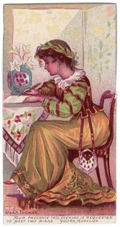
View on eBay

1880s Trade Card Clark's O.N.T. Spool Cotton Tuesday's Child Full of Grace

1880s Trade Card Clark's O.N.T. Spool Cotton Tuesday's Child Full of Grace — An embossed Victorian thread card from the nursery-rhyme theme. Approx. 2.80 x 4.00 in.

$20.18

Description

An embossed Victorian thread card from the nursery-rhyme theme. A little girl in grown-up costume, a tall lace cap, blue bodice, red overskirt and a flowered apron with a long trailing hem, poses with a fan. Bronze lettering beside her reads "Tuesday's Child is full of Grace," above the blue "Clark's O.N.T. Spool Cotton" trademark roundel. Verse at the foot: "The dainty costume worn by me / My mamma made with O.N.T." The outlines and lettering are printed in metallic bronze, and the figure and lettering are embossed.

The reverse, printed in black: "Use Clark's O.N.T. Spool Cotton on White Spools! George A. Clark, Sole Agent. It is superior to all others for hand and machine use. Garments sewed with O.N.T. Fast Black will never show white on the seams after being worn or washed."

Approx. 2.80 x 4.00 in.

Read the full description

Historical Context

Our New Thread. O.N.T. stood for "Our New Thread." George A. Clark, of the Paisley, Scotland, thread family, came to the United States in 1856, and the Clarks opened a factory in Newark, New Jersey, in 1864. Clark's O.N.T. spool cotton soon became a recognized American brand.

Thread wars. Clark and its Paisley rival J. & P. Coats competed fiercely for American customers, and both flooded stores with picture cards. In the United States the two finally merged as Coats & Clark in 1952.

Monday's child. The card borrows the old fortune-telling rhyme that begins "Monday's child is fair of face, Tuesday's child is full of grace," a natural for a thread maker selling to mothers who sewed their children's clothes.

Condition

Excellent. Clean, bright front with sharp corners and crisp embossing; the bronze ink is bright. The reverse is clean with light even toning; the embossing shows through as relief, as made. Please see the photos, which are part of the description.

About The Printing

This is an original chromolithograph. Each color was drawn onto its own separate stone by hand and printed as its own pass through the press, every pass registering exactly against the last. This card uses the flat-color mode of the process — broad areas of solid, opaque ink with crisp boundaries rather than blended tone. It is the same technique that produced the great poster designs of the period.

Under magnification the colors resolve as solid fields with clean edges and no dot structure at all. There is no halftone screen and no four-color rosette, which is what a modern reproduction would show. Modern process printing simulates every color from four inks; here each color is its own ink, laid down whole.

The outlines and lettering are printed in metallic bronze ink, the design is embossed, and the reverse is printed in black.

Provenance

From my family's estate collections, built over more than 60 years by knowledgeable antiques collectors and traders. Stored in a climate-controlled environment.

Also In Our Store

More Clark's O.N.T. cards in our store: https://www.ebay.com/str/tfauctionsintl?_nkw=clark

More Victorian advertising trade cards for thread, children and nursery-rhyme subjects are in our store.

Disclaimer

The images and any video show the actual item and are part of the official listing description, so please review them closely. Measurements and weights are approximate, and any maker or material we haven't confirmed is described as assumed. Questions? Message us; we answer quickly.
View on eBay

1880s Lion Coffee Trade Card Forget-Me-Nots Seascape Ships Bufford Woolson

1880s Lion Coffee Trade Card Forget-Me-Nots Seascape Ships Bufford Woolson — Sprays of blue forget-me-nots frame a tilted seascape with sailing ships. Approx. 3.62 x 5.11 in.

$19.92

Description

Sprays of blue forget-me-nots frame a tilted seascape with sailing ships. Bufford printer's imprint.

The back is printed in black: "If you want a picture card like this buy a package of LION COFFEE. It is composed of a successful combination of Mocha, Java and Rio, and is roasted with the greatest care, but is not ground. Is never sold in bulk. Beautiful picture in every package. Lion is the King of Coffees. Manufactured by Woolson Spice Co., Toledo, Ohio."

Approx. 3.62 x 5.11 in.

Read the full description

Historical Context

The coffee that came with a picture. Lion Coffee began in Toledo, Ohio, in 1864 and became part of the Woolson Spice Company in 1882. Alvin Woolson built the brand by putting picture cards in every package, and the back of this card says so.

Condition

Front: pink ink dashes and small black dots at upper left; even toning. Back: even toning. Please judge from the photos. Please see the photos, which are part of the description.

About The Printing

This is an original chromolithograph, and it was slow, exacting work. Each color had to be drawn onto its own separate stone by hand — in monochrome, the artist judging how much stipple each area needed so the colors would combine correctly only once every stone had been printed. The sheet then went through the press once for every color it carries, often a dozen or more, and every pass had to register exactly against the last. A pass out of register showed.

Under magnification the image resolves into irregular hand-drawn stipple, each ink carrying its own dot pattern, the colors mixing in the eye rather than on the paper. There is no regular halftone screen and no four-color rosette, which is what a modern reproduction would show. Modern process printing simulates every color from four inks; chromolithography laid each color down as its own.

The back is printed in black.

Provenance

From my family's estate collections, built over more than 60 years by knowledgeable antiques collectors and traders. Stored in a climate-controlled environment.

Also In Our Store

More Lion Coffee cards in our store: https://www.ebay.com/str/tfauctionsintl?_nkw=lion+coffee

More Victorian advertising trade cards are in our store.

Disclaimer

The images and any video show the actual item and are part of the official listing description, so please review them closely. Measurements and weights are approximate, and any maker or material we haven't confirmed is described as assumed. Questions? Message us; we answer quickly.
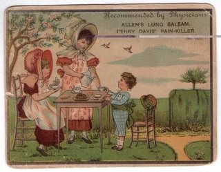
View on eBay

Victorian Trade Card Hood's Sarsaparilla Pharmacy Scene PT Barnum Circus Back

Hood's Sarsaparilla — “Be Sure You Are Right”

$19.47

Original Victorian advertising trade card, chromolithograph, copyright 1886. Approx. 4.10 x 2.65 in.

An elderly man in a yellow overcoat and wide black hat stands outside a pharmacy, umbrella under one arm, holding a package of Hood's Sarsaparilla up to the light and examining it through his glasses. The caption beside him reads “That's all right. Hood's Sarsaparilla. Can't Fool me twice.” A poster for the product hangs in the shop window behind him.

The lower panel carries the advertiser's text in full: the old man was once induced to buy some other preparation when he asked for Hood's, does not propose to be victimized again, and so examines his new purchase carefully. Prepared only by C. I. Hood & Co., Lowell, Mass.

The reverse is given over to a circus advertisement headed “Much for Little,” quoting P. T. Barnum on a big show for a small amount, and naming the performers: Daring Zazel, fired from a huge cannon a distance of 50 feet; Graceful Miss Alita, walking the ceiling like a veritable fly; Beautiful Miss Patricia, dissolving into air before your eyes; The Two Macks Vaudeville Combination; and Whitfield, the man with 100 different faces. It closes by returning to Hood's and its “100 Doses One Dollar.”

Read the full description

Historical Context

Patent medicine and the circus were selling the same thing: a promise that outran the evidence. Putting them on one card was not an accident of printing — both were buying the same attention, and both knew the customer wanted to be amazed before being convinced.

The joke on the front is the more interesting half. The old man is not being told the product works. He is being told he is too shrewd to be fooled, which is a harder sell and a better one. Flattering the buyer's judgment was a new idea in 1886 and it has never gone out of use.

Condition

Toning and age typical of the period. Losses and tearing along one long edge with a chipped area toward the corner; light surface soiling; minor edge and corner wear; scattered foxing, more apparent on the reverse. The chromolithographed image on the front remains bright. Please view the images carefully.

About The Printing

This is an original chromolithograph, and it was slow, exacting work. Each color had to be drawn onto its own separate stone by hand — in monochrome, the artist judging how much stipple each area needed so the colors would combine correctly only once every stone had been printed. The sheet then went through the press once for every color it carries, often a dozen or more, and every pass had to register exactly against the last. A pass out of register showed.

Under magnification the image resolves into irregular hand-drawn stipple, each ink carrying its own dot pattern, the colors mixing in the eye rather than on the paper. There is no regular halftone screen and no four-color rosette, which is what a modern reproduction would show. Modern process printing simulates every color from four inks; chromolithography laid each color down as its own.

Provenance

This item comes from the personal collections of my family estate, accumulated over more than 200 years — including items that came west by wagon train to Colorado and later to Oklahoma. Now that my parents have passed we cannot keep all of these cherished items. They were well-educated antiques collectors/traders and continued to build their collections over more than 60 years. The vast majority of the pieces are from the Victorian Era, however there are plenty of older and newer items. Everything has been stored in a climate-controlled environment over time.

Disclaimer

Specifications and detailed item descriptions are provided as a courtesy only and are not guaranteed to be one hundred percent accurate. Please do your own research. There are generally no receipts available for any items from original purchases. Any dimensions and/or weights are approximate. The absence of a more detailed condition report does not imply there are no condition issues with the item(s). Please inspect images carefully as they are part of the official item description and best representation of the actual condition. Additional images may be available upon request depending on time and availability. Not responsible for internet mis-translations or mis-identification of maker's marks if found or assumptions of makers or materials — item descriptions will indicate if it is assumed. If you see a problem, please message us immediately and we will do our best to sort out a solution and confirm the information. With the exception of eBay rules, no returns are accepted.

View on eBay

1880s Trade Card Jacob Rosenberg Boots and Shoes Children at Fence with Hoop

1880s Trade Card Jacob Rosenberg Boots and Shoes Children at Fence with Hoop — A large Victorian trade card imprinted for a shoe dealer. Approx. 5.70 x 7.60 in.

$19.44

Description

A large Victorian trade card imprinted for a shoe dealer. Three children by a split-rail fence: a girl in a straw bonnet, red-and-white cape and long brown dress holds a book and leads a toddler in a white dress with a red sash, red stockings and a straw hat, while a boy in blue lies sprawled on the path beside his red hoop. A large house and trees stand behind. The imprint at upper right reads: "Compliments of JACOB ROSENBERG, Wholesale & Retail Dealer in BOOTS AND SHOES, 1124 & 1126 S. Fourth St. Agency for German Felt Shoes and Slippers, Custom Work and Repairing a Specialty." Stock number "1009" at lower left. No city is printed. The back is blank.

Vertical, approx. 5.70 x 7.60 in.

Read the full description

Historical Context

A neighborhood shoe store. Rosenberg sold wholesale and retail from a double storefront on South Fourth Street, took in custom work and repairs, and advertised an agency for German felt shoes and slippers.

Stock card, local imprint. Designs like this were printed in quantity with open space for a merchant's name; Rosenberg's advertising fills the sky. The number 1009 at lower left is a stock design number.

Children at play. Sweet scenes of children, here a tumble with a hoop on the way home from school, were among the most popular trade card subjects of the 1880s.

Condition

As-is, with honest wear. Front: a diagonal crease across the lower right corner, running into the picture, with a small chip at the corner tip; a short crease at the left edge about halfway down; wear at the upper corners; overall toning to the margins. Back: blank and toned, with a darker vertical band near the left edge; long diagonal creases at the upper left and lower left corners, a small corner chip at lower left, and short edge creases at the right side and bottom. Colors remain strong. No writing. Please see the photos, which are part of the description.

About The Printing

This is an original chromolithograph, and it was slow, exacting work. Each color had to be drawn onto its own separate stone by hand — in monochrome, the artist judging how much stipple each area needed so the colors would combine correctly only once every stone had been printed. The sheet then went through the press once for every color it carries, often a dozen or more, and every pass had to register exactly against the last. A pass out of register showed.

Under magnification the image resolves into irregular hand-drawn stipple, each ink carrying its own dot pattern, the colors mixing in the eye rather than on the paper. There is no regular halftone screen and no four-color rosette, which is what a modern reproduction would show. Modern process printing simulates every color from four inks; chromolithography laid each color down as its own.

The Rosenberg advertising is printed in black type in the sky of the design.

Provenance

From my family's estate collections, built over more than 60 years by knowledgeable antiques collectors and traders. Stored in a climate-controlled environment.

Also In Our Store

More Victorian advertising trade cards for local merchants, with children and other popular subjects, are in our store.

Disclaimer

The images and any video show the actual item and are part of the official listing description, so please review them closely. Measurements and weights are approximate, and any maker or material we haven't confirmed is described as assumed. Questions? Message us; we answer quickly.
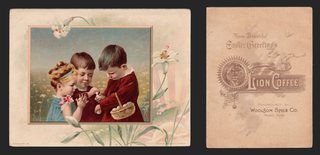
View on eBay

1880s Victorian Trade Card J&P Coats Thread Katisha The Mikado Kimono Spool Poem

1880s Victorian Trade Card J&P Coats Thread Katisha The Mikado Kimono Spool Poem — A Victorian thread trade card. Approx. 2.50 x 4.15 in.

$18.92

Description

A Victorian thread trade card. A woman stands in costume as Katisha, the formidable lady of Gilbert and Sullivan's "The Mikado," in a crimson and gold kimono embroidered with a crane, waves and flowers, a ribbon ornament in her hair. At her feet sits an oversized spool of thread labeled "J&P COATS 200 YDS 50 BEST SIX CORD." Caption at top: "KATISHA." (the top of the lettering is trimmed). Verse in the panel below: "There is music in the whirling of the spindle — there is music that the clicking needle makes, and a sort of happy feeling comes gently o'er you stealing, — [wh]en you use Coats' Thread that never kinks or breaks."

The reverse is printed in blue with a large engraved spool and "J&P. Coats' Best Six Cord Thread — White, Black and Colors — For Hand and Machine."

Approx. 2.50 x 4.15 in.

Read the full description

Historical Context

Mikado mania. Gilbert and Sullivan's "The Mikado" opened at the Savoy Theatre in London on March 14, 1885, and ran for 672 performances. Katisha is the elderly lady in love with Nanki-Poo. The opera set off a fashion for all things Japanese, and advertisers issued Mikado trade cards to sell all kinds of goods.

Thread wars. J. & P. Coats takes its name from the brothers James and Peter Coats of Paisley, Scotland, who took over their father's thread business in 1830. In 1869 the firm took control of a thread mill in Pawtucket, Rhode Island, and its spools fought for American sewing baskets against Clark's O.N.T. The two rivals merged in the United States as Coats & Clark in 1952.

The trade card craze. In the 1880s cheap color printing put picture cards on every store counter, and families pasted them into scrapbooks by the hundred.

Condition

Heavily handled, sold as is. The lower left corner of the front is missing, taking the first letters of the last line ("[WH]EN"); the same loss shows at the upper right of the reverse. The top edge is trimmed close, clipping the top of the "KATISHA" caption. Light surface soiling and a few small scuffs on the front; colors remain strong. The reverse is toned, with scattered brown stains and spotting, most at the left side. Please see the photos, which are part of the description.

About The Printing

This is an original chromolithograph, and it was slow, exacting work. Each color had to be drawn onto its own separate stone by hand — in monochrome, the artist judging how much stipple each area needed so the colors would combine correctly only once every stone had been printed. The sheet then went through the press once for every color it carries, often a dozen or more, and every pass had to register exactly against the last. A pass out of register showed.

Under magnification the image resolves into irregular hand-drawn stipple, each ink carrying its own dot pattern, the colors mixing in the eye rather than on the paper. There is no regular halftone screen and no four-color rosette, which is what a modern reproduction would show. Modern process printing simulates every color from four inks; chromolithography laid each color down as its own.

The reverse is printed in a single blue ink.

Provenance

From my family's estate collections, built over more than 60 years by knowledgeable antiques collectors and traders. Stored in a climate-controlled environment.

Also In Our Store

More J. & P. Coats cards in our store: https://www.ebay.com/str/tfauctionsintl?_nkw=coats

More Victorian advertising trade cards for thread, soap and theater subjects are in our store.

Disclaimer

The images and any video show the actual item and are part of the official listing description, so please review them closely. Measurements and weights are approximate, and any maker or material we haven't confirmed is described as assumed. Questions? Message us; we answer quickly.
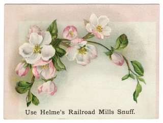
View on eBay

1880s Trade Card James Pyle's Pearline Girl with Lamb and Kitten Wash Poem

DESCRIPTION

$17.67

A little girl with long red-gold hair, in a pink dress and white pinafore, cradles a tabby kitten and an armful of fresh grass while a lamb nibbles at it, in a garden of climbing roses beside a doorstep. A small "JAMES PYLE'S PEARLINE" trademark panel sits at upper left. The caption reads: "'MID PLEASURES AND PALACES THOUGH WE MAY ROAM,' THERE'S NOTHING LIKE PEARLINE FOR WASHING AT HOME." The word "OVER" is printed at the top and bottom right edges, partly trimmed.

The back is printed in black with a two-stanza poem, "ONLY WIND." The second stanza warns against a peddler who claims "the washing stuff he's selling / Is as good as PYLE'S PEARLINE," ending "Recollect 'tis only wind." Several words of the second stanza are lost to paper loss (see Condition). Approx. 2.55 x 4.10 in.

Read the full description

Historical Context

Home, sweet home on wash day. The caption borrows the opening line of "Home! Sweet Home!", John Howard Payne's song from his 1823 opera Clari, or the Maid of Milan, with music by Henry Bishop, and turns it into a laundry slogan.

Beware of imitations. Pearline was a washing compound, and the poem on the back is an attack on cheaper rivals sold door to door, comparing a peddler's patter to the wind, however sweet his voice, even one like Jenny Lind's.

Children and animals. A girl, a kitten and a lamb in a rose garden: exactly the sentimental subject Victorian collectors pasted into their albums, and still a favorite with collectors of children and farm animal cards.

Condition

Sold as-is for its image and text. Front: an area of surface paper loss about 0.5 in. across at lower center, over the girl's legs and the grass, exposing white card; small nick at the upper left edge; corners lightly worn; colors bright elsewhere. Back: matching surface loss in the second stanza that removes several words, plus a few small scuffed patches and light marks at the lower right; overall light toning. Please see the photos, which are part of the description.

About The Printing

This is an original chromolithograph, and it was slow, exacting work. Each color had to be drawn onto its own separate stone by hand — in monochrome, the artist judging how much stipple each area needed so the colors would combine correctly only once every stone had been printed. The sheet then went through the press once for every color it carries, often a dozen or more, and every pass had to register exactly against the last. A pass out of register showed.

Under magnification the image resolves into irregular hand-drawn stipple, each ink carrying its own dot pattern, the colors mixing in the eye rather than on the paper. There is no regular halftone screen and no four-color rosette, which is what a modern reproduction would show. Modern process printing simulates every color from four inks; chromolithography laid each color down as its own.

The poem on the back is printed in black letterpress.

Provenance

From my family's estate collections, built over more than 60 years by knowledgeable antiques collectors and traders. Stored in a climate-controlled environment.

Also In Our Store

More Victorian advertising trade cards for soap and laundry, thread and coffee are in our store.

Disclaimer

Specifications and detailed item descriptions are provided as a courtesy only and are not guaranteed to be one hundred percent accurate. Please do your own research. There are generally no receipts available for any items from original purchases. Any dimensions and/or weights are approximate. The absence of a more detailed condition report does not imply there are no condition issues with the item(s). Please inspect images carefully as they are part of the official item description and best representation of the actual condition. Additional images may be available upon request depending on time and availability. Not responsible for internet mis-translations or mis-identification of maker's marks if found or assumptions of makers or materials — item descriptions will indicate if it is assumed. If you see a problem, please message us immediately and we will do our best to sort out a solution and confirm the information. With the exception of eBay rules, no returns are accepted.

View on eBay

1880s Trade Card Dilworth's Coffee Children Riding Donkeys on the Beach Urn

1880s Trade Card Dilworth's Coffee Children Riding Donkeys on the Beach Urn — Two children ride donkeys along the sand by the sea: a boy in a white sailor suit and blue cap on a dark brown donkey, and a girl in a white bonnet and pink dress on a grey one, holding the reins. Approx. 2.50 x 3.25 in.

$17.44

Description

Two children ride donkeys along the sand by the sea: a boy in a white sailor suit and blue cap on a dark brown donkey, and a girl in a white bonnet and pink dress on a grey one, holding the reins. At upper right is a small emblem of an ornate urn on feet, likely a coffee urn (best reading). The front carries no text.

The back is printed in black: "Dilworth's Coffee ✣ BECAUSE: ✣ IS UNEQUALLED". The rest of the back is blank. The back reads across the long side of the card.

Approx. 2.50 x 3.25 in.

Read the full description

Historical Context

Coffee by the package. In the 1880s branded, packaged coffee was pushing out loose beans sold from the grocer's bin, and roasters handed out picture cards to win loyal customers. Dilworth's answer to why its coffee was best: "because" it is unequalled.

Donkey rides on the sand. A sailor-suited boy and a bonneted girl on a pair of shaggy donkeys capture a favorite Victorian seaside pleasure, for collectors of children, beach and donkey subjects.

Condition

Front: very good, with bright color, light toning, light edge wear and lightly rounded corners. Back: water staining with tide lines across the top band and below the printing, several round stain spots near the bottom, a scuffed patch of surface at the upper right corner, a few small specks, and overall toning. Please see the photos, which are part of the description.

About The Printing

This is an original chromolithograph, and it was slow, exacting work. Each color had to be drawn onto its own separate stone by hand — in monochrome, the artist judging how much stipple each area needed so the colors would combine correctly only once every stone had been printed. The sheet then went through the press once for every color it carries, often a dozen or more, and every pass had to register exactly against the last. A pass out of register showed.

Under magnification the image resolves into irregular hand-drawn stipple, each ink carrying its own dot pattern, the colors mixing in the eye rather than on the paper. There is no regular halftone screen and no four-color rosette, which is what a modern reproduction would show. Modern process printing simulates every color from four inks; chromolithography laid each color down as its own.

The back is printed in black type, separate from the color work on the front.

Provenance

From my family's estate collections, built over more than 60 years by knowledgeable antiques collectors and traders. Stored in a climate-controlled environment.

Also In Our Store

More Victorian advertising trade cards for coffee, spices and baking soda are in our store.

Disclaimer

The images and any video show the actual item and are part of the official listing description, so please review them closely. Measurements and weights are approximate, and any maker or material we haven't confirmed is described as assumed. Questions? Message us; we answer quickly.
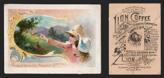
View on eBay

Arbuckle Coffee Trade Card No 22 Lisbon Portugal Belem Trip Around the World

Arbuckle Coffee Trade Card No 22 Lisbon Portugal Belem Trip Around the World — Original Victorian advertising trade card, chromolithograph, copyright 1891. Approx. 5.05 x 3.05 in. Printed by Joseph P. Knapp, Lith., N.Y.

$17.33

Description

Arbuckle Bros Ariosa Coffee — “Lisbon, Portugal,” No. 22 of 50 Views from a Trip Around the World

A harbor view of Lisbon from Fort Almeida, with sailing ships on the Tagus and the city climbing the hills beyond, is surrounded by vignettes: the Royal Castle; Belem Castle, the fortified tower at the water's edge; A Sport, a mustached man in a wide-brimmed hat; and A Lisbon Lady in a striped headscarf, with bunches of grapes and vine leaves trailing between them. Lettered at the foot: LISBON, PORTUGAL, and along the left edge, COPYRIGHT 1891 BY ARBUCKLE BROS. N.Y.

The reverse is headed One of 50 views from a trip around the world. The left column carries Arbuckle's GRIND YOUR COFFEE AT HOME advice and the ARIOSA COFFEE claim; the right column is a travel sketch of Lisbon and its history, ending with the city's population. The card is numbered 22.

Read the full description

Historical Context

This is the travel series, the same one as the Dublin card: fifty stops on an armchair tour of the world, one to a package of coffee. For a family in Kansas in 1891, the tower at Belem and the grape arbors of Portugal were exactly as far away as the moon, and a card like this was how they arrived.

The grapevine running through the design is the clue to what Portugal meant to an American of the period — wine and port, the country's best-known export.

Condition

Toning and age typical of the period. Light surface soiling; minor edge and corner wear; toning to the reverse. The chromolithographed image remains bright and the reverse text fully legible. Please view the images carefully.

About The Printing

This is an original chromolithograph, and it was slow, exacting work. Each color had to be drawn onto its own separate stone by hand — in monochrome, the artist judging how much stipple each area needed so the colors would combine correctly only once every stone had been printed. The sheet then went through the press once for every color it carries, often a dozen or more, and every pass had to register exactly against the last. A pass out of register showed.

Under magnification the image resolves into irregular hand-drawn stipple, each ink carrying its own dot pattern, the colors mixing in the eye rather than on the paper. There is no regular halftone screen and no four-color rosette, which is what a modern reproduction would show. Modern process printing simulates every color from four inks; chromolithography laid each color down as its own.

Provenance

From my family's estate collections, built over more than 60 years by knowledgeable antiques collectors and traders. Stored in a climate-controlled environment.

Also In Our Store

More Victorian advertising trade cards are in our store.

Disclaimer

The images and any video show the actual item and are part of the official listing description, so please review them closely. Measurements and weights are approximate, and any maker or material we haven't confirmed is described as assumed. Questions? Message us; we answer quickly.
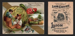
View on eBay

1889 Arbuckle Coffee Trade Card No 55 Oregon State Map Salmon Fisheries Fishing

1889 Arbuckle Coffee Trade Card No 55 Oregon State Map Salmon Fisheries Fishing — Original Victorian advertising trade card, chromolithograph, copyright 1889 by Arbuckle Bros., N.Y. Approx. 5.05 x 3.05 in.

$17.19 1889

Description

Arbuckle Bros Ariosa Coffee — Oregon, State Map No. 55

A colored map of Oregon, its towns and rivers lettered in, with Washington Territory to the north and California, Nevada and Idaho at the borders. Beside it a fisherman in a slouch hat and waders stands in the river landing a salmon in a net, two salmon hang on a line at the left, and a stack of red SALMON cans fills the lower corner. Lettered: SALMON FISHERIES. Area in Sq. Miles 96,030. Population 174,768.

The reverse is headed ARBUCKLES' Ariosa Coffee, COSTS MORE AND IS WORTH MORE THAN OTHER BRANDS OF COFFEE. WHY? Four numbered reasons follow: the coffee is made from green coffee of higher grade; its strength and aroma are retained by the glazing; the glazing is made of choice eggs and pure confectioners' “A” sugar; and it adds richness of flavor. A BEWARE paragraph warns against low-grade package coffee. A second column, READ THIS, explains the series — fifty cards, each showing a correct map of one State or Territory with pictures of its peculiar industries and scenery — and suggests that anyone with two cards of one kind exchange with a neighbor. A list of the states and territories represented follows. Arbuckle Bros. Coffee Company, New York. The card is numbered 55. Printed by Donaldson Brothers, N.Y.

Read the full description

Historical Context

Oregon's picture is its industry: salmon, caught in the rivers and canned for shipment east. The cans in the corner are the whole story of the Columbia River in the 1880s — a fish that had fed the region for thousands of years, turning into a product sold in grocery stores across the country.

Watch the northern border. The card labels Washington T., for Territory. Washington became a state in November 1889, so this map was drawn just before it happened.

Condition

Toning and age typical of the period. Light surface soiling; minor edge and corner wear; toning to the reverse. The chromolithographed image remains bright and the reverse text fully legible. Please view the images carefully.

About The Printing

This is an original chromolithograph, and it was slow, exacting work. Each color had to be drawn onto its own separate stone by hand — in monochrome, the artist judging how much stipple each area needed so the colors would combine correctly only once every stone had been printed. The sheet then went through the press once for every color it carries, often a dozen or more, and every pass had to register exactly against the last. A pass out of register showed.

Under magnification the image resolves into irregular hand-drawn stipple, each ink carrying its own dot pattern, the colors mixing in the eye rather than on the paper. There is no regular halftone screen and no four-color rosette, which is what a modern reproduction would show. Modern process printing simulates every color from four inks; chromolithography laid each color down as its own.

Provenance

From my family's estate collections, built over more than 60 years by knowledgeable antiques collectors and traders. Stored in a climate-controlled environment.

Also In Our Store

More Victorian advertising trade cards are in our store.

Disclaimer

The images and any video show the actual item and are part of the official listing description, so please review them closely. Measurements and weights are approximate, and any maker or material we haven't confirmed is described as assumed. Questions? Message us; we answer quickly.
View on eBay

1889 Arbuckle Coffee Trade Card No 54 Pennsylvania State Map Coal Iron Oil Well

1889 Arbuckle Coffee Trade Card No 54 Pennsylvania State Map Coal Iron Oil Well — Original Victorian advertising trade card, chromolithograph, copyright 1889 by Arbuckle Bros., N.Y. Approx. 5.05 x 3.05 in.

$17.08 1889

Description

Arbuckle Bros Ariosa Coffee — Pennsylvania, State Map No. 54

A colored map of Pennsylvania, its towns and ranges lettered in, framed by vignettes of the state's industries: Shooting an Oil Well, with derricks on the hillside; Loading a Coal Barge; a Blast Furnace; Rolling Rails in a steel mill; and an Oil Refinery with a train of tank cars. Lettered at the foot: COAL - IRON - OIL. Area 45,215 Sq. Miles. Population 4,282,891.

The reverse is headed ARBUCKLES' Ariosa Coffee, COSTS MORE AND IS WORTH MORE THAN OTHER BRANDS OF COFFEE. WHY? Four numbered reasons follow: the coffee is made from green coffee of higher grade; its strength and aroma are retained by the glazing; the glazing is made of choice eggs and pure confectioners' “A” sugar; and it adds richness of flavor. A BEWARE paragraph warns against low-grade package coffee. A second column, READ THIS, explains the series — fifty cards, each showing a correct map of one State or Territory with pictures of its peculiar industries and scenery — and suggests that anyone with two cards of one kind exchange with a neighbor. A list of the states and territories represented follows. Arbuckle Bros. Coffee Company, New York. The card is numbered 54. Printed by Donaldson Brothers, N.Y.

Read the full description

Historical Context

COAL - IRON - OIL is Pennsylvania in three words, and in 1889 it was the industrial heart of the country. The first commercial oil well had been drilled in the state thirty years before, and the vignettes follow the chain from the ground to the railroad: dig it, smelt it, roll it, ship it.

“Shooting” an oil well meant dropping explosives down the bore to crack the rock and start the oil flowing — dangerous work, and a spectacle people came to watch.

Condition

Toning and age typical of the period. Light surface soiling; minor edge and corner wear; toning to the reverse. The chromolithographed image remains bright and the reverse text fully legible. Please view the images carefully.

About The Printing

This is an original chromolithograph, and it was slow, exacting work. Each color had to be drawn onto its own separate stone by hand — in monochrome, the artist judging how much stipple each area needed so the colors would combine correctly only once every stone had been printed. The sheet then went through the press once for every color it carries, often a dozen or more, and every pass had to register exactly against the last. A pass out of register showed.

Under magnification the image resolves into irregular hand-drawn stipple, each ink carrying its own dot pattern, the colors mixing in the eye rather than on the paper. There is no regular halftone screen and no four-color rosette, which is what a modern reproduction would show. Modern process printing simulates every color from four inks; chromolithography laid each color down as its own.

Provenance

From my family's estate collections, built over more than 60 years by knowledgeable antiques collectors and traders. Stored in a climate-controlled environment.

Also In Our Store

More Victorian advertising trade cards are in our store.

Disclaimer

The images and any video show the actual item and are part of the official listing description, so please review them closely. Measurements and weights are approximate, and any maker or material we haven't confirmed is described as assumed. Questions? Message us; we answer quickly.
View on eBay

1889 Arbuckle Coffee Trade Card No 61 Kentucky Map Racehorse Whisky Distillery

1889 Arbuckle Coffee Trade Card No 61 Kentucky Map Racehorse Whisky Distillery — Original Victorian advertising trade card, chromolithograph, copyright 1889 by Arbuckle Bros., N.Y. Approx. 5.05 x 3.10 in.

$17.04 1889

Description

Arbuckle Bros Ariosa Coffee — Kentucky, State Map No. 61

A colored map of Kentucky, its towns and rivers lettered in, with Ohio, Indiana, Illinois, Missouri, Tennessee, Virginia and West Virginia around it. Above the map a jockey in yellow silks sits a chestnut racehorse in a paddock, captioned THOROUGHBRED STOCK, BLUE GRASS REGION, and a horseshoe frames a second rider. At the right is the interior of a WHISKY DISTILLERY, a copper still and a man tending the fire. Area in Sq. Miles 40,400. Population 1,648,690.

The reverse is headed ARBUCKLES' Ariosa Coffee, COSTS MORE AND IS WORTH MORE THAN OTHER BRANDS OF COFFEE. WHY? Four numbered reasons follow: the coffee is made from green coffee of higher grade; its strength and aroma are retained by the glazing; the glazing is made of choice eggs and pure confectioners' “A” sugar; and it adds richness of flavor. A BEWARE paragraph warns against low-grade package coffee. A second column, READ THIS, explains the series — fifty cards, each showing a correct map of one State or Territory with pictures of its peculiar industries and scenery — and suggests that anyone with two cards of one kind exchange with a neighbor. A list of the states and territories represented follows. Arbuckle Bros. Coffee Company, New York. The card is numbered 61. Printed by Donaldson Brothers, N.Y.

Read the full description

Historical Context

Horses and whiskey — Kentucky's reputation was already fixed by 1889, and the card simply prints it. The Kentucky Derby had been run for fifteen years, and Bluegrass bourbon was sold across the country.

The spelling “whisky,” without the e, is what the card uses. American distillers of the period used both.

Condition

Toning and age typical of the period. White abrasions and small patches of surface loss across the distillery vignette in the upper right; small creases; minor edge and corner wear; toning to the reverse. The racehorse and the map remain bright and the reverse text fully legible. Please view the images carefully.

About The Printing

This is an original chromolithograph, and it was slow, exacting work. Each color had to be drawn onto its own separate stone by hand — in monochrome, the artist judging how much stipple each area needed so the colors would combine correctly only once every stone had been printed. The sheet then went through the press once for every color it carries, often a dozen or more, and every pass had to register exactly against the last. A pass out of register showed.

Under magnification the image resolves into irregular hand-drawn stipple, each ink carrying its own dot pattern, the colors mixing in the eye rather than on the paper. There is no regular halftone screen and no four-color rosette, which is what a modern reproduction would show. Modern process printing simulates every color from four inks; chromolithography laid each color down as its own.

Provenance

From my family's estate collections, built over more than 60 years by knowledgeable antiques collectors and traders. Stored in a climate-controlled environment.

Also In Our Store

More Victorian advertising trade cards are in our store.

Disclaimer

The images and any video show the actual item and are part of the official listing description, so please review them closely. Measurements and weights are approximate, and any maker or material we haven't confirmed is described as assumed. Questions? Message us; we answer quickly.
View on eBay

1889 Arbuckle Coffee Trade Card No 57 West Virginia State Map Oil Refinery Train

1889 Arbuckle Coffee Trade Card No 57 West Virginia State Map Oil Refinery Train — Original Victorian advertising trade card, chromolithograph, copyright 1889 by Arbuckle Bros., N.Y. Approx. 5.05 x 3.05 in.

$17.01 1889

Description

Arbuckle Bros Ariosa Coffee — West Virginia, State Map No. 57

A colored map of West Virginia, its towns and rivers lettered in, with Ohio, Pennsylvania, Maryland, Virginia and Kentucky around it. At the right an oil refinery rises behind a train of tank cars, smokestacks and storage tanks under a dark sky, captioned OIL REFINERY. Area in Sq. Miles 24,780. Population 618,457.

The reverse is headed ARBUCKLES' Ariosa Coffee, COSTS MORE AND IS WORTH MORE THAN OTHER BRANDS OF COFFEE. WHY? Four numbered reasons follow: the coffee is made from green coffee of higher grade; its strength and aroma are retained by the glazing; the glazing is made of choice eggs and pure confectioners' “A” sugar; and it adds richness of flavor. A BEWARE paragraph warns against low-grade package coffee. A second column, READ THIS, explains the series — fifty cards, each showing a correct map of one State or Territory with pictures of its peculiar industries and scenery — and suggests that anyone with two cards of one kind exchange with a neighbor. A list of the states and territories represented follows. Arbuckle Bros. Coffee Company, New York. The card is numbered 57. Printed by Donaldson Brothers, N.Y.

Read the full description

Historical Context

West Virginia was barely a quarter-century old when this card was printed, having split from Virginia during the Civil War. The map makes the point quietly, with Virginia drawn as a separate state along the eastern border.

The refinery and the tank cars show what the new state was selling. Oil and gas had been found along its rivers, and the railroad carried it out.

Condition

Toning and age typical of the period. A few small brown spots in the upper part of the image; light surface soiling; minor edge and corner wear; toning to the reverse. The chromolithographed image remains bright and the reverse text fully legible. Please view the images carefully.

About The Printing

This is an original chromolithograph, and it was slow, exacting work. Each color had to be drawn onto its own separate stone by hand — in monochrome, the artist judging how much stipple each area needed so the colors would combine correctly only once every stone had been printed. The sheet then went through the press once for every color it carries, often a dozen or more, and every pass had to register exactly against the last. A pass out of register showed.

Under magnification the image resolves into irregular hand-drawn stipple, each ink carrying its own dot pattern, the colors mixing in the eye rather than on the paper. There is no regular halftone screen and no four-color rosette, which is what a modern reproduction would show. Modern process printing simulates every color from four inks; chromolithography laid each color down as its own.

Provenance

From my family's estate collections, built over more than 60 years by knowledgeable antiques collectors and traders. Stored in a climate-controlled environment.

Also In Our Store

More Victorian advertising trade cards are in our store.

Disclaimer

The images and any video show the actual item and are part of the official listing description, so please review them closely. Measurements and weights are approximate, and any maker or material we haven't confirmed is described as assumed. Questions? Message us; we answer quickly.
View on eBay

1880s Trade Card J & P Coats Thread Pippin Hill Lady Umbrella Spool Six Cord

1880s Trade Card J & P Coats Thread Pippin Hill Lady Umbrella Spool Six Cord — A lady in a long ruffled dress and bonnet curtsies on a muddy hill path, umbrella in hand, beside a large spool of Coats thread. Approx. 2.51 x 3.70 in.

$16.92

Description

A lady in a long ruffled dress and bonnet curtsies on a muddy hill path, umbrella in hand, beside a large spool of Coats thread. Lettered "White, Black & Colors for Hand & Machine," with the rhyme "As I was going up Pippin Hill, Pippin Hill was dirty, there I met a sweet pretty lass, and she dropped me a curtsey."

The back is printed in blue: "J. & P. COATS. Trade Mark for the United States ... Best Six-Cord Thread. For Sale Everywhere," with an engraved scene.

Approx. 2.51 x 3.70 in.

Read the full description

Historical Context

Thread from Paisley. J. & P. Coats was a Scottish thread firm of Paisley, which made its six-cord thread in the United States at Pawtucket, Rhode Island.

A nursery rhyme to sell thread. The old rhyme of Pippin Hill gives the card its charm.

Condition

Front: toning and edge wear, damage at the left edge. Back: toned, edge wear. Please see the photos, which are part of the description.

About The Printing

This is an original chromolithograph, and it was slow, exacting work. Each color had to be drawn onto its own separate stone by hand — in monochrome, the artist judging how much stipple each area needed so the colors would combine correctly only once every stone had been printed. The sheet then went through the press once for every color it carries, often a dozen or more, and every pass had to register exactly against the last. A pass out of register showed.

Under magnification the image resolves into irregular hand-drawn stipple, each ink carrying its own dot pattern, the colors mixing in the eye rather than on the paper. There is no regular halftone screen and no four-color rosette, which is what a modern reproduction would show. Modern process printing simulates every color from four inks; chromolithography laid each color down as its own.

The back is printed in a single blue ink.

Provenance

From my family's estate collections, built over more than 60 years by knowledgeable antiques collectors and traders. Stored in a climate-controlled environment.

Also In Our Store

More J. & P. Coats cards in our store: https://www.ebay.com/str/tfauctionsintl?_nkw=coats

More Victorian advertising trade cards are in our store.

Disclaimer

The images and any video show the actual item and are part of the official listing description, so please review them closely. Measurements and weights are approximate, and any maker or material we haven't confirmed is described as assumed. Questions? Message us; we answer quickly.
View on eBay

Victorian Trade Card Round Oak Stove Beckwith Crittendon Wilson West Concord MN

The Round Oak Stove — Crittendon & Wilson, West Concord, Minnesota

$16.68

Original Victorian advertising trade card, chromolithograph, c. 1880s-90s. Approx. 4.85 x 3.35 in.

A young woman in profile, her dark hair gathered up, wears a pearl necklace and an apricot gown trimmed with lace and white flowers, against a brushed blue-green ground. Lettered in the upper left: “The Name Tells.”

On the reverse the text is set inside an outline drawing of the stove itself: The ROUND OAK, Makes 'Em Hustle, 5 SIZES FOR COAL OR WOOD, With low down Fire Pot, and air tight Bottom, making a PERFECT FIRE KEEPER. Has Spun Urn, Nickeled Rail and Top Ring, Name Plates, Knobs and Hinge Pins. Fittings strictly first-class. EVERY STOVE FULLY WARRANTED. BEWARE OF IMITATIONS. The Genuine Bears the Name of P. D. BECKWITH, DOWAGIAC, MICH. The local dealer's name is overprinted in heavier type across the foot: CRITTENDON & WILSON, West Concord, Minn.

Read the full description

Historical Context

“The Name Tells” and “Beware of Imitations” are the same message from two sides. The Round Oak was copied widely enough that the maker put his own name on every stove and told customers to look for it. The pretty face on the front is there to be kept; the warning on the back is the reason the card was printed.

The dealer imprint is what makes this one. The stove was sold across the country, but this card was handed across the counter in West Concord, Minnesota, a small town with a hardware store that stocked the Round Oak. National brand, local shop.

Condition

Toning and age typical of the period. A chip to the lower-right corner of the card; a small nick at the left edge; a toned, unprinted strip along the top edge; rounded, worn corners; toning to the reverse. The portrait on the front remains bright and the reverse text fully legible. Please view the images carefully.

About The Printing

This is an original chromolithograph, and it was slow, exacting work. Each color had to be drawn onto its own separate stone by hand — in monochrome, the artist judging how much stipple each area needed so the colors would combine correctly only once every stone had been printed. The sheet then went through the press once for every color it carries, often a dozen or more, and every pass had to register exactly against the last. A pass out of register showed.

Under magnification the image resolves into irregular hand-drawn stipple, each ink carrying its own dot pattern, the colors mixing in the eye rather than on the paper. There is no regular halftone screen and no four-color rosette, which is what a modern reproduction would show. Modern process printing simulates every color from four inks; chromolithography laid each color down as its own.

Provenance

This item comes from the personal collections of my family estate, accumulated over more than 200 years — including items that came west by wagon train to Colorado and later to Oklahoma. Now that my parents have passed we cannot keep all of these cherished items. They were well-educated antiques collectors/traders and continued to build their collections over more than 60 years. The vast majority of the pieces are from the Victorian Era, however there are plenty of older and newer items. Everything has been stored in a climate-controlled environment over time.

Disclaimer

Specifications and detailed item descriptions are provided as a courtesy only and are not guaranteed to be one hundred percent accurate. Please do your own research. There are generally no receipts available for any items from original purchases. Any dimensions and/or weights are approximate. The absence of a more detailed condition report does not imply there are no condition issues with the item(s). Please inspect images carefully as they are part of the official item description and best representation of the actual condition. Additional images may be available upon request depending on time and availability. Not responsible for internet mis-translations or mis-identification of maker's marks if found or assumptions of makers or materials — item descriptions will indicate if it is assumed. If you see a problem, please message us immediately and we will do our best to sort out a solution and confirm the information. With the exception of eBay rules, no returns are accepted.

View on eBay

Victorian Trade Card Soapine Kendall Mfg Co Providence RI Girl Auburn Hair

Soapine — Kendall Mfg. Co., Providence, Rhode Island

$16.58

Original Victorian advertising trade card, chromolithograph, c. 1880s. Approx. 5.20 x 3.60 in.

A young woman shown in profile against a painted sky of blue and violet, her long auburn hair falling loose over a pale gold dress with a lace collar and a deep red sash. The printing on this card is the finest in the group — the flesh tones, the hair and the sky are all built from dense multi-colored stipple.

The reverse reads: For Washing and Cleaning Everything, No Matter What, Soapine Works QUICKER, EASIER, CHEAPER and BETTER Than Soap or anything Else. One Trial will Convince You. Kendall Mfg. Co., Providence, R.I., Established 1827. For sale by all grocers.

Read the full description

Historical Context

Kendall was already sixty years old when this card was printed, and the reverse says so. In an era when anyone could put a name on a box, “Established 1827” was doing real work — it meant somebody had been answering for the product for three generations.

The front makes no argument at all. There is no soap in the picture, no kitchen, no washing. Just a portrait good enough to want on the wall, with the name underneath. The company was buying a place in the house rather than a place in the argument.

Condition

Toning and age typical of the period. A crease to one corner; staining and pale patches to the reverse; light surface soiling; minor edge and corner wear. The chromolithographed portrait on the front remains bright with strong color. Please view the images carefully.

About The Printing

This is an original chromolithograph, and it was slow, exacting work. Each color had to be drawn onto its own separate stone by hand — in monochrome, the artist judging how much stipple each area needed so the colors would combine correctly only once every stone had been printed. The sheet then went through the press once for every color it carries, often a dozen or more, and every pass had to register exactly against the last. A pass out of register showed.

Under magnification the image resolves into irregular hand-drawn stipple, each ink carrying its own dot pattern, the colors mixing in the eye rather than on the paper. There is no regular halftone screen and no four-color rosette, which is what a modern reproduction would show. Modern process printing simulates every color from four inks; chromolithography laid each color down as its own.

Provenance

This item comes from the personal collections of my family estate, accumulated over more than 200 years — including items that came west by wagon train to Colorado and later to Oklahoma. Now that my parents have passed we cannot keep all of these cherished items. They were well-educated antiques collectors/traders and continued to build their collections over more than 60 years. The vast majority of the pieces are from the Victorian Era, however there are plenty of older and newer items. Everything has been stored in a climate-controlled environment over time.

Disclaimer

Specifications and detailed item descriptions are provided as a courtesy only and are not guaranteed to be one hundred percent accurate. Please do your own research. There are generally no receipts available for any items from original purchases. Any dimensions and/or weights are approximate. The absence of a more detailed condition report does not imply there are no condition issues with the item(s). Please inspect images carefully as they are part of the official item description and best representation of the actual condition. Additional images may be available upon request depending on time and availability. Not responsible for internet mis-translations or mis-identification of maker's marks if found or assumptions of makers or materials — item descriptions will indicate if it is assumed. If you see a problem, please message us immediately and we will do our best to sort out a solution and confirm the information. With the exception of eBay rules, no returns are accepted.

View on eBay

Victorian Trade Card C F Blanke Java Blend Coffee Birds Pansies Rose Calvert

C. F. Blanke Tea & Coffee Co. — Java Blend Coffee

$16.57

Original Victorian advertising trade card, chromolithograph, c. 1880s-90s. Approx. 5.40 x 3.60 in. Printed by Calvert Lith. Co., Detroit.

Two small birds, one with a blue head and one a gold finch, share a thorned rose branch above a still lake. Large yellow and maroon pansies fill the left of the card; a pink rose and a deep red rosebud hang at the right. The design sits inside a ruled border, and a printer's design number, C-797, is printed in the lower left corner.

The reverse, printed in blue, reads: C. F. BLANKE TEA & COFFEE CO'S JAVA BLEND COFFEE is a combination of JAVA, MOCHA, MARACAIBO AND SANTOS. It makes a delicious flavored and strong cup of COFFEE. TRY IT. YOU WILL LIKE IT. A BEAUTIFUL PICTURE CARD IN EVERY PACKAGE.

Read the full description

Historical Context

“A beautiful picture card in every package” is the whole strategy in one line. The picture has nothing to do with coffee and was never meant to. The design number in the corner gives it away: this is a printer's stock design, and Blanke bought it to put in the package because a pretty card got the next package bought.

The blend is named by where the beans came from — Java, Mocha, Maracaibo and Santos. Coffee was still sold by its port of origin, and a four-port blend was a way of promising something better than the plain Rio most people drank. The card does not say where Blanke was based; the company is generally associated with St. Louis.

Condition

Toning and age typical of the period. A circular water stain beside the rose in the upper right; fine surface crazing across the lower half of the front; a crease through the lower-left corner running through the design number; small surface losses along the top edge; a stain to the lower left of the reverse. Colors remain strong. Please view the images carefully.

About The Printing

This is an original chromolithograph, and it was slow, exacting work. Each color had to be drawn onto its own separate stone by hand — in monochrome, the artist judging how much stipple each area needed so the colors would combine correctly only once every stone had been printed. The sheet then went through the press once for every color it carries, often a dozen or more, and every pass had to register exactly against the last. A pass out of register showed.

Under magnification the image resolves into irregular hand-drawn stipple, each ink carrying its own dot pattern, the colors mixing in the eye rather than on the paper. There is no regular halftone screen and no four-color rosette, which is what a modern reproduction would show. Modern process printing simulates every color from four inks; chromolithography laid each color down as its own.

Provenance

This item comes from the personal collections of my family estate, accumulated over more than 200 years — including items that came west by wagon train to Colorado and later to Oklahoma. Now that my parents have passed we cannot keep all of these cherished items. They were well-educated antiques collectors/traders and continued to build their collections over more than 60 years. The vast majority of the pieces are from the Victorian Era, however there are plenty of older and newer items. Everything has been stored in a climate-controlled environment over time.

Disclaimer

Specifications and detailed item descriptions are provided as a courtesy only and are not guaranteed to be one hundred percent accurate. Please do your own research. There are generally no receipts available for any items from original purchases. Any dimensions and/or weights are approximate. The absence of a more detailed condition report does not imply there are no condition issues with the item(s). Please inspect images carefully as they are part of the official item description and best representation of the actual condition. Additional images may be available upon request depending on time and availability. Not responsible for internet mis-translations or mis-identification of maker's marks if found or assumptions of makers or materials — item descriptions will indicate if it is assumed. If you see a problem, please message us immediately and we will do our best to sort out a solution and confirm the information. With the exception of eBay rules, no returns are accepted.

View on eBay

1889 Arbuckle Coffee Trade Card No 85 Wisconsin State Map Beer Brewery Logging

1889 Arbuckle Coffee Trade Card No 85 Wisconsin State Map Beer Brewery Logging — Original Victorian advertising trade card, chromolithograph, copyright 1889 by Arbuckle Bros., N.Y. Approx. 5.05 x 3.05 in.

$16.56 1889

Description

Arbuckle Bros Ariosa Coffee — Wisconsin, State Map No. 85

A colored map of Wisconsin, its towns and rivers lettered in, between Lake Superior and Lake Michigan, with Minnesota, Iowa, Illinois and Michigan around it. At the right is the interior of a BEER BREWERY — a great copper brew kettle, vats and workmen — and a roundel below shows lumbermen driving logs down a river toward a mill. Area 56,040 Sq. Miles. Population 1,315,497.

The reverse is headed ARBUCKLES' Ariosa Coffee, COSTS MORE AND IS WORTH MORE THAN OTHER BRANDS OF COFFEE. WHY? Four numbered reasons follow: the coffee is made from green coffee of higher grade; its strength and aroma are retained by the glazing; the glazing is made of choice eggs and pure confectioners' “A” sugar; and it adds richness of flavor. A BEWARE paragraph warns against low-grade package coffee. A second column, READ THIS, explains the series — fifty cards, each showing a correct map of one State or Territory with pictures of its peculiar industries and scenery — and suggests that anyone with two cards of one kind exchange with a neighbor. A list of the states and territories represented follows. Arbuckle Bros. Coffee Company, New York. The card is numbered 85. Printed by Donaldson Brothers, N.Y.

Read the full description

Historical Context

Beer and lumber were Wisconsin's two great industries in 1889, and the card gives one to each half of the picture. Milwaukee's brewers, many of them German immigrants, were already shipping beer nationally; the northern pineries were feeding the sawmills that built the prairie towns.

The copper brew kettle is drawn with real care, which is typical of this series: the artists clearly worked from real industrial scenes rather than inventing them.

Condition

Toning and age typical of the period. Light surface soiling; minor edge and corner wear; toning to the reverse. The chromolithographed image remains bright and the reverse text fully legible. Please view the images carefully.

About The Printing

This is an original chromolithograph, and it was slow, exacting work. Each color had to be drawn onto its own separate stone by hand — in monochrome, the artist judging how much stipple each area needed so the colors would combine correctly only once every stone had been printed. The sheet then went through the press once for every color it carries, often a dozen or more, and every pass had to register exactly against the last. A pass out of register showed.

Under magnification the image resolves into irregular hand-drawn stipple, each ink carrying its own dot pattern, the colors mixing in the eye rather than on the paper. There is no regular halftone screen and no four-color rosette, which is what a modern reproduction would show. Modern process printing simulates every color from four inks; chromolithography laid each color down as its own.

Provenance

From my family's estate collections, built over more than 60 years by knowledgeable antiques collectors and traders. Stored in a climate-controlled environment.

Also In Our Store

More Victorian advertising trade cards are in our store.

Disclaimer

The images and any video show the actual item and are part of the official listing description, so please review them closely. Measurements and weights are approximate, and any maker or material we haven't confirmed is described as assumed. Questions? Message us; we answer quickly.
View on eBay

1889 Arbuckle Coffee Trade Card No 53 Ireland Map Killarney Jaunting Car

1889 Arbuckle Coffee Trade Card No 53 Ireland Map Killarney Jaunting Car — Original Victorian advertising trade card, chromolithograph, copyright 1889 by Arbuckle Bros., N.Y. Approx. 5.10 x 3.00 in.

$16.33 1889

Description

Arbuckle Bros Ariosa Coffee — Ireland, Map Card No. 53

A colored map of Ireland, its counties and towns lettered in, shares the card with a view of Innisfallen, Killarney: a horse-drawn jaunting car with passengers in a red-wheeled cart beside the lake under the trees. The map panel is framed by the Atlantic Ocean, the Irish Sea and St. George's Channel, with Scotland, Wales and the Isle of Man at the edges. A panel at the foot reads: Area 32,531 Sq. M. Pop. 5,174,836. Constitutional Monarchy.

The reverse carries Arbuckle's GRIND YOUR COFFEE AT HOME advice and the ARIOSA claim, closing with the line that rival makers know no higher praise than to say “It's just as good as Arbuckles'.” An EXPLANATORY panel describes the series — fifty cards, each showing a correctly colored map of one of the chief countries of the world with pictures of its industries, scenery and customs — and explains that every package of Arbuckle's coffee contains one of these cards or one of the companion series of fifty Zoological cards. A list of the countries represented follows. Arbuckle Bros. Coffee Co., New York City. The card is numbered 53. Printed by Donaldson Brothers, N.Y.

Read the full description

Historical Context

The foreign map series put a country on one side of a card and its reputation on the other side of the picture. For Ireland, Arbuckle chose Killarney — lakes, trees, and a tourist on a jaunting car — rather than the Dublin they had shown in the travel series.

The government line, Constitutional Monarchy, is a period detail in itself. In 1889 Ireland was part of the United Kingdom, and the card lists it as a country of its own.

Condition

Toning and age typical of the period. Foxing and scattered spots along the top edge of the reverse; light surface soiling; minor edge and corner wear. The chromolithographed image remains bright and the reverse text legible. Please view the images carefully.

About The Printing

This is an original chromolithograph, and it was slow, exacting work. Each color had to be drawn onto its own separate stone by hand — in monochrome, the artist judging how much stipple each area needed so the colors would combine correctly only once every stone had been printed. The sheet then went through the press once for every color it carries, often a dozen or more, and every pass had to register exactly against the last. A pass out of register showed.

Under magnification the image resolves into irregular hand-drawn stipple, each ink carrying its own dot pattern, the colors mixing in the eye rather than on the paper. There is no regular halftone screen and no four-color rosette, which is what a modern reproduction would show. Modern process printing simulates every color from four inks; chromolithography laid each color down as its own.

Provenance

From my family's estate collections, built over more than 60 years by knowledgeable antiques collectors and traders. Stored in a climate-controlled environment.

Also In Our Store

More Victorian advertising trade cards are in our store.

Disclaimer

The images and any video show the actual item and are part of the official listing description, so please review them closely. Measurements and weights are approximate, and any maker or material we haven't confirmed is described as assumed. Questions? Message us; we answer quickly.
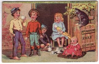
View on eBay

1880s Lion Coffee Victorian Trade Card Daffodils Winter Farm Scene Woolson Spice

1880s Lion Coffee Victorian Trade Card Daffodils Winter Farm Scene Woolson Spice — Yellow daffodils in a gilt-ringed circle beside a small winter vignette of a snowy farmhouse, on a pale green ground. Approx. 5.06 x 3.81 in.

$16.32

Description

Yellow daffodils in a gilt-ringed circle beside a small winter vignette of a snowy farmhouse, on a pale green ground.

The back is printed in black: "If you want a picture card like this buy a package of LION COFFEE. It is composed of a successful combination of Mocha, Java and Rio, and is roasted with the greatest care, but is not ground. Is never sold in bulk. Beautiful picture in every package. Lion is the King of Coffees. Manufactured by Woolson Spice Co., Toledo, Ohio."

Approx. 5.06 x 3.81 in.

Read the full description

Historical Context

The coffee that came with a picture. Lion Coffee began in Toledo, Ohio, in 1864 and became part of the Woolson Spice Company in 1882. Alvin Woolson built the brand by putting picture cards in every package, and the back of this card says so.

Condition

Front: very good, clean color. Back: small edge losses and scuffing at the corners and along the bottom line of text. Please see the photos, which are part of the description.

About The Printing

This is an original chromolithograph, and it was slow, exacting work. Each color had to be drawn onto its own separate stone by hand — in monochrome, the artist judging how much stipple each area needed so the colors would combine correctly only once every stone had been printed. The sheet then went through the press once for every color it carries, often a dozen or more, and every pass had to register exactly against the last. A pass out of register showed.

Under magnification the image resolves into irregular hand-drawn stipple, each ink carrying its own dot pattern, the colors mixing in the eye rather than on the paper. There is no regular halftone screen and no four-color rosette, which is what a modern reproduction would show. Modern process printing simulates every color from four inks; chromolithography laid each color down as its own.

The back is printed in black.

Provenance

From my family's estate collections, built over more than 60 years by knowledgeable antiques collectors and traders. Stored in a climate-controlled environment.

Also In Our Store

More Lion Coffee cards in our store: https://www.ebay.com/str/tfauctionsintl?_nkw=lion+coffee

More Victorian advertising trade cards are in our store.

Disclaimer

The images and any video show the actual item and are part of the official listing description, so please review them closely. Measurements and weights are approximate, and any maker or material we haven't confirmed is described as assumed. Questions? Message us; we answer quickly.
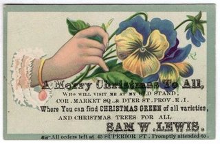
View on eBay

Victorian Trade Card Use Niagara Starch Girl Blue Beret Long Hair Lace Collar

Niagara Starch — Girl in a Blue Beret

$16.23

Original Victorian advertising trade card, chromolithograph, c. 1880s. Approx. 3.55 x 2.40 in.

A portrait of a young girl with long wavy light-brown hair under a large blue tam with a pompom and a maroon band, wearing a white dress with a ruffled lace collar, set against a soft stippled gray-blue ground. Lettered in script at the foot: Use Niagara Starch.

The reverse is blank.

Read the full description

Historical Context

Starch was a weekly chore product, used on collars, cuffs and shirt fronts, and nobody needed to be told what it was for. So the card does not explain the product at all. It shows a well-kept child in a crisp white dress with a lace collar and lets the reader draw the connection.

A card this plain on the back was meant for the album rather than the kitchen drawer. The name sits at the foot of the picture, where it would be seen every time the page was turned.

Condition

Toning and age typical of the period. The blank reverse has heavy tide-line staining with large pale patches, likely from an old album mounting; a small pale scuff to the right of the face on the front; minor edge and corner wear. The portrait on the front remains bright. Please view the images carefully.

About The Printing

This is an original chromolithograph, and it was slow, exacting work. Each color had to be drawn onto its own separate stone by hand — in monochrome, the artist judging how much stipple each area needed so the colors would combine correctly only once every stone had been printed. The sheet then went through the press once for every color it carries, often a dozen or more, and every pass had to register exactly against the last. A pass out of register showed.

Under magnification the image resolves into irregular hand-drawn stipple, each ink carrying its own dot pattern, the colors mixing in the eye rather than on the paper. There is no regular halftone screen and no four-color rosette, which is what a modern reproduction would show. Modern process printing simulates every color from four inks; chromolithography laid each color down as its own.

Provenance

This item comes from the personal collections of my family estate, accumulated over more than 200 years — including items that came west by wagon train to Colorado and later to Oklahoma. Now that my parents have passed we cannot keep all of these cherished items. They were well-educated antiques collectors/traders and continued to build their collections over more than 60 years. The vast majority of the pieces are from the Victorian Era, however there are plenty of older and newer items. Everything has been stored in a climate-controlled environment over time.

Disclaimer

Specifications and detailed item descriptions are provided as a courtesy only and are not guaranteed to be one hundred percent accurate. Please do your own research. There are generally no receipts available for any items from original purchases. Any dimensions and/or weights are approximate. The absence of a more detailed condition report does not imply there are no condition issues with the item(s). Please inspect images carefully as they are part of the official item description and best representation of the actual condition. Additional images may be available upon request depending on time and availability. Not responsible for internet mis-translations or mis-identification of maker's marks if found or assumptions of makers or materials — item descriptions will indicate if it is assumed. If you see a problem, please message us immediately and we will do our best to sort out a solution and confirm the information. With the exception of eBay rules, no returns are accepted.

View on eBay

1891 Arbuckle Ariosa Coffee Trade Card Antwerp #6 Trip Around the World Knapp

DESCRIPTION

$16.21 1891

Card number 6 from Arbuckle's "Trip Around the World" series, a montage of Antwerp. The tall Gothic spire of "ANTWERP CATHEDRAL" rises at left over a busy square; at upper right a "MILK-MAID" in a white winged bonnet; a pair of skaters on the ice; a long "VIEW OF ANTWERP" skyline with a windmill; "A FISHERMAN" with pipe and cap in a medallion; and "THE FISH MARKET" with a statue fountain. Caption: "ANTWERP, HOLLAND." Small print at lower left: "COPYRIGHT 1891 BY ARBUCKLE BROS. N.Y."

The back is printed in blue: "One of 50 views from a trip around the world." At left, "GRIND YOUR COFFEE AT HOME," with the Ariosa claims: "So long as ARIOSA remains in the whole berry, our glazing, composed of choice eggs and pure confectioners' A sugar, closes the pores of the coffee," and "ARIOSA COFFEE has during 25 years set the standard for all other roasted coffees." Signed "ARBUCKLE BROS. NEW YORK CITY" and "JOSEPH P. KNAPP, LITH. N.Y." At right, a history of Antwerp (Rubens, the Cathedral of Notre Dame, "Population, 221,360"). Number 6 at the foot. Approx. 3.05 x 5.05 in.

Read the full description

Historical Context

The coffee that won the West. The Arbuckle brothers began roasting coffee in Pittsburgh and moved the business to New York City in 1871. John Arbuckle patented an egg-based glaze for roasted beans in 1868, and the packaged Ariosa brand became famous on the frontier. The back of this card explains the glaze in the company's own words.

Fifty views of the world. This is number 6 of the 1891 "Views from a Trip Around the World" series, one of the many numbered sets Arbuckle packed with its coffee to keep families buying, and collecting.

Antwerp, Holland? The front captions the city as being in Holland, while the text on the back correctly calls Antwerp "the chief commercial city of Belgium." A small slip of the period that collectors enjoy.

Printed by Knapp. The card is signed by Joseph P. Knapp, Lith., N.Y., one of the major color printers behind the Arbuckle series.

Condition

Very good. Front: colors bright and clean; corners lightly worn, the upper right slightly soft; light edge wear. Back: even light toning and a few tiny specks; print crisp and fully legible. Please see the photos, which are part of the description.

About The Printing

This is an original chromolithograph, and it was slow, exacting work. Each color had to be drawn onto its own separate stone by hand — in monochrome, the artist judging how much stipple each area needed so the colors would combine correctly only once every stone had been printed. The sheet then went through the press once for every color it carries, often a dozen or more, and every pass had to register exactly against the last. A pass out of register showed.

Under magnification the image resolves into irregular hand-drawn stipple, each ink carrying its own dot pattern, the colors mixing in the eye rather than on the paper. There is no regular halftone screen and no four-color rosette, which is what a modern reproduction would show. Modern process printing simulates every color from four inks; chromolithography laid each color down as its own.

The back is printed in a single blue ink.

Provenance

From my family's estate collections, built over more than 60 years by knowledgeable antiques collectors and traders. Stored in a climate-controlled environment.

Also In Our Store

More Arbuckle and other Victorian coffee trade cards, and trade cards for thread and patent medicines, are in our store.

Disclaimer

Specifications and detailed item descriptions are provided as a courtesy only and are not guaranteed to be one hundred percent accurate. Please do your own research. There are generally no receipts available for any items from original purchases. Any dimensions and/or weights are approximate. The absence of a more detailed condition report does not imply there are no condition issues with the item(s). Please inspect images carefully as they are part of the official item description and best representation of the actual condition. Additional images may be available upon request depending on time and availability. Not responsible for internet mis-translations or mis-identification of maker's marks if found or assumptions of makers or materials — item descriptions will indicate if it is assumed. If you see a problem, please message us immediately and we will do our best to sort out a solution and confirm the information. With the exception of eBay rules, no returns are accepted.

View on eBay

Victorian Trade Card Electric Light Soap Electro Soap Mfg Co Indianapolis Roses

Electric-Light Soap — Electro Soap Mfg. Co., Indianapolis, Indiana

$16.13

Original Victorian advertising trade card, chromolithograph, c. 1880s-90s. Approx. 4.35 x 2.80 in.

A spray of pink and red roses and rosebuds, a yellow tea rose, a red blossom, blue cornflowers and grasses, with a small butterfly and a trailing blue ribbon, sweeps across the left of a white card. The advertiser's text is printed in black at the right: USE ELECTRIC-LIGHT SOAP. No rubbing required. ELECTRO SOAP M'F'G CO. INDIANAPOLIS, IND.

The reverse is blank; the front text shows through faintly.

Read the full description

Historical Context

Calling a soap “Electric-Light” in the 1880s was like calling a product “smart” today. Electric light was the newest and most astonishing thing a town could have, and very few homes did. The name borrowed the excitement without having anything to do with electricity at all.

“No rubbing required” was the real promise. Laundry was hard physical work, and a soap that claimed to take the scrubbing out of it was offering an afternoon back.

Condition

Toning and age typical of the period. A narrow toned band along the top edge of the front; faint show-through of the front text on the blank reverse; minor edge and corner wear. Colors remain strong. Please view the images carefully.

About The Printing

This is an original chromolithograph, and it was slow, exacting work. Each color had to be drawn onto its own separate stone by hand — in monochrome, the artist judging how much stipple each area needed so the colors would combine correctly only once every stone had been printed. The sheet then went through the press once for every color it carries, often a dozen or more, and every pass had to register exactly against the last. A pass out of register showed.

Under magnification the image resolves into irregular hand-drawn stipple, each ink carrying its own dot pattern, the colors mixing in the eye rather than on the paper. There is no regular halftone screen and no four-color rosette, which is what a modern reproduction would show. Modern process printing simulates every color from four inks; chromolithography laid each color down as its own.

Provenance

This item comes from the personal collections of my family estate, accumulated over more than 200 years — including items that came west by wagon train to Colorado and later to Oklahoma. Now that my parents have passed we cannot keep all of these cherished items. They were well-educated antiques collectors/traders and continued to build their collections over more than 60 years. The vast majority of the pieces are from the Victorian Era, however there are plenty of older and newer items. Everything has been stored in a climate-controlled environment over time.

Disclaimer

Specifications and detailed item descriptions are provided as a courtesy only and are not guaranteed to be one hundred percent accurate. Please do your own research. There are generally no receipts available for any items from original purchases. Any dimensions and/or weights are approximate. The absence of a more detailed condition report does not imply there are no condition issues with the item(s). Please inspect images carefully as they are part of the official item description and best representation of the actual condition. Additional images may be available upon request depending on time and availability. Not responsible for internet mis-translations or mis-identification of maker's marks if found or assumptions of makers or materials — item descriptions will indicate if it is assumed. If you see a problem, please message us immediately and we will do our best to sort out a solution and confirm the information. With the exception of eBay rules, no returns are accepted.

View on eBay

1920s Journal-Post Want Ad Card Lady in Garden Paper Lanterns Phone Main 4000

1920s Journal-Post Want Ad Card Lady in Garden Paper Lanterns Phone Main 4000 — A small vintage advertising card for the want ads of the Journal-Post. Approx. 2.45 x 3.90 in.

$16.02

Description

A small vintage advertising card for the want ads of the Journal-Post. A young woman with upswept dark hair, in a red sleeveless bodice and a full white skirt trimmed with red bows, glances back over her shoulder in a garden at dusk hung with Japanese-style paper lanterns. Below, in bold black type: "DO YOU WANT GOOD, RELIABLE HELP? A JOURNAL-POST WANT AD WILL PUT YOU IN TOUCH WITH THE RIGHT KIND. PHONE MAIN 4000." Small print at the foot: a circled-C copyright mark with a circled H and the number 1157, and "MADE IN U.S.A." The back is blank.

Vertical, approx. 2.45 x 3.90 in.

Read the full description

Historical Context

A Kansas City want ad? The card names no city. The best-known paper of the name is the Kansas City Journal-Post. Walter S. Dickey bought the Kansas City Journal and, in 1922, the Kansas City Post, and the two were combined as the Kansas City Journal-Post on October 4, 1928. The paper's last issue appeared on March 31, 1942.

Help wanted. Before employment agencies and job boards, a classified ad was how a household found a cook, a maid or a nurse, and newspapers promoted their want-ad columns with giveaways like this card.

Pocket-size advertising. Small enough for a purse or a desk drawer, the card kept the paper's telephone number at hand. "PHONE MAIN 4000" dates from the era of named telephone exchanges.

Condition

Very good. Front bright and clean, corners lightly rounded, light edge wear, and a tiny orange mark at the bottom edge. The blank back is lightly toned with faint mottling. Please see the photos, which are part of the description.

About The Printing

This is a color lithograph of the twentieth century, printed by a more modern commercial method. The exact process cannot be determined with certainty from a scan, so none is claimed here. Under magnification the image resolves into a regular, fine dot pattern rather than the irregular hand-drawn stipple of an 1880s chromolithograph.

That screen is exactly what a card of this date should show, so it is not a sign of reproduction here. The evidence of an original is the card itself: its printed text, its imprints and the wear of its age.

The want-ad text is printed in solid black type over the color picture.

Provenance

From my family's estate collections, built over more than 60 years by knowledgeable antiques collectors and traders. Stored in a climate-controlled environment.

Also In Our Store

More Journal-Post cards in our store: https://www.ebay.com/str/tfauctionsintl?_nkw=journal-post

A companion Journal-Post want-ad card with a different illustration, and more vintage advertising cards, are in our store.

Disclaimer

The images and any video show the actual item and are part of the official listing description, so please review them closely. Measurements and weights are approximate, and any maker or material we haven't confirmed is described as assumed. Questions? Message us; we answer quickly.
View on eBay

1880s Trade Card Clark's O.N.T. Spool Cotton Sunrise in the Desert Pyramids

1880s Trade Card Clark's O.N.T. Spool Cotton Sunrise in the Desert Pyramids — A large Victorian trade card for Clark's O.N.T. Approx. 7.00 x 5.05 in.

$15.98

Description

A large Victorian trade card for Clark's O.N.T. Spool Cotton, titled "Sunrise in the Desert." At left stands a mustached man in a white head wrap and cloak, a red embroidered jacket, a white sash and blue breeches, holding a long rifle. Behind him, in a diamond-shaped panel, the sun rises over the desert behind a camel caravan and two pyramids, with a bleached skull and ribs in the sand in the foreground. The Clark's O.N.T. Spool Cotton trademark roundel, in blue and yellow, is at lower right.

The back is printed in green around a large O.N.T. trademark: "If the Lady who receives this card will buy CLARK'S O.N.T. SPOOL COTTON, SHE WILL GET THE BEST THREAD FOR HAND & MACHINE SEWING. IT IS WOUND ON WHITE SPOOLS. The above label is on the bottom of every spool."

Horizontal, approx. 7.00 x 5.05 in.

Read the full description

Historical Context

Our New Thread. O.N.T. stood for "Our New Thread," the name Clark gave the product when it was introduced. The thread makers were among the busiest trade card advertisers of the 1880s, and Clark's cards were issued in long series.

Made in Newark. The Clark Thread Company's factory stood in Newark, New Jersey, on the west bank of the Passaic River.

Orientalist travel. Egypt and the Near East, with pyramids, caravans and desert guards in rich costume, were favorite subjects of Victorian painters and printers. This large card is a strong example for collectors of Orientalist imagery.

Written for the lady of the house. The back speaks directly to the woman who did the family sewing, and who, in the 1880s, often kept these cards in an album.

Condition

Front very good: clean and bright, corners sharp to lightly worn. A small light stain in the margin to the right of the trademark roundel, and a few tiny surface scuffs and dark flecks in the sand below the skull. The back shows extensive tan streaking from old album glue, with small areas of surface paper loss (thinning) at the upper left and along the left side; the printing remains complete and legible. No writing. Please see the photos, which are part of the description.

About The Printing

This is an original chromolithograph, and it was slow, exacting work. Each color had to be drawn onto its own separate stone by hand — in monochrome, the artist judging how much stipple each area needed so the colors would combine correctly only once every stone had been printed. The sheet then went through the press once for every color it carries, often a dozen or more, and every pass had to register exactly against the last. A pass out of register showed.

Under magnification the image resolves into irregular hand-drawn stipple, each ink carrying its own dot pattern, the colors mixing in the eye rather than on the paper. There is no regular halftone screen and no four-color rosette, which is what a modern reproduction would show. Modern process printing simulates every color from four inks; chromolithography laid each color down as its own.

The advertising on the back is printed in a single green ink.

Provenance

From my family's estate collections, built over more than 60 years by knowledgeable antiques collectors and traders. Stored in a climate-controlled environment.

Also In Our Store

More Clark's O.N.T. cards in our store: https://www.ebay.com/str/tfauctionsintl?_nkw=clark

More Victorian advertising trade cards for thread and sewing, along with other Orientalist and travel subjects, are in our store.

Disclaimer

The images and any video show the actual item and are part of the official listing description, so please review them closely. Measurements and weights are approximate, and any maker or material we haven't confirmed is described as assumed. Questions? Message us; we answer quickly.
View on eBay

1889 Arbuckle Coffee Trade Card No 82 South Dakota State Map Elk Herd Prairie

1889 Arbuckle Coffee Trade Card No 82 South Dakota State Map Elk Herd Prairie — Original Victorian advertising trade card, chromolithograph, copyright 1889 by Arbuckle Bros., N.Y. Approx. 5.05 x 3.05 in.

$15.77 1889

Description

Arbuckle Bros Ariosa Coffee — South Dakota, State Map No. 82

A colored map of South Dakota, its towns and rivers lettered in, with North Dakota, Minnesota, Nebraska, Wyoming and Montana around it. Below the map a herd of elk grazes across the prairie, and in the foreground a bull elk with a full spread of antlers stands over a resting cow. A scroll at the right reads: Area 74,450 Sq. Miles. Population 67,589.

The reverse is headed ARBUCKLES' Ariosa Coffee, COSTS MORE AND IS WORTH MORE THAN OTHER BRANDS OF COFFEE. WHY? Four numbered reasons follow: the coffee is made from green coffee of higher grade; its strength and aroma are retained by the glazing; the glazing is made of choice eggs and pure confectioners' “A” sugar; and it adds richness of flavor. A BEWARE paragraph warns against low-grade package coffee. A second column, READ THIS, explains the series — fifty cards, each showing a correct map of one State or Territory with pictures of its peculiar industries and scenery — and suggests that anyone with two cards of one kind exchange with a neighbor. A list of the states and territories represented follows. Arbuckle Bros. Coffee Company, New York. The card is numbered 82. Printed by Donaldson Brothers, N.Y.

Read the full description

Historical Context

This card catches South Dakota at the moment it became a state. The Dakota Territory was divided and both halves admitted in November 1889, the same year as the copyright line — and Arbuckle already had a card for each half.

The elk herd is the picture of the country before the settlers finished arriving. The population figure is the other clue. This card prints 67,589 and the North Dakota card 67,588 — together 135,177, the 1880 census count for the whole Dakota Territory. Arbuckle appears simply to have split the old figure in half, because no separate count for either state yet existed.

Condition

Toning and age typical of the period. Light surface soiling; minor edge and corner wear; toning to the reverse. The chromolithographed image remains bright and the reverse text fully legible. Please view the images carefully.

About The Printing

This is an original chromolithograph, and it was slow, exacting work. Each color had to be drawn onto its own separate stone by hand — in monochrome, the artist judging how much stipple each area needed so the colors would combine correctly only once every stone had been printed. The sheet then went through the press once for every color it carries, often a dozen or more, and every pass had to register exactly against the last. A pass out of register showed.

Under magnification the image resolves into irregular hand-drawn stipple, each ink carrying its own dot pattern, the colors mixing in the eye rather than on the paper. There is no regular halftone screen and no four-color rosette, which is what a modern reproduction would show. Modern process printing simulates every color from four inks; chromolithography laid each color down as its own.

Provenance

From my family's estate collections, built over more than 60 years by knowledgeable antiques collectors and traders. Stored in a climate-controlled environment.

Also In Our Store

More Victorian advertising trade cards are in our store.

Disclaimer

The images and any video show the actual item and are part of the official listing description, so please review them closely. Measurements and weights are approximate, and any maker or material we haven't confirmed is described as assumed. Questions? Message us; we answer quickly.
View on eBay

1889 Arbuckle Coffee Trade Card No 71 Siberia Map Convicts in Mines Polar Bear

1889 Arbuckle Coffee Trade Card No 71 Siberia Map Convicts in Mines Polar Bear — Original Victorian advertising trade card, chromolithograph, copyright 1889 by Arbuckle Bros., N.Y. Approx. 5.05 x 3.10 in.

$15.31 1889

Description

Arbuckle Bros Ariosa Coffee — Siberia, Map Card No. 71

A colored map of Siberia, from the Arctic Ocean to the Chinese Empire, with Persia, Afghanistan and Beloochistan to the south and the Pacific to the east, marked Russian Possession. A polar bear looks out from a red roundel in the corner, and a broken shackle and chain hang below the map. The main scene, captioned CONVICTS AT WORK IN THE MINES, shows a line of convicts swinging picks in the snow under guards in greatcoats and caps, bayonets fixed, icicles hanging overhead. The map panel reads: Area 6,288,000 Sq. M. Pop. 14,697,000. Russian Possession.

The reverse carries Arbuckle's GRIND YOUR COFFEE AT HOME advice and the ARIOSA claim, closing with the line that rival makers know no higher praise than to say “It's just as good as Arbuckles'.” An EXPLANATORY panel describes the series — fifty cards, each showing a correctly colored map of one of the chief countries of the world with pictures of its industries, scenery and customs — and explains that every package of Arbuckle's coffee contains one of these cards or one of the companion series of fifty Zoological cards. A list of the countries represented follows. Arbuckle Bros. Coffee Co., New York City. The card is numbered 71. Printed by Donaldson Brothers, N.Y.

Read the full description

Historical Context

Siberia was the one place on the foreign map series with no industry to show except punishment. Russia sent convicts and political exiles east to the mines, and by the late 1880s American readers knew about it from George Kennan's reports in The Century magazine, which caused a sensation.

The shackle and chain beside the map is not decoration. For an American coffee buyer in 1889, Siberia meant exile.

Condition

Toning and age typical of the period. Light surface soiling; minor edge and corner wear; toning to the reverse. The chromolithographed image remains bright and the reverse text fully legible. Please view the images carefully.

About The Printing

This is an original chromolithograph, and it was slow, exacting work. Each color had to be drawn onto its own separate stone by hand — in monochrome, the artist judging how much stipple each area needed so the colors would combine correctly only once every stone had been printed. The sheet then went through the press once for every color it carries, often a dozen or more, and every pass had to register exactly against the last. A pass out of register showed.

Under magnification the image resolves into irregular hand-drawn stipple, each ink carrying its own dot pattern, the colors mixing in the eye rather than on the paper. There is no regular halftone screen and no four-color rosette, which is what a modern reproduction would show. Modern process printing simulates every color from four inks; chromolithography laid each color down as its own.

Provenance

From my family's estate collections, built over more than 60 years by knowledgeable antiques collectors and traders. Stored in a climate-controlled environment.

Also In Our Store

More Victorian advertising trade cards are in our store.

Disclaimer

The images and any video show the actual item and are part of the official listing description, so please review them closely. Measurements and weights are approximate, and any maker or material we haven't confirmed is described as assumed. Questions? Message us; we answer quickly.
View on eBay

1920s Journal-Post Want Ad Advertising Card Lady in Fur Stole Phone Main 4000

1920s Journal-Post Want Ad Advertising Card Lady in Fur Stole Phone Main 4000 — A small vintage advertising card for the want ads of the Journal-Post. Approx. 2.50 x 3.90 in.

$15.26

Description

A small vintage advertising card for the want ads of the Journal-Post. A young woman with bobbed dark hair, in a white gown with a green sash and a dark fur stole over a mauve wrap, holds a posy of purple flowers in an elegant room with a shaded lamp, a fruit compote and a striped chair. Below, in bold black type: "DO YOU WANT GOOD, RELIABLE HELP? A JOURNAL-POST WANT AD WILL PUT YOU IN TOUCH WITH THE RIGHT KIND. PHONE MAIN 4000." Small print at the foot: "MADE IN U.S.A." and a circled-C copyright mark with a circled H and the number 1161 (best reading). The back is blank.

Vertical, approx. 2.50 x 3.90 in.

Read the full description

Historical Context

A Kansas City want ad? The card names no city. The best-known paper of the name is the Kansas City Journal-Post. Walter S. Dickey bought the Kansas City Journal and, in 1922, the Kansas City Post, and the two were combined as the Kansas City Journal-Post on October 4, 1928. The paper's last issue appeared on March 31, 1942.

Help wanted. Before employment agencies and job boards, a classified ad was how a household found a cook, a maid or a nurse, and newspapers promoted their want-ad columns with giveaways like this card.

Pocket-size advertising. Small enough for a purse or a desk drawer, the card kept the paper's telephone number at hand. "PHONE MAIN 4000" dates from the era of named telephone exchanges.

Condition

Very good. Front bright and clean, corners lightly rounded, light edge wear, and a few tiny brown age spots in the margins. The blank back is lightly toned, with a few small brown spots (foxing) toward the upper left. No writing. Please see the photos, which are part of the description.

About The Printing

This is a color lithograph of the twentieth century, printed by a more modern commercial method. The exact process cannot be determined with certainty from a scan, so none is claimed here. Under magnification the image resolves into a regular, fine dot pattern rather than the irregular hand-drawn stipple of an 1880s chromolithograph.

That screen is exactly what a card of this date should show, so it is not a sign of reproduction here. The evidence of an original is the card itself: its printed text, its imprints and the wear of its age.

The want-ad text is printed in solid black type over the color picture.

Provenance

From my family's estate collections, built over more than 60 years by knowledgeable antiques collectors and traders. Stored in a climate-controlled environment.

Also In Our Store

More Journal-Post cards in our store: https://www.ebay.com/str/tfauctionsintl?_nkw=journal-post

A companion Journal-Post want-ad card with a different illustration, and more vintage advertising cards, are in our store.

Disclaimer

The images and any video show the actual item and are part of the official listing description, so please review them closely. Measurements and weights are approximate, and any maker or material we haven't confirmed is described as assumed. Questions? Message us; we answer quickly.
View on eBay

Victorian Trade Card BBBB Coffee Acrostic Poem Red Rose Winter Abbey Ruin

Victorian Trade Card BBBB Coffee Acrostic Poem Red Rose Winter Abbey Ruin — Original Victorian advertising trade card, chromolithograph, c. 1880s-90s. Approx. 5.80 x 3.95 in.

$15.01

Description

“B.B.B.B.” Coffee — Red Rose with an Acrostic Back

A large deep-red rose with a bud, green leaves, fern and small yellow blossoms spreads across the upper part of the card, above a small winter scene of a turreted stone abbey beside a frozen pond. There is no lettering on the front.

The reverse is an acrostic — the first letter of each line spells out the brand. Do you Think? GOOD COFFEE SHOULD: Be free from all adulterations? Be possessed of considerable strength? Be sure to have a delicious flavor? Be FRESHLY ROASTED? IF SO, WE Certainly agree with you, On these all important points; For no single day passes but that we Freshly roast the “B.B.B.B.” the most Excellent grade of Coffee Ever put up in one-pound packages. Buy “B.B.B.B.”

Read the full description

Historical Context

Read down the left edge of the reverse and it spells B-B-B-B-C-O-F-F-E-E. A word puzzle on the back of a coffee card rewarded the reader for looking twice, and anyone who worked it out remembered the name.

The card does not say who roasted B.B.B.B. Coffee or where. That is part of its interest: a brand confident enough to go by four initials, and small enough that the name has not come down to us attached to a company.

Condition

Toning and age typical of the period. A small brown adhesion spot on the right of the reverse; a soft crease with light damage at the lower-right corner, visible on both sides; some rubbing across the center of the rose; light surface soiling. Colors remain rich. Please view the images carefully.

About The Printing

This is an original chromolithograph, and it was slow, exacting work. Each color had to be drawn onto its own separate stone by hand — in monochrome, the artist judging how much stipple each area needed so the colors would combine correctly only once every stone had been printed. The sheet then went through the press once for every color it carries, often a dozen or more, and every pass had to register exactly against the last. A pass out of register showed.

Under magnification the image resolves into irregular hand-drawn stipple, each ink carrying its own dot pattern, the colors mixing in the eye rather than on the paper. There is no regular halftone screen and no four-color rosette, which is what a modern reproduction would show. Modern process printing simulates every color from four inks; chromolithography laid each color down as its own.

Provenance

From my family's estate collections, built over more than 60 years by knowledgeable antiques collectors and traders. Stored in a climate-controlled environment.

Also In Our Store

More Victorian advertising trade cards are in our store.

Disclaimer

The images and any video show the actual item and are part of the official listing description, so please review them closely. Measurements and weights are approximate, and any maker or material we haven't confirmed is described as assumed. Questions? Message us; we answer quickly.
View on eBay

1889 Arbuckle Coffee Trade Card No 77 Illinois Map Watch Making Farm [SEE DESC]

Arbuckle Bros Ariosa Coffee — Illinois, State Map No. 77

$14.58 1889

Original Victorian advertising trade card, chromolithograph, copyright 1889 by Arbuckle Bros., N.Y. Approx. 5.05 x 3.05 in.

A colored map of Illinois, its towns and rivers lettered in, with Chicago on Lake Michigan and Wisconsin, Iowa, Missouri, Indiana and Kentucky around it. At the left, captioned WATCH MAKING, women work at benches in a factory under overhead belts, and a gold pocket watch lies open in a red presentation case. At the right, captioned AGRICULTURAL MACHINERY, a plow, a mower and a hay rake stand before a brick factory. Area in Sq. Miles 56,650. Population 3,077,871.

The reverse is headed ARBUCKLES' Ariosa Coffee, COSTS MORE AND IS WORTH MORE THAN OTHER BRANDS OF COFFEE. WHY? Four numbered reasons follow: the coffee is made from green coffee of higher grade; its strength and aroma are retained by the glazing; the glazing is made of choice eggs and pure confectioners' “A” sugar; and it adds richness of flavor. A BEWARE paragraph warns against low-grade package coffee. A second column, READ THIS, explains the series — fifty cards, each showing a correct map of one State or Territory with pictures of its peculiar industries and scenery — and suggests that anyone with two cards of one kind exchange with a neighbor. A list of the states and territories represented follows. Arbuckle Bros. Coffee Company, New York. The card is numbered 77. Printed by Donaldson Brothers, N.Y.

Read the full description

Historical Context

Illinois gets two industries that would both have been instantly recognizable to a buyer in 1889. The Elgin watch works outside Chicago was one of the largest in the world, and Illinois factories were making the plows and reapers that were opening the prairie farms further west.

The women at the watch benches are a detail worth noticing. Fine assembly work of this kind was widely given to women workers, and the card shows it as simply part of the scene.

Condition

Toning and age typical of the period. Light surface soiling; minor edge and corner wear; toning to the reverse. The chromolithographed image remains bright and the reverse text fully legible. Please view the images carefully.

About The Printing

This is an original chromolithograph, and it was slow, exacting work. Each color had to be drawn onto its own separate stone by hand — in monochrome, the artist judging how much stipple each area needed so the colors would combine correctly only once every stone had been printed. The sheet then went through the press once for every color it carries, often a dozen or more, and every pass had to register exactly against the last. A pass out of register showed.

Under magnification the image resolves into irregular hand-drawn stipple, each ink carrying its own dot pattern, the colors mixing in the eye rather than on the paper. There is no regular halftone screen and no four-color rosette, which is what a modern reproduction would show. Modern process printing simulates every color from four inks; chromolithography laid each color down as its own.

Provenance

This item comes from the personal collections of my family estate, accumulated over more than 200 years — including items that came west by wagon train to Colorado and later to Oklahoma. Now that my parents have passed we cannot keep all of these cherished items. They were well-educated antiques collectors/traders and continued to build their collections over more than 60 years. The vast majority of the pieces are from the Victorian Era, however there are plenty of older and newer items. Everything has been stored in a climate-controlled environment over time.

Disclaimer

Specifications and detailed item descriptions are provided as a courtesy only and are not guaranteed to be one hundred percent accurate. Please do your own research. There are generally no receipts available for any items from original purchases. Any dimensions and/or weights are approximate. The absence of a more detailed condition report does not imply there are no condition issues with the item(s). Please inspect images carefully as they are part of the official item description and best representation of the actual condition. Additional images may be available upon request depending on time and availability. Not responsible for internet mis-translations or mis-identification of maker's marks if found or assumptions of makers or materials — item descriptions will indicate if it is assumed. If you see a problem, please message us immediately and we will do our best to sort out a solution and confirm the information. With the exception of eBay rules, no returns are accepted.

View on eBay

1889 Arbuckle Coffee Trade Card No 96 North Dakota Map Wheat Reaping [SEE DESC]

Arbuckle Bros Ariosa Coffee — North Dakota, State Map No. 96

$14.47 1889

Original Victorian advertising trade card, chromolithograph, copyright 1889 by Arbuckle Bros., N.Y. Approx. 5.05 x 3.05 in.

A colored map of North Dakota, its towns, forts and rivers lettered in, with Canada, Minnesota, South Dakota and Montana around it, hung from a ribbon with a sheaf of golden wheat. Captioned WHEAT FIELDS, the scene runs across the whole card: at the left, SOWING, farmers with horse-drawn seed drills, a wagon and sacks of seed; at the right, REAPING, a horse-drawn binder cutting the grain and shocks of wheat standing in the field. A gold cartouche reads: Area 77,000 Sq. Miles. Population 67,588.

The reverse is headed ARBUCKLES' Ariosa Coffee, COSTS MORE AND IS WORTH MORE THAN OTHER BRANDS OF COFFEE. WHY? Four numbered reasons follow: the coffee is made from green coffee of higher grade; its strength and aroma are retained by the glazing; the glazing is made of choice eggs and pure confectioners' “A” sugar; and it adds richness of flavor. A BEWARE paragraph warns against low-grade package coffee. A second column, READ THIS, explains the series — fifty cards, each showing a correct map of one State or Territory with pictures of its peculiar industries and scenery — and suggests that anyone with two cards of one kind exchange with a neighbor. A list of the states and territories represented follows. Arbuckle Bros. Coffee Company, New York. The card is numbered 96. Printed by Donaldson Brothers, N.Y.

Read the full description

Historical Context

North Dakota in 1889 was wheat, and nothing else on the card needs saying. The great bonanza farms of the Red River Valley ran to tens of thousands of acres, worked by gangs of men and machines exactly like the ones drawn here.

Like the South Dakota card, this one arrived just as the territory was divided. Both halves became states in November 1889, and Arbuckle had a map ready for each. The population figures give the game away: this card prints 67,588 and the South Dakota card 67,589. Together they make 135,177, the 1880 census count for the whole Dakota Territory. Arbuckle appears simply to have split the old figure in half.

Condition

Toning and age typical of the period. Light surface soiling; minor edge and corner wear; toning to the reverse. The chromolithographed image remains bright and the reverse text fully legible. Please view the images carefully.

About The Printing

This is an original chromolithograph, and it was slow, exacting work. Each color had to be drawn onto its own separate stone by hand — in monochrome, the artist judging how much stipple each area needed so the colors would combine correctly only once every stone had been printed. The sheet then went through the press once for every color it carries, often a dozen or more, and every pass had to register exactly against the last. A pass out of register showed.

Under magnification the image resolves into irregular hand-drawn stipple, each ink carrying its own dot pattern, the colors mixing in the eye rather than on the paper. There is no regular halftone screen and no four-color rosette, which is what a modern reproduction would show. Modern process printing simulates every color from four inks; chromolithography laid each color down as its own.

Provenance

This item comes from the personal collections of my family estate, accumulated over more than 200 years — including items that came west by wagon train to Colorado and later to Oklahoma. Now that my parents have passed we cannot keep all of these cherished items. They were well-educated antiques collectors/traders and continued to build their collections over more than 60 years. The vast majority of the pieces are from the Victorian Era, however there are plenty of older and newer items. Everything has been stored in a climate-controlled environment over time.

Disclaimer

Specifications and detailed item descriptions are provided as a courtesy only and are not guaranteed to be one hundred percent accurate. Please do your own research. There are generally no receipts available for any items from original purchases. Any dimensions and/or weights are approximate. The absence of a more detailed condition report does not imply there are no condition issues with the item(s). Please inspect images carefully as they are part of the official item description and best representation of the actual condition. Additional images may be available upon request depending on time and availability. Not responsible for internet mis-translations or mis-identification of maker's marks if found or assumptions of makers or materials — item descriptions will indicate if it is assumed. If you see a problem, please message us immediately and we will do our best to sort out a solution and confirm the information. With the exception of eBay rules, no returns are accepted.

View on eBay

Clark's Mile End Thread Trade Card No 6 Bullfinch Poem Giacomelli Song Birds

Clark's Mile-End Spool Cotton — “The Bullfinch,” No. 6 of Twelve Aquarelles after Hector Giacomelli

$14.39

Original Victorian advertising trade card, chromolithograph, c. 1880s. Approx. 4.50 x 2.90 in. Printed by Donaldson Brothers, N.Y.

A bullfinch perches on top of a white panel carrying a poem, while two more birds sit in a nest of twigs and grasses below. A Clark's Mile-End spool-end label, numbered 24, sits in the lower left corner. The poem, THE BULLFINCH, is set in blackletter:

The Bullfinch, clad in sober Garb,

Whistles a most melodious lay,

And of all feathered songsters is

The daintiest gourmand, people say.

The ripest grains, most luscious fruits

Into his larder are impressed!

He scorns to eat of common fare;

He will have nothing but the best.

The Bullfinch teaches you a truth,

That if were well to heed, my friend:

Don't buy poor thread, it's worse than none

Purchase the best, 'tis “Clark's Mile End.”

The reverse, printed in blue, explains the series: the proprietors of Clark's Mile End Spool Cotton propose to issue a series of twelve aquarelles from designs by the celebrated Parisian artist Hector Giacomelli, illustrative of our native song birds, and asks the reader to preserve the cards as issued. Below: Families and Dressmakers should use CLARK'S MILE-END SPOOL COTTON, BEST SIX CORD for Machine and Hand Use. Thomas Russell & Co., Sole Agents. The card is numbered 6.

Read the full description

Historical Context

Giacomelli was a real name in Paris, known for his bird illustrations, and the thread company put that name on the back for a reason. A set of twelve fine bird pictures, issued one at a time and each with its own verse, was something a household would keep in order in an album. “Preserve the cards as issued” is the company telling you so.

The poem does the selling the picture will not. Three verses about a bird that will eat only the best, and the last two lines turn it round on the thread.

Condition

Toning and age typical of the period. The printed ground stops a little short of the right edge, leaving a narrow unprinted strip as trimmed at the time; light surface soiling; minor edge and corner wear. The reverse is clean with strong blue printing. Please view the images carefully.

About The Printing

This is an original chromolithograph, and it was slow, exacting work. Each color had to be drawn onto its own separate stone by hand — in monochrome, the artist judging how much stipple each area needed so the colors would combine correctly only once every stone had been printed. The sheet then went through the press once for every color it carries, often a dozen or more, and every pass had to register exactly against the last. A pass out of register showed.

Under magnification the image resolves into irregular hand-drawn stipple, each ink carrying its own dot pattern, the colors mixing in the eye rather than on the paper. There is no regular halftone screen and no four-color rosette, which is what a modern reproduction would show. Modern process printing simulates every color from four inks; chromolithography laid each color down as its own.

Provenance

This item comes from the personal collections of my family estate, accumulated over more than 200 years — including items that came west by wagon train to Colorado and later to Oklahoma. Now that my parents have passed we cannot keep all of these cherished items. They were well-educated antiques collectors/traders and continued to build their collections over more than 60 years. The vast majority of the pieces are from the Victorian Era, however there are plenty of older and newer items. Everything has been stored in a climate-controlled environment over time.

Disclaimer

Specifications and detailed item descriptions are provided as a courtesy only and are not guaranteed to be one hundred percent accurate. Please do your own research. There are generally no receipts available for any items from original purchases. Any dimensions and/or weights are approximate. The absence of a more detailed condition report does not imply there are no condition issues with the item(s). Please inspect images carefully as they are part of the official item description and best representation of the actual condition. Additional images may be available upon request depending on time and availability. Not responsible for internet mis-translations or mis-identification of maker's marks if found or assumptions of makers or materials — item descriptions will indicate if it is assumed. If you see a problem, please message us immediately and we will do our best to sort out a solution and confirm the information. With the exception of eBay rules, no returns are accepted.

View on eBay

1880s Stock Trade Card Boys in Shoe Sleigh Pulled by Dog Holly Winter Scene

1880s Stock Trade Card Boys in Shoe Sleigh Pulled by Dog Holly Winter Scene — A Victorian stock trade card with no advertiser imprint on either side. Approx. 4.40 x 2.80 in.

$14.38

Description

A Victorian stock trade card with no advertiser imprint on either side. Two small boys ride a giant black shoe fitted as a sleigh, the older one in a brown hat and red scarf driving with reins and a switch, the younger clinging behind him. A shaggy golden dog in a red harness pulls them at a run across the ice, while a hat flies off behind a load of holly with red berries. Behind them stand a snow-roofed farmhouse and bare winter trees under a blue-grey sky. Dark borders at top and bottom. There is no printed text on the front or the back; the reverse is blank.

Approx. 4.40 x 2.80 in.

Read the full description

Historical Context

A card waiting for a name. Lithographers printed picture cards in quantity and sold them to merchants, who had their names added for their own customers. This one was never imprinted, so it survives exactly as it left the printer.

Dogs and children. A dog in harness pulling children in a shoe brings together two favorite Victorian subjects, with holly for the holidays, and it crosses over to dog, winter and Christmas collectors.

The trade card craze. In the 1880s cheap color printing put picture cards on every store counter, and families pasted them into scrapbooks by the hundred.

Condition

Very good. Bright colors and clean front; corners sharp with light wear. A small dark spot in the sky at upper left. The blank reverse is toned with an overall mottled, wavy staining pattern. Please see the photos, which are part of the description.

About The Printing

This is an original chromolithograph, and it was slow, exacting work. Each color had to be drawn onto its own separate stone by hand — in monochrome, the artist judging how much stipple each area needed so the colors would combine correctly only once every stone had been printed. The sheet then went through the press once for every color it carries, often a dozen or more, and every pass had to register exactly against the last. A pass out of register showed.

Under magnification the image resolves into irregular hand-drawn stipple, each ink carrying its own dot pattern, the colors mixing in the eye rather than on the paper. There is no regular halftone screen and no four-color rosette, which is what a modern reproduction would show. Modern process printing simulates every color from four inks; chromolithography laid each color down as its own.

The reverse is blank.

Provenance

From my family's estate collections, built over more than 60 years by knowledgeable antiques collectors and traders. Stored in a climate-controlled environment.

Also In Our Store

More Victorian trade cards with dogs, children and winter scenes are in our store.

Disclaimer

The images and any video show the actual item and are part of the official listing description, so please review them closely. Measurements and weights are approximate, and any maker or material we haven't confirmed is described as assumed. Questions? Message us; we answer quickly.
View on eBay

1889 Arbuckle Coffee Trade Card No 97 Colorado State Map Pikes Peak Silver Mine

Arbuckle Bros Ariosa Coffee — Colorado, State Map No. 97

$14.28 1889

Original Victorian advertising trade card, chromolithograph, copyright 1889 by Arbuckle Bros., N.Y. Approx. 5.05 x 3.00 in.

A colored map of Colorado, its towns, parks and rivers lettered in, with Wyoming, Nebraska, Kansas, New Mexico, Utah, Arizona, Texas and the Public Lands around it. It is flanked by two mountain views, PIKE'S PEAK at the left above a forest of pines, and MT. OF THE HOLY CROSS at the right, with a SILVER MINE and its mill buildings at the foot. A scroll reads: Area 103,925 Sq. Miles. Population 194,327.

The reverse is headed ARBUCKLES' Ariosa Coffee, COSTS MORE AND IS WORTH MORE THAN OTHER BRANDS OF COFFEE. WHY? Four numbered reasons follow: the coffee is made from green coffee of higher grade; its strength and aroma are retained by the glazing; the glazing is made of choice eggs and pure confectioners' “A” sugar; and it adds richness of flavor. A BEWARE paragraph warns against low-grade package coffee. A second column, READ THIS, explains the series — fifty cards, each showing a correct map of one State or Territory with pictures of its peculiar industries and scenery — and suggests that anyone with two cards of one kind exchange with a neighbor. A list of the states and territories represented follows. Arbuckle Bros. Coffee Company, New York. The card is numbered 97. Printed by Donaldson Brothers, N.Y.

Read the full description

Historical Context

Colorado in 1889 meant mountains and silver. Leadville and the other mining camps had made fortunes in the previous decade, and the silver mine at the foot of the card was the reason most people had come.

The Mount of the Holy Cross was famous from William Henry Jackson's photograph of the snow-filled cross on its face, and it was one of the best-known mountain views in America. The card puts it alongside Pike's Peak as the two Colorado landmarks a buyer back east would recognize.

Condition

Toning and age typical of the period. Light surface soiling; minor edge and corner wear; toning to the reverse. The chromolithographed image remains bright and the reverse text fully legible. Please view the images carefully.

About The Printing

This is an original chromolithograph, and it was slow, exacting work. Each color had to be drawn onto its own separate stone by hand — in monochrome, the artist judging how much stipple each area needed so the colors would combine correctly only once every stone had been printed. The sheet then went through the press once for every color it carries, often a dozen or more, and every pass had to register exactly against the last. A pass out of register showed.

Under magnification the image resolves into irregular hand-drawn stipple, each ink carrying its own dot pattern, the colors mixing in the eye rather than on the paper. There is no regular halftone screen and no four-color rosette, which is what a modern reproduction would show. Modern process printing simulates every color from four inks; chromolithography laid each color down as its own.

Provenance

This item comes from the personal collections of my family estate, accumulated over more than 200 years — including items that came west by wagon train to Colorado and later to Oklahoma. Now that my parents have passed we cannot keep all of these cherished items. They were well-educated antiques collectors/traders and continued to build their collections over more than 60 years. The vast majority of the pieces are from the Victorian Era, however there are plenty of older and newer items. Everything has been stored in a climate-controlled environment over time.

Disclaimer

Specifications and detailed item descriptions are provided as a courtesy only and are not guaranteed to be one hundred percent accurate. Please do your own research. There are generally no receipts available for any items from original purchases. Any dimensions and/or weights are approximate. The absence of a more detailed condition report does not imply there are no condition issues with the item(s). Please inspect images carefully as they are part of the official item description and best representation of the actual condition. Additional images may be available upon request depending on time and availability. Not responsible for internet mis-translations or mis-identification of maker's marks if found or assumptions of makers or materials — item descriptions will indicate if it is assumed. If you see a problem, please message us immediately and we will do our best to sort out a solution and confirm the information. With the exception of eBay rules, no returns are accepted.

View on eBay

1880s Trade Card Clark's O.N.T. Spool Cotton Crowd of Babies Milward Needles

DESCRIPTION

$13.90

A crowd of eleven babies and small children in lace collars, bonnets and Sunday dresses presses around a large round spool end, the centerpiece an embossed medallion of a little girl in a lace bonnet tied with a blue bow. A doll in a white dress and bonnet sits at lower left. Small artist's or printer's mark at lower left, best reading "M&Co."

The back is printed in blue: "CLARK'S O.N.T. SPOOL COTTON in White, Fast Black and All the New Colors is 'AHEAD OF ALL OF THEM' for Hand and Machine Sewing. Garments sewed with our FAST BLACK will never show white on the Seams af[ter] being worn or washed." Below the rule, partly lost to damage: "MILWARD'S [HEL]IX NE[EDLES] (Est[ablished] ... 1730) EACH NEEDLE PER[FECT]" (best reading). Approx. 2.80 x 4.25 in.

Read the full description

Historical Context

Our New Thread. "O.N.T." stood for "Our New Thread," the Clark Thread Company's famous brand. The Clark family's thread business began at Paisley, Scotland, in 1812, and George A. Clark completed a large new mill in Newark, New Jersey, in 1866; the company even named its soccer team Clark O.N.T.

Fast black. The back's selling point is a dye that would not fade: thread that "will never show white on the Seams" after wear and washing.

Thread and needles together. The back also advertises Milward's needles, an old English needle-making name, on the same card as the thread.

A crowd of babies. Victorian printers loved a crush of round-faced babies, and this embossed example, with its doll and bonneted centerpiece, is a crossover piece for collectors of children and doll imagery.

Condition

Sold as-is for its image. Front: the upper right corner is missing (paper loss about 0.3 in. deep) with grey smudging around the break; a short white surface crease at the bottom center; light rubbing to the embossed medallion; edges toned; colors otherwise strong. Back: paper loss at the upper left corner; a band of surface scuffing and thinning across the lower right that removes parts of the Milward's needle text; light toning overall. Please see the photos, which are part of the description.

About The Printing

This is an original chromolithograph, and it was slow, exacting work. Each color had to be drawn onto its own separate stone by hand — in monochrome, the artist judging how much stipple each area needed so the colors would combine correctly only once every stone had been printed. The sheet then went through the press once for every color it carries, often a dozen or more, and every pass had to register exactly against the last. A pass out of register showed.

Under magnification the image resolves into irregular hand-drawn stipple, each ink carrying its own dot pattern, the colors mixing in the eye rather than on the paper. There is no regular halftone screen and no four-color rosette, which is what a modern reproduction would show. Modern process printing simulates every color from four inks; chromolithography laid each color down as its own.

The central medallion is embossed, and the back is printed in a single blue ink.

Provenance

From my family's estate collections, built over more than 60 years by knowledgeable antiques collectors and traders. Stored in a climate-controlled environment.

Also In Our Store

More Victorian advertising trade cards for thread, sewing notions and patent medicines are in our store.

Disclaimer

Specifications and detailed item descriptions are provided as a courtesy only and are not guaranteed to be one hundred percent accurate. Please do your own research. There are generally no receipts available for any items from original purchases. Any dimensions and/or weights are approximate. The absence of a more detailed condition report does not imply there are no condition issues with the item(s). Please inspect images carefully as they are part of the official item description and best representation of the actual condition. Additional images may be available upon request depending on time and availability. Not responsible for internet mis-translations or mis-identification of maker's marks if found or assumptions of makers or materials — item descriptions will indicate if it is assumed. If you see a problem, please message us immediately and we will do our best to sort out a solution and confirm the information. With the exception of eBay rules, no returns are accepted.

View on eBay

1889 Arbuckle Coffee Trade Card No 92 Mexico Map Bull Fighting Mules [SEE DESC]

Arbuckle Bros Ariosa Coffee — Mexico, Map Card No. 92

$13.66 1889

Original Victorian advertising trade card, chromolithograph, copyright 1889 by Arbuckle Bros., N.Y. Approx. 4.95 x 3.15 in.

A colored map of Mexico, its states and towns lettered in, with the United States to the north, the Gulf of Mexico and the Pacific Ocean on either side, and Central America to the south. At the left, captioned BULL FIGHTING, a matador with a red cape and a mounted picador face a charging bull before a stand of spectators hung with flags. An inset at the upper right, captioned MULE TRAIN CROSSING THE MOUNTAINS, shows pack mules on a mountain trail. The map panel gives the government as a Federal Republic, with Pop. 10,000,000 and Area 772,000 Sq. M. printed beneath.

The reverse carries Arbuckle's GRIND YOUR COFFEE AT HOME advice and the ARIOSA claim, closing with the line that rival makers know no higher praise than to say “It's just as good as Arbuckles'.” An EXPLANATORY panel describes the series — fifty cards, each showing a correctly colored map of one of the chief countries of the world with pictures of its industries, scenery and customs — and explains that every package of Arbuckle's coffee contains one of these cards or one of the companion series of fifty Zoological cards. A list of the countries represented follows. Arbuckle Bros. Coffee Co., New York City. The card is numbered 92. Printed by Donaldson Brothers, N.Y.

Read the full description

Historical Context

Mexico in 1889 was drawing American railroads and investment south, and the mule train in the corner shows the country those railroads were replacing — goods carried over the mountains on animals, as they had been for centuries.

The bullfight was the image every American reader associated with Mexico, and the card leads with it. It is the most dramatic scene in the foreign map series.

Condition

Toning and age typical of the period. Light surface soiling; minor edge and corner wear; toning to the reverse. The chromolithographed image remains bright and the reverse text fully legible. Please view the images carefully.

About The Printing

This is an original chromolithograph, and it was slow, exacting work. Each color had to be drawn onto its own separate stone by hand — in monochrome, the artist judging how much stipple each area needed so the colors would combine correctly only once every stone had been printed. The sheet then went through the press once for every color it carries, often a dozen or more, and every pass had to register exactly against the last. A pass out of register showed.

Under magnification the image resolves into irregular hand-drawn stipple, each ink carrying its own dot pattern, the colors mixing in the eye rather than on the paper. There is no regular halftone screen and no four-color rosette, which is what a modern reproduction would show. Modern process printing simulates every color from four inks; chromolithography laid each color down as its own.

Provenance

This item comes from the personal collections of my family estate, accumulated over more than 200 years — including items that came west by wagon train to Colorado and later to Oklahoma. Now that my parents have passed we cannot keep all of these cherished items. They were well-educated antiques collectors/traders and continued to build their collections over more than 60 years. The vast majority of the pieces are from the Victorian Era, however there are plenty of older and newer items. Everything has been stored in a climate-controlled environment over time.

Disclaimer

Specifications and detailed item descriptions are provided as a courtesy only and are not guaranteed to be one hundred percent accurate. Please do your own research. There are generally no receipts available for any items from original purchases. Any dimensions and/or weights are approximate. The absence of a more detailed condition report does not imply there are no condition issues with the item(s). Please inspect images carefully as they are part of the official item description and best representation of the actual condition. Additional images may be available upon request depending on time and availability. Not responsible for internet mis-translations or mis-identification of maker's marks if found or assumptions of makers or materials — item descriptions will indicate if it is assumed. If you see a problem, please message us immediately and we will do our best to sort out a solution and confirm the information. With the exception of eBay rules, no returns are accepted.

View on eBay

Victorian Trade Card McLaughlin's XXXX Coffee Chicago Boy Portrait Sepia Stipple

McLaughlin's XXXX Coffee — W. F. McLaughlin & Co., Chicago

$13.63

Original Victorian advertising trade card, single-color lithograph on tinted stock, c. 1880s. Approx. 3.50 x 2.30 in.

A portrait of a boy with long curling hair and a wide open collar, one hand held to his chest, printed in a single deep brown-violet ink in the manner of a stipple engraving. Lettered in script beside him: McLaughlin's XXXX Coffee.

The reverse reads: McLAUGHLIN'S ROASTED COFFEE, ONE POUND PACKAGES. BEST VALUE FOR YOUR MONEY. It costs the grocer more money than any other package Coffee, but to the consumer is worth at least 5 cents a pound more. Try it once and we will guarantee you will have no other. For sale by all the best grocers. W. F. McLAUGHLIN & CO., Importers, Jobbers and Roasters of Coffee, 82, 84, 86 and 88 South Water St., CHICAGO.

Read the full description

Historical Context

The back makes an unusual confession: this coffee costs the grocer more than any other package brand. Most advertisers hid their price. McLaughlin put it up front and turned it into the argument — the grocer pays more, so the grocer must think it is worth it, and you get five cents a pound of value you did not pay for.

Packaged coffee in one-pound bags was still a new idea. Most people bought coffee loose, often green, and roasted it at home. A card like this was selling the package as much as the coffee.

Condition

Toning and age typical of the period. A paler strip along the left edge of the front; a small stain on the boy's cheek; light foxing to the lower left of the reverse; minor edge and corner wear. The printed image remains clear and the reverse text fully legible. Please view the images carefully.

About The Printing

This card was printed from a single stone in one ink, on tinted stock — an economical choice, since the colored card supplies a second tone at no extra press pass. The design was drawn by hand in reverse on the stone, the shading built from the density of the drawn marks rather than from color.

Under magnification the tone resolves into hand-drawn stipple, not a mechanical screen. There is no halftone screen and no four-color rosette, which is what a modern reproduction would show.

Provenance

This item comes from the personal collections of my family estate, accumulated over more than 200 years — including items that came west by wagon train to Colorado and later to Oklahoma. Now that my parents have passed we cannot keep all of these cherished items. They were well-educated antiques collectors/traders and continued to build their collections over more than 60 years. The vast majority of the pieces are from the Victorian Era, however there are plenty of older and newer items. Everything has been stored in a climate-controlled environment over time.

Disclaimer

Specifications and detailed item descriptions are provided as a courtesy only and are not guaranteed to be one hundred percent accurate. Please do your own research. There are generally no receipts available for any items from original purchases. Any dimensions and/or weights are approximate. The absence of a more detailed condition report does not imply there are no condition issues with the item(s). Please inspect images carefully as they are part of the official item description and best representation of the actual condition. Additional images may be available upon request depending on time and availability. Not responsible for internet mis-translations or mis-identification of maker's marks if found or assumptions of makers or materials — item descriptions will indicate if it is assumed. If you see a problem, please message us immediately and we will do our best to sort out a solution and confirm the information. With the exception of eBay rules, no returns are accepted.

View on eBay

1880s Lion Coffee Trade Card Bullfinch Pink Flower Winter Cottage Woolson Spice

1880s Lion Coffee Trade Card Bullfinch Pink Flower Winter Cottage Woolson Spice — A bullfinch perched on a branch above a pink flower, with a round winter vignette of a snowy cottage. Approx. 3.39 x 5.36 in.

$13.52

Description

A bullfinch perched on a branch above a pink flower, with a round winter vignette of a snowy cottage.

The back is printed in black in a mix of decorative typefaces: "If you want a Picture Card like this buy a package of LION COFFEE. It is composed of a successful combination of Mocha, Java and Rio, and is roasted with the greatest care but is not ground. Is never sold in bulk. Beautiful Picture in Every Package. Lion is the King of Coffees. Manufactured by Woolson Spice Co., Toledo, Ohio."

Approx. 3.39 x 5.36 in.

Read the full description

Historical Context

The coffee that came with a picture. Lion Coffee began in Toledo, Ohio, in 1864 and became part of the Woolson Spice Company in 1882. Alvin Woolson built the brand by putting picture cards in every package, and the back of this card says so.

Condition

Front: very good, clean color. Back: heavy staining and scuffing, with small paper losses at the corners; text legible. Please see the photos, which are part of the description.

About The Printing

This is an original chromolithograph, and it was slow, exacting work. Each color had to be drawn onto its own separate stone by hand — in monochrome, the artist judging how much stipple each area needed so the colors would combine correctly only once every stone had been printed. The sheet then went through the press once for every color it carries, often a dozen or more, and every pass had to register exactly against the last. A pass out of register showed.

Under magnification the image resolves into irregular hand-drawn stipple, each ink carrying its own dot pattern, the colors mixing in the eye rather than on the paper. There is no regular halftone screen and no four-color rosette, which is what a modern reproduction would show. Modern process printing simulates every color from four inks; chromolithography laid each color down as its own.

The back is printed in black.

Provenance

From my family's estate collections, built over more than 60 years by knowledgeable antiques collectors and traders. Stored in a climate-controlled environment.

Also In Our Store

More Lion Coffee cards in our store: https://www.ebay.com/str/tfauctionsintl?_nkw=lion+coffee

More Victorian advertising trade cards are in our store.

Disclaimer

The images and any video show the actual item and are part of the official listing description, so please review them closely. Measurements and weights are approximate, and any maker or material we haven't confirmed is described as assumed. Questions? Message us; we answer quickly.
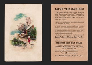
View on eBay

1880s Trade Card Arm & Hammer Soda Beautiful Flowers No. 39 Fuchsia New York

DESCRIPTION

$13.37

A small Arm & Hammer flower card: a spray of fuchsias, pink, red, white and deep purple, hanging from a curling stem with broad green leaves, on a cream ground. At lower left is the round Arm & Hammer Brand trademark, "Church & Co. New York", with the arm and hammer at center. Printed at the foot: "Fuchsia" and "39".

The back is printed in black: "New Series / Beautiful Flowers / No. 39", with the note that the card "has no connection with any Lottery, and does not draw a prize" and that "The perfect quality of the Arm & Hammer Brand of Soda and Saleratus is sufficient inducement for all intelligent consumers to BUY ONLY THAT BRAND." A set of 60 could be had by mail for "six two cent stamps". Under "Important Reasons" it argues for package soda over bulk soda "weighed and wrapped by the dealer". Imprint: "The Great Arm & Hammer Brand Soda and Saleratus, 129 Pearl St. New York", with the round Church & Co. trademark. Printer: "Beacon Lith. Co. Boston." A few words at the top of the back are covered by an old piece of paper (see Condition).

Approx. 1.85 x 2.95 in.

Read the full description

Historical Context

A brand older than the box. The Arm & Hammer name and logo date back to the 1860s. Church & Co., whose name is on this card, later joined with John Dwight & Co. as Church & Dwight in 1896, and the arm and hammer is still on the box today.

Collect all sixty. The back says it plainly: a set of these cards, 60 in all, "accumulated in the ordinary course of buying housekeeping supplies will form an interesting collection." Arm & Hammer flower, bird and animal series were saved in albums by the thousands, and collectors still build the sets number by number.

Package versus bulk. The back also makes a case that sounds modern: buy the sealed, branded package, not soda scooped from the grocer's barrel, because the brand carries "the guarantee of a responsible manufacturer."

For the garden collector. The fuchsia, drawn in four colors from bud to full bloom, makes this a natural fit for botanical and flower collectors as well as advertising collectors.

Condition

Used, with honest age wear. Front: bright color; light soiling and a few small grey specks in the cream margin and on the leaves; a small tan strip of old paper residue at the top edge; corners lightly rounded. Back: an old piece of blue-green paper or tape about 0.6 in. wide is stuck at top center, covering part of the heading and first lines; a small dark spot at the left edge; even toning. Please see the photos, which are part of the description.

About The Printing

This is an original chromolithograph, and it was slow, exacting work. Each color had to be drawn onto its own separate stone by hand — in monochrome, the artist judging how much stipple each area needed so the colors would combine correctly only once every stone had been printed. The sheet then went through the press once for every color it carries, often a dozen or more, and every pass had to register exactly against the last. A pass out of register showed.

Under magnification the image resolves into irregular hand-drawn stipple, each ink carrying its own dot pattern, the colors mixing in the eye rather than on the paper. There is no regular halftone screen and no four-color rosette, which is what a modern reproduction would show. Modern process printing simulates every color from four inks; chromolithography laid each color down as its own.

The back is printed in black letterpress-style type, separate from the color work on the front.

Provenance

From my family's estate collections, built over more than 60 years by knowledgeable antiques collectors and traders. Stored in a climate-controlled environment.

Also In Our Store

More Victorian advertising trade cards for baking soda, coffee and patent medicines are in our store.

Disclaimer

Specifications and detailed item descriptions are provided as a courtesy only and are not guaranteed to be one hundred percent accurate. Please do your own research. There are generally no receipts available for any items from original purchases. Any dimensions and/or weights are approximate. The absence of a more detailed condition report does not imply there are no condition issues with the item(s). Please inspect images carefully as they are part of the official item description and best representation of the actual condition. Additional images may be available upon request depending on time and availability. Not responsible for internet mis-translations or mis-identification of maker's marks if found or assumptions of makers or materials — item descriptions will indicate if it is assumed. If you see a problem, please message us immediately and we will do our best to sort out a solution and confirm the information. With the exception of eBay rules, no returns are accepted.

View on eBay

1880s Trade Card Royal Snow Flake Crackers Dozier-Weyl St. Louis Parrot

DESCRIPTION

$13.21

A bold cracker card: a big green, red and blue macaw on a perch with a seed cup, gripping a paint brush that drips red paint. Lettered: "Give me a Royal Snow Flake or I'll paint this whole town Red. Made only by Dozier-Weyl Cracker Co. St. Louis." Below is a city skyline of smoking factory chimneys, a spire and a domed building under a yellow and orange sky.

The back is blank stock.

Approx. 3.40 x 5.20 in.

Read the full description

Historical Context

Polly wants a cracker. The Dozier-Weyl Cracker Co. of St. Louis put a parrot to work selling its Royal Snowflake crackers. Another card in the same vein, held by Digital Commonwealth, has the bird asking "Polly wanta cracker?" This one threatens to paint the town red if it does not get one.

A St. Louis baker. Dozier-Weyl was an established St. Louis cracker maker; The Metropolitan Museum of Art holds its "Descriptive Sample Book of Goods" of 1881.

For bird and humor collectors. The strong poster-like color, the slang slogan and the parrot make this a card that appeals well beyond cracker and food advertising.

Condition

As-is, with clear wear. Front: a chip with paper loss at the upper left corner and a short tear along the top edge there; a vertical crease with a small split at the bottom edge near the spire; the right edge cut close, touching the last letter of "Flake"; scuffing and light soiling; colors strong. Back: a band of old tape or album paper residue across the bottom edge with some surface loss; a curved crease at the upper left; small surface scrapes at upper center and lower left; ink offset in red, yellow and blue; overall toning. Please see the photos, which are part of the description.

About The Printing

This is an original chromolithograph. Each color was drawn onto its own separate stone by hand and printed as its own pass through the press, every pass registering exactly against the last. This card uses the flat-color mode of the process — broad areas of solid, opaque ink with crisp boundaries rather than blended tone. It is the same technique that produced the great poster designs of the period.

Under magnification the colors resolve as solid fields with clean edges and no dot structure at all. There is no halftone screen and no four-color rosette, which is what a modern reproduction would show. Modern process printing simulates every color from four inks; here each color is its own ink, laid down whole.

The sky and ground are built up from fine ruled lines of overlapping color, a mechanical tint of the period, rather than from dots.

Provenance

From my family's estate collections, built over more than 60 years by knowledgeable antiques collectors and traders. Stored in a climate-controlled environment.

Also In Our Store

More Victorian advertising trade cards for crackers, coffee and patent medicines are in our store.

Disclaimer

Specifications and detailed item descriptions are provided as a courtesy only and are not guaranteed to be one hundred percent accurate. Please do your own research. There are generally no receipts available for any items from original purchases. Any dimensions and/or weights are approximate. The absence of a more detailed condition report does not imply there are no condition issues with the item(s). Please inspect images carefully as they are part of the official item description and best representation of the actual condition. Additional images may be available upon request depending on time and availability. Not responsible for internet mis-translations or mis-identification of maker's marks if found or assumptions of makers or materials — item descriptions will indicate if it is assumed. If you see a problem, please message us immediately and we will do our best to sort out a solution and confirm the information. With the exception of eBay rules, no returns are accepted.

View on eBay

1889 Arbuckle Coffee Trade Card No 95 Netherlands Holland Map Fishing Dairy

Arbuckle Bros Ariosa Coffee — Netherlands, Map Card No. 95

$13.17 1889

Original Victorian advertising trade card, chromolithograph, copyright 1889 by Arbuckle Bros., N.Y. Approx. 5.05 x 3.05 in.

A colored map of the Netherlands, its towns lettered in, with the North Sea, Belgium and Germany around it, drawn on an unrolled scroll. At the left, captioned FISHING, Dutch women in white caps and aprons carry baskets along a beach, with fishing boats behind them. At the right, captioned DAIRY PRODUCTS, a brown cow grazes in a green meadow. A line at the foot reads: Gov.: Constitutional Monarchy. Pop. 4,114,000. Area 12,740 Sq. M.

The reverse carries Arbuckle's GRIND YOUR COFFEE AT HOME advice and the ARIOSA claim, closing with the line that rival makers know no higher praise than to say “It's just as good as Arbuckles'.” An EXPLANATORY panel describes the series — fifty cards, each showing a correctly colored map of one of the chief countries of the world with pictures of its industries, scenery and customs — and explains that every package of Arbuckle's coffee contains one of these cards or one of the companion series of fifty Zoological cards. A list of the countries represented follows. Arbuckle Bros. Coffee Co., New York City. The card is numbered 95. Printed by Donaldson Brothers, N.Y.

Read the full description

Historical Context

Fish and dairy, the two things the Dutch sent abroad, are how the card sums up the country. The women on the beach are the fishermen's wives who carried the catch inland to market, and they were a favorite subject for painters of the period.

The map is drawn on a scroll unrolling across the card, one of the more inventive layouts in the foreign series.

Condition

Toning and age typical of the period. A small pencil mark at the upper right of the reverse; light surface soiling; minor edge and corner wear; toning to the reverse. The chromolithographed image remains bright and the reverse text fully legible. Please view the images carefully.
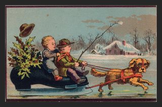
About The Printing

This is an original chromolithograph, and it was slow, exacting work. Each color had to be drawn onto its own separate stone by hand — in monochrome, the artist judging how much stipple each area needed so the colors would combine correctly only once every stone had been printed. The sheet then went through the press once for every color it carries, often a dozen or more, and every pass had to register exactly against the last. A pass out of register showed.

Under magnification the image resolves into irregular hand-drawn stipple, each ink carrying its own dot pattern, the colors mixing in the eye rather than on the paper. There is no regular halftone screen and no four-color rosette, which is what a modern reproduction would show. Modern process printing simulates every color from four inks; chromolithography laid each color down as its own.

Provenance

This item comes from the personal collections of my family estate, accumulated over more than 200 years — including items that came west by wagon train to Colorado and later to Oklahoma. Now that my parents have passed we cannot keep all of these cherished items. They were well-educated antiques collectors/traders and continued to build their collections over more than 60 years. The vast majority of the pieces are from the Victorian Era, however there are plenty of older and newer items. Everything has been stored in a climate-controlled environment over time.

Disclaimer

Specifications and detailed item descriptions are provided as a courtesy only and are not guaranteed to be one hundred percent accurate. Please do your own research. There are generally no receipts available for any items from original purchases. Any dimensions and/or weights are approximate. The absence of a more detailed condition report does not imply there are no condition issues with the item(s). Please inspect images carefully as they are part of the official item description and best representation of the actual condition. Additional images may be available upon request depending on time and availability. Not responsible for internet mis-translations or mis-identification of maker's marks if found or assumptions of makers or materials — item descriptions will indicate if it is assumed. If you see a problem, please message us immediately and we will do our best to sort out a solution and confirm the information. With the exception of eBay rules, no returns are accepted.
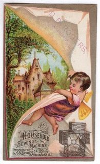
View on eBay

Arbuckle Ariosa Coffee Trade Card No 27 Big Horn Sheep Zoological [SEE DESC]

Arbuckle Bros Ariosa Coffee — Zoological Series No. 27, “Big-Horn”

$12.23

Original Victorian advertising trade card, chromolithograph, copyright 1890 by Arbuckle Bros. Coffee Co. Approx. 5.10 x 3.05 in. Printed by Knapp & Co. Lith., New York.

A bighorn ram and a younger animal bound down a rocky mountain slope, pine woods behind and a pale sky above. Captioned in the lower margin: BIG-HORN (Capra montana). The card is numbered 27 on the reverse.

The reverse carries three blocks of text. GRIND YOUR COFFEE AT HOME advises keeping a small coffee-mill in the kitchen and grinding one mess at a time, noting that coffee loses more of its strength and aroma in an hour after grinding than in six months before. An EXPLANATORY panel sets out the series: fifty cards, each showing a true picture drawn and colored by an eminent artist of one of the most interesting specimens of the animal kingdom, with the classical appellation together with the English name. It explains that every package of Arbuckle's Coffee contains either one of these cards or one of a companion series of fifty National Geographical cards, distributed so that each package in a hundred-pound case carries a card different from all the others. A third block promotes ARIOSA COFFEE, and a full list of the fifty animals represented runs down the right-hand side.

Read the full description

Historical Context

Arbuckle sold coffee by making the package worth opening. Fifty animals in one series, fifty maps in another, distributed so that no two packages in a case matched — a child who wanted the complete set had to keep the family buying coffee. It is a loyalty scheme a century before the phrase existed, and it worked well enough that Arbuckle became one of the largest coffee businesses in the country.

The reverse contains a small masterpiece of competitive advertising. Arbuckle observes that rival manufacturers, recommending their own goods, have known no higher praise than to say “It's just as good as Arbuckles'.” Quoting your competitors' own words back as proof of your standing is a move that has aged very well.

Condition

Toning and age typical of the period. Creasing and a short split across the upper right of the card; light surface soiling; minor edge and corner wear; toning to the reverse. The chromolithographed image remains bright and the reverse text fully legible. Please view the images carefully.

About The Printing

This is an original chromolithograph, and it was slow, exacting work. Each color had to be drawn onto its own separate stone by hand — in monochrome, the artist judging how much stipple each area needed so the colors would combine correctly only once every stone had been printed. The sheet then went through the press once for every color it carries, often a dozen or more, and every pass had to register exactly against the last. A pass out of register showed.

Under magnification the image resolves into irregular hand-drawn stipple, each ink carrying its own dot pattern, the colors mixing in the eye rather than on the paper. There is no regular halftone screen and no four-color rosette, which is what a modern reproduction would show. Modern process printing simulates every color from four inks; chromolithography laid each color down as its own.

Provenance

This item comes from the personal collections of my family estate, accumulated over more than 200 years — including items that came west by wagon train to Colorado and later to Oklahoma. Now that my parents have passed we cannot keep all of these cherished items. They were well-educated antiques collectors/traders and continued to build their collections over more than 60 years. The vast majority of the pieces are from the Victorian Era, however there are plenty of older and newer items. Everything has been stored in a climate-controlled environment over time.

Disclaimer

Specifications and detailed item descriptions are provided as a courtesy only and are not guaranteed to be one hundred percent accurate. Please do your own research. There are generally no receipts available for any items from original purchases. Any dimensions and/or weights are approximate. The absence of a more detailed condition report does not imply there are no condition issues with the item(s). Please inspect images carefully as they are part of the official item description and best representation of the actual condition. Additional images may be available upon request depending on time and availability. Not responsible for internet mis-translations or mis-identification of maker's marks if found or assumptions of makers or materials — item descriptions will indicate if it is assumed. If you see a problem, please message us immediately and we will do our best to sort out a solution and confirm the information. With the exception of eBay rules, no returns are accepted.

View on eBay

1891 Arbuckle Coffee Trade Card No 29 Dublin Ireland Around World [SEE DESC]

Arbuckle Bros Ariosa Coffee — “Dublin, Ireland,” No. 29 of 50 Views from a Trip Around the World

$12.11 1891

Original Victorian advertising trade card, chromolithograph, copyright 1891. Approx. 5.05 x 3.05 in. Printed by Joseph P. Knapp, Lith., N.Y.

A panorama of Dublin from Phoenix Park, with the river, a stone bridge and red-roofed houses, is surrounded by vignettes: a Colleen in a patterned headscarf; the Custom House with sailing ships at the quay; a Laborer with a clay pipe; and An Irish Jaunting Car, a horse-drawn side car with passengers and a girl at the roadside. A sprig of shamrock and pink clover blossoms sits at the center. Lettered at the foot: DUBLIN, IRELAND, and COPYRIGHT 1891 BY ARBUCKLE BROS. N.Y.

The reverse is headed One of 50 views from a trip around the world, and is numbered 29. The left column carries Arbuckle's GRIND YOUR COFFEE AT HOME advice and the ARIOSA COFFEE claim, closing with the line that rival makers know no higher praise than to say “It's just as good as Arbuckles'.” The right column is a travel sketch of Dublin — Sackville Street, the Nelson Monument, Trinity College and its library, Christ Church and St. Patrick's Cathedral, the house where Thomas Moore was born, and Phoenix Park with the Wellington Testimonial — ending with the population as of 1881.

Read the full description

Historical Context

Arbuckle ran several numbered series at once, and this is the travel series: fifty stops on an armchair tour of the world, one per package of coffee. The reverse reads like a guidebook, and for many households in 1891 it was the only guidebook to Dublin they would ever own.

The front shows the working of the series well. A city view, a landmark, and a pair of local types — the colleen and the laborer — each framed like a postcard pinned to a board. It is how most Americans of the period expected to meet a foreign country: as a set of pictures, collected one at a time.

Condition

Toning and age typical of the period. A short split and a small brown spot at the bottom edge below the title; wear to the lower-left corner; light edge toning; minor corner wear elsewhere. The chromolithographed image remains bright and the reverse text fully legible. Please view the images carefully.

About The Printing

This is an original chromolithograph, and it was slow, exacting work. Each color had to be drawn onto its own separate stone by hand — in monochrome, the artist judging how much stipple each area needed so the colors would combine correctly only once every stone had been printed. The sheet then went through the press once for every color it carries, often a dozen or more, and every pass had to register exactly against the last. A pass out of register showed.

Under magnification the image resolves into irregular hand-drawn stipple, each ink carrying its own dot pattern, the colors mixing in the eye rather than on the paper. There is no regular halftone screen and no four-color rosette, which is what a modern reproduction would show. Modern process printing simulates every color from four inks; chromolithography laid each color down as its own.

Provenance

This item comes from the personal collections of my family estate, accumulated over more than 200 years — including items that came west by wagon train to Colorado and later to Oklahoma. Now that my parents have passed we cannot keep all of these cherished items. They were well-educated antiques collectors/traders and continued to build their collections over more than 60 years. The vast majority of the pieces are from the Victorian Era, however there are plenty of older and newer items. Everything has been stored in a climate-controlled environment over time.

Disclaimer

Specifications and detailed item descriptions are provided as a courtesy only and are not guaranteed to be one hundred percent accurate. Please do your own research. There are generally no receipts available for any items from original purchases. Any dimensions and/or weights are approximate. The absence of a more detailed condition report does not imply there are no condition issues with the item(s). Please inspect images carefully as they are part of the official item description and best representation of the actual condition. Additional images may be available upon request depending on time and availability. Not responsible for internet mis-translations or mis-identification of maker's marks if found or assumptions of makers or materials — item descriptions will indicate if it is assumed. If you see a problem, please message us immediately and we will do our best to sort out a solution and confirm the information. With the exception of eBay rules, no returns are accepted.

View on eBay

Victorian Arbuckles Ariosa Coffee Trade Card Winter Mill Red Quince Flowers

Arbuckle Bros Ariosa Coffee — Winter Mill and Flowering Quince

$10.91

Original Victorian advertising trade card, chromolithograph, c. 1880s-90s. Approx. 5.00 x 3.05 in.

A branch of red flowering quince, with open blossoms and round buds, sweeps across the foreground. Behind it a snowy mountain valley opens out, a water mill with a snow-covered roof standing beside a stream among dark pines. The front carries no lettering.

The reverse reads: ARBUCKLES' ARIOSA COFFEE COSTS MORE AND IS WORTH MORE THAN OTHER BRANDS OF COFFEE. WHY? Four numbered reasons follow — the higher-grade green coffee, the strength and aroma retained by the glazing, the choice eggs and pure confectioners' “A” sugar used in it, and its richness of flavor — with a BEWARE paragraph against low-grade package coffee. ARBUCKLE BROS. COFFEE CO., NEW YORK. The card is unnumbered.

Read the full description

Historical Context

Not every Arbuckle card belonged to a numbered series. Alongside the maps and the travel views, the company packed plain picture cards like this one, with the full sales argument on the back and nothing on the front but a scene to keep.

The back is the most complete statement of Arbuckle's case: coffee sold roasted and glazed in a sealed package, rather than loose from a barrel. The glaze of egg and sugar kept the beans fresh, and Arbuckle wanted every customer to know it was there.

Condition

Toning and age typical of the period. Several patches of surface paper loss on the reverse, where the card was once glued into an album, passing through parts of the text; a pencil name at the top of the reverse; minor edge and corner wear. The front is clean and bright. Please view the images carefully.

About The Printing

This is an original chromolithograph, and it was slow, exacting work. Each color had to be drawn onto its own separate stone by hand — in monochrome, the artist judging how much stipple each area needed so the colors would combine correctly only once every stone had been printed. The sheet then went through the press once for every color it carries, often a dozen or more, and every pass had to register exactly against the last. A pass out of register showed.

Under magnification the image resolves into irregular hand-drawn stipple, each ink carrying its own dot pattern, the colors mixing in the eye rather than on the paper. There is no regular halftone screen and no four-color rosette, which is what a modern reproduction would show. Modern process printing simulates every color from four inks; chromolithography laid each color down as its own.

Provenance

This item comes from the personal collections of my family estate, accumulated over more than 200 years — including items that came west by wagon train to Colorado and later to Oklahoma. Now that my parents have passed we cannot keep all of these cherished items. They were well-educated antiques collectors/traders and continued to build their collections over more than 60 years. The vast majority of the pieces are from the Victorian Era, however there are plenty of older and newer items. Everything has been stored in a climate-controlled environment over time.

Disclaimer

Specifications and detailed item descriptions are provided as a courtesy only and are not guaranteed to be one hundred percent accurate. Please do your own research. There are generally no receipts available for any items from original purchases. Any dimensions and/or weights are approximate. The absence of a more detailed condition report does not imply there are no condition issues with the item(s). Please inspect images carefully as they are part of the official item description and best representation of the actual condition. Additional images may be available upon request depending on time and availability. Not responsible for internet mis-translations or mis-identification of maker's marks if found or assumptions of makers or materials — item descriptions will indicate if it is assumed. If you see a problem, please message us immediately and we will do our best to sort out a solution and confirm the information. With the exception of eBay rules, no returns are accepted.

View on eBay

1880s Trade Card Lion Coffee Woolson Spice Toledo Ohio Rose Winter Cottage

1880s Trade Card Lion Coffee Woolson Spice Toledo Ohio Rose Winter Cottage

$10.00

A large embossed card with a full-blown pink rose, two buds and green leaves curling over a turned-back sheet that opens on a winter scene: a yellow cottage with a snow-covered roof and smoking chimney, bare trees and a fir, and a snowy path in the foreground. The front carries no printed text.

The back is printed in blue: "Fine Pictures FREE! Besides the Beautiful Picture Card in every package of LION COFFEE, we also give away many fine pictures, books, games, etc., mailed free, in exchange for large Lion Heads, cut from LION COFFEE Wrappers." It invites the reader to ask the grocer for the latest Illustrated Premium List, or send a 1-cent stamp to "Woolson Spice Co., Huron and Jackson Streets, Toledo, O."

Approx. 3.60 x 5.45 in.

Read the full description

Historical Context

The coffee that came with a picture. Lion Coffee began in Toledo, Ohio, in 1864 and became part of the Woolson Spice Company in 1882. Alvin Woolson built the brand by putting picture cards in every package, and this card says so on its back.

Cut out the lion's head. The premium system printed here, save the lion heads from the wrappers and trade them for pictures, books and games, made Lion one of the best-known coffee brands of its day and filled family albums with cards like this one.

Roses in the snow. A summer rose set against a winter cottage is a favorite Victorian contrast, and the deep embossing makes this one of the more sculptural cards of the period. A good card for collectors of florals, winter scenes and Toledo history.

Condition

Used, with age wear. Front: a crease with a short surface break runs in about 1 in. from the left edge at mid-height, by the lower rosebud; a short crease near the lower right corner and light creasing at the lower left corner; corners lightly worn; a few small specks in the margins; light even toning. Back: light toning, the embossing shows through as expected, light creasing at the lower left and a small crease line at the right edge; no writing. Please see the photos, which are part of the description.

About The Printing

This is an original chromolithograph, and it was slow, exacting work. Each color had to be drawn onto its own separate stone by hand — in monochrome, the artist judging how much stipple each area needed so the colors would combine correctly only once every stone had been printed. The sheet then went through the press once for every color it carries, often a dozen or more, and every pass had to register exactly against the last. A pass out of register showed.

Under magnification the image resolves into irregular hand-drawn stipple, each ink carrying its own dot pattern, the colors mixing in the eye rather than on the paper. There is no regular halftone screen and no four-color rosette, which is what a modern reproduction would show. Modern process printing simulates every color from four inks; chromolithography laid each color down as its own.

The rose, leaves and scene are embossed, and the relief shows through on the back. The back is printed in a single blue ink.

Provenance

From my family's estate collections, built over more than 60 years by knowledgeable antiques collectors and traders. Stored in a climate-controlled environment.

Also In Our Store

More Victorian advertising trade cards for coffee, spices and baking soda are in our store.

Disclaimer

Specifications and detailed item descriptions are provided as a courtesy only and are not guaranteed to be one hundred percent accurate. Please do your own research. There are generally no receipts available for any items from original purchases. Any dimensions and/or weights are approximate. The absence of a more detailed condition report does not imply there are no condition issues with the item(s). Please inspect images carefully as they are part of the official item description and best representation of the actual condition. Additional images may be available upon request depending on time and availability. Not responsible for internet mis-translations or mis-identification of maker's marks if found or assumptions of makers or materials — item descriptions will indicate if it is assumed. If you see a problem, please message us immediately and we will do our best to sort out a solution and confirm the information. With the exception of eBay rules, no returns are accepted.

View on eBay

1880s Trade Card J. & P. Coats Thread Comic Market Women Vegetables Spool

DESCRIPTION

$10.00

A comic market scene. Two old market women on wooden stools argue across their baskets of greens, red apples and carrots, both with mouths open and hands raised, one in a white cap and polka-dot kerchief, the other in a spotted orange headscarf. Between them stands a prim lady in spectacles, a beribboned bonnet and a grey dress, a market basket on one arm and a furled red umbrella in hand. A large spool of J. & P. Coats thread hangs at upper left, its label reading "J. & P. COATS 200 YDS 50 BEST SIX CORD."

The back is printed in blue: "J.&P. COATS BEST SIX CORD THREAD FOR HAND AND MACHINE. WHITE, BLACK AND COLORS," with a large engraved spool and sprays of flowers. Approx. 4.05 x 2.75 in.

Read the full description

Historical Context

Thread from Paisley. J. & P. Coats was a Scottish thread firm of Paisley. In 1869 it allied with the Conant thread works of Pawtucket, Rhode Island, which then made the Coats six-cord thread in the United States.

Made for the sewing machine. Six-cord thread was strong enough for machine stitching, and the back of this card says it plainly: "For Hand and Machine."

Comedy sells thread. Instead of showing the product at work, the artist stages a squabble between two market women while a starchy customer waits, and drops a giant spool into the corner. Humorous scenes like this were a staple of the Victorian trade card.

Condition

Fair to good. Front: light soiling and foxing across the sky area, heaviest at upper center, with a few small grey smudges; small dark spot at the left edge; a curved surface crease at the lower right corner and a short crease at the right edge; corners softly rounded, the lower left with a small bump. Colors otherwise bright. Back: overall toning with light staining at the left and center, a few small dark specks, and a light crease at the lower left corner. Please see the photos, which are part of the description.

About The Printing

This is an original chromolithograph, and it was slow, exacting work. Each color had to be drawn onto its own separate stone by hand — in monochrome, the artist judging how much stipple each area needed so the colors would combine correctly only once every stone had been printed. The sheet then went through the press once for every color it carries, often a dozen or more, and every pass had to register exactly against the last. A pass out of register showed.

Under magnification the image resolves into irregular hand-drawn stipple, each ink carrying its own dot pattern, the colors mixing in the eye rather than on the paper. There is no regular halftone screen and no four-color rosette, which is what a modern reproduction would show. Modern process printing simulates every color from four inks; chromolithography laid each color down as its own.

The back is printed in a single blue ink.

Provenance

From my family's estate collections, built over more than 60 years by knowledgeable antiques collectors and traders. Stored in a climate-controlled environment.

Also In Our Store

More Victorian advertising trade cards for thread, sewing and patent medicines are in our store.

Disclaimer

Specifications and detailed item descriptions are provided as a courtesy only and are not guaranteed to be one hundred percent accurate. Please do your own research. There are generally no receipts available for any items from original purchases. Any dimensions and/or weights are approximate. The absence of a more detailed condition report does not imply there are no condition issues with the item(s). Please inspect images carefully as they are part of the official item description and best representation of the actual condition. Additional images may be available upon request depending on time and availability. Not responsible for internet mis-translations or mis-identification of maker's marks if found or assumptions of makers or materials — item descriptions will indicate if it is assumed. If you see a problem, please message us immediately and we will do our best to sort out a solution and confirm the information. With the exception of eBay rules, no returns are accepted.

View on eBay

No listings match that search.